
I’ve done a quick review while hooked up to my ultra wide display (2560 x 1080, 100% scale) and it also serves me the mobile interface. Let me know if you need logs and/or dev console information. Still on Firefox, I didn’t try any other browsers for now.
1 Like
Regarding Tentative Addition 1: I personally think this would be a great addition, as it lets us review the information while also cross-referencing what we got wrong in the original sentence all in one go.
2 Likes
プチ mobile update:
- Adjusted sizes of Quiz text – made larger text size show up on smaller devices
- For anyone interested, I’ll post the current breakpoint sizing below
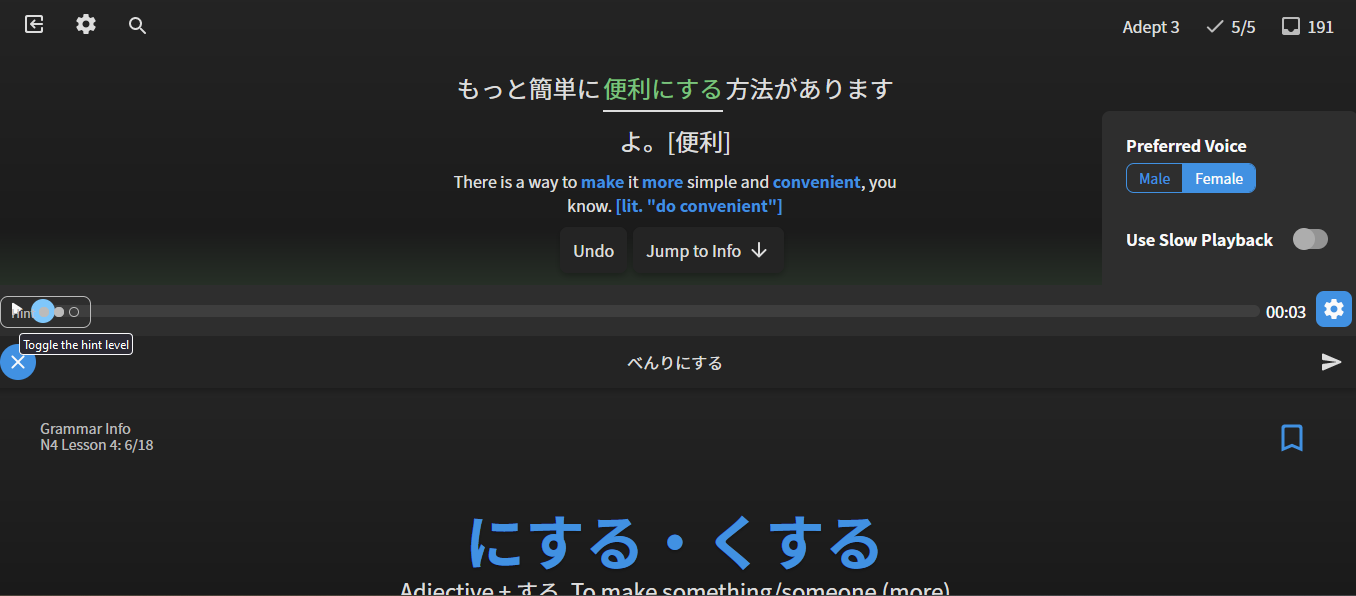
- @JamesBunpro
- Add Keyboard Legend and Report button to settings menu on tablet-sized devices
- Reduce desktop text size slightly
- Apply max width to question content (question, translation hint etc.) to stop it spreading fully across the page, and keep it more centered
- Fixed post-attempt-menu overlapping with hints
- Show Hint button if there is space on mobile (even if is post-question-attempt)
- Fix ‘tense’ sizing
- Only focus input after toggling the hint if it’s not mobile
Breakpoints and sizing for the Japanese question text
- Note that all font sizes are at
16pxfont-size setting
Default
18px

@media (min-width: 550px) and (min-height: 550px)
24px

@media (min-width: 1000px) and (min-height: 685px)
36.8px
@bunnypro Should fix your squashed-screen issue
@Marcus This is the ‘morning’ update
For everyone getting the mobile interface on large devices:
- After a fair bit of research, there is unfortunately there is just no way to detect if a device is using a physical keyboard or not
- The current check that is implemented will detect if you have any touch screen functionality
- If there is, it will show the vertically-squished mobile display
- The current implementation seems to be the best way to support touch devices – although I understand it’s ugly / undesirable to have a large section of your page unused if you’re on a tablet /w keyboard
- This is just one of the drawbacks/hindrances with web-apps
- Now might be the time to switch to the mobile app.
- If anyone has any technical solutions for device detection on web, flick me a DM
- Until browser support is better, It’ll have to remain as is. Sorry for the confusion ya’ll!
- We may have a future design that will make the half screen less ugly tho… watch this space
5 Likes
Okay, just re-tried. Opted back into beta, refreshed everything, and got this:

I’m sorry, but it’s horrible.
We had great reviews to begin with, then they changed, I disliked them because I dislike change, but I got used to them, and now they’ve changed again and it’s the worst of the three.
Don’t get me wrong, I love and adore Bunpro, it’s making all the difference in my Japanese progress, but this new look is awful.
I might be missing something obvious but isn’t what the user agent string is used for in those scenarios ? Why would you present a mobile version of a web site to a desktop OS just because it’s touch capable ? I didn’t try it myself but I suppose people that use “request desktop version” from their mobile web browser get the same behavior ? If that’s the case then it’s also not correct behavior since the user specifically asked for it.
I do appreciate the return of the Legend and Report button however there’s a massive amount of touch screen enabled Windows laptop with detachable keyboard or not out there in the wild. I should not be getting a mobile interface on a 34" ultra wide display.
1 Like
Echoing this, right down to the old Fujitsu laptop situation! In fact, I had to check I wasn’t zoomed out on the page for whatever reason, because it was so scaled down.

The top left buttons are a good size for what they are, at least.
2 Likes
I should not be getting a mobile interface on a 34" ultra wide display.
You’re totally right.
I think I’m gonna flip it around again, and if you’re on a wide screen, you get the desktop version no matter what. The website is Desktop-first, and the app is Mobile-first – which is what it should be.
As for the User-Agent string, using it for responsive design not recommended, but in combination with what I’m using at the moment it is definitely an idea worth investigating.
1 Like
Hi there, veritas! Thanks for the fix! I can confirm that layout-aware scanning works properly now!
Not sure if this has been addressed, but I was doing my reviews a moment ago, and in one of the grammar points I got wrong, I was trying to add my own notes during the review and it wouldn’t let me because of the key shortcuts. When I push space, the screen scrolled up again, keeping me from continuing typing.
Also, I have no problems reading the smaller font, but I think it looks weird because there so much unused space, maybe there should be a way so we can like make the font bigger or smaller depending on how we want it? Not sure if thats possible.
2 Likes
1 Like
@chicharron @bunnypro
Thanks for your feedback RE the text sizes/spacing. We’re currently looking into options internally and should have some new designs/options for users to get the page displaying how they want it.
@chicharron Will look into the Spacebar issue!
@bunnypro Big d’oh moment. Hot-fixed the Hints button back so that it doesn’t display post-attempt.
Will wait till we have a proper solution implemented. Got some good changes on their way!
2 Likes
Hey there, within the new beta, I noticed that pressing “enter” typically goes to the next review item. However, this behavior breaks when one clicks off of the text entry box to, say, view grammar point information. This alone wouldn’t be too annoying, but it’s not terribly intuitive that you need to click back into the completed/failed text entry box to move to the next review, mostly because there is no flashing “cursor” or any indication you are “tabbed” into the answer box, as it’s already in it’s completed/failed state.
From my perspective, I would find it much more intuitive for the “press enter to go to next review” to become active upon the cursor re-entering the main question area (or to remain active in the grammar point summary area), as often it’s rather annoying to press “space” to view the grammar point, then need to click back into the answer choice, then press enter to move on.
I apologize if this suggestion has already been addressed or is insignificant.
2 Likes
I see someone has already mentioned it, but I find the new dimensions pretty bad. The text is way smaller than necessary, and even if I zoom in, the other buttons becomes way to large compare to the text, which is the actual thing of interest. I also get a big black box on the lower half, or the grammar info “in my face” taking attention away from the sentence.
2 Likes
Thanks for the feedback!
You are right, we should introduce another type of feedback to show that you are focusing on the input. Currently the only thing that shows that you are highlighting the text is indeed only the text-editing caret, and this disappears after you attempt a question.
Will have a think about what else we could use to show this focus.
Just some more options to consider at this state:
- The
Ihotkey will bring you back to focusing the input, no matter where you are on the page - The right-arrow icon will submit the question
We can’t make the Enter key be the global “Submit” key because it would interfere with how keyboard users use the Tab & Enter key to tab between the different buttons on the screen.
Hope this sheds some light!
1 Like
Yeah the new dimensions and half-height screen display is unfortunately pretty sub-optimal.
Instead of implementing another half-way solution that we might get wrong again, we’re taking a bit of time internally to do some redesigns of how might tackle the screen-size/device issue.
We should have this update out next week sometime.
Thanks ya’ll for your patience!
2 Likes
Ok. I liked the original v2 reviews screen display pretty good though. Right now I got back to using reviews v1. Good job by the way.
3 Likes
Good news for you then – basically the update will allow you to choose between a (prettier) fixed height view (currently it indeed does look like a bug) and the original (full-page-height) view from the original update.
Anyway, I’ll ping ya’ll when the update is here 
4 Likes
That’d be good news for me too! V.1 was fine. V.2 grew on me a lot. V.3 breaks my heart it’s so difficult to read. When we get the choice, I’ll probably go with V.2! Thanks so much!

I agree with this!
A big drawback of v.3 (squashed version) is that when you submit but realise you made a typo, the grammar point appears on screen immediately, so kinda gives away the answer.
For those unfortunate times when you think you just made a typo, but in fact got completely the wrong grammar point 
PS: I don’t know much about this, but can’t the original font sizes and scaling from the old “v.1” reviews just be used? Never had a problem before.
1 Like