When displaying a hint and entering a correct answer for question 1, the hint for question 2 briefly pops up when pressing enter to continue from question 1 to question 2.
Thanks for the feedback Dave! Out of curiosity, what device are you looking at Grammar Points on?
We have plans to make the Grammar Point page not use tabs/columns at all.
This update should come after we implement Vocab reviews.
Hopefully the spacing issue is not too frustrating until that update comes!
Got my hands on a tablet this week so gonna work on this!
An update should be available really soon.
Thanks for the UI feedback.
The input bug is a high priority, and should be fixed today or tomorrow!
Good catch! No this bug hadn’t been reported yet.
We’re planning on switching away from a tab-system, so that change might come around before I have time to implement a fix!
Anyway, this bug on my radar now so cheers 
Thanks so much for the detailed response and designs! I’ll pass it along to our designer. We’ve got big changes in discussion for the layout of Reviews.
As for why we have the input field in the first place – there are a few technical difficulties:
- Input fields can’t break across lines
- Some questions have multiple instances of the answer inside the question (think と、や、でも、やら、にしても etc.)
That being said, it’s definitely an interesting idea. We could have the HTML input field be invisible and off screen, and have what’s entered be represented inside the question or something. We’d have to think about how to do accessibility.
As for the stuff with adding text to the front of what you’ve already inputted – this is on my radar and should be fixed today or tomorrow.
This bug shouldn’t be related to Reviews 2.0.
Hopefully resetting your timezone helps you fix the issue too @Kioshen!
Thanks for all the details! I’ve made a note on our internal ticket for this.
Should help us bug fix it faster.
I’ll look at what’s done on the non-beta system and see what differs
1.) Hi there! This is now the default interaction for the “Auto-Expand Info” setting on Mobile.
If you primarily use mobile, I’d turn this off for now
2.) Working on a fix for this currently!
As for the screenshots, what device are you using? Seems your viewport width is 236px.
We currently only support devices with viewports down to 360px
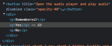
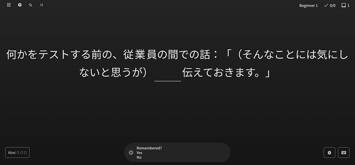
im not sure if i did something to change settings (missclick somewhere? very possible, sorry if so!) or if this is some kind of bug, but i tried to do my lesson today like always, but upon going to the review page for the new grammar point, i cannot input anything into the textfield that only says “Remembered? Yes, No”,
it looks like some kind of auto input, but i cant click on the yes/no (its not clickable link or button, just text, as shown on pic below), nothing i click on keyboard does anything to help here and and im not aware of changing any settings either - i have always done all my reviews with manual input before. Same thing if i add the grammar point as known and head to reviews via there instead of via lesson page.

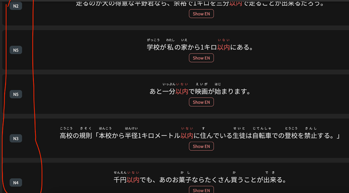
Opting out of reviews beta lets me input a text there, but ive left it there in case its somehow useful for debugging? It was this N2 grammar point 一応 ①
A feature was added to allow Vocab sentences to use the ‘Cloze’ question style (the same style that Grammar Points use).
This changed what the DB was returning to the new system, and it was unnaccounted for!
This should be fixed now.
Thanks for all the detail and for pointing this out!
wow that was really quick fix, its indeed working now, thanks! 
When I click a new grammar point when doing my reviews, for example from the synonyms, instead of opening the little box as before, I get sent out of the reviews and the grammar point is opened. This should probably open a new window.
Also, I still have problems with grammar points not being viewable and audio lacking one review behind when I have a typo and retype my answer.
iPad, as I said in the original report.
— Dave
i really loved bunpro cloze for the vocabulary deck! The idea was really good!
Just one thing I find interesting to add is in the case of words that are said informally or politely. For example “ohayou” and “ohayougozaimasu”. When it is the case to add “gozaimasu”, it would be nice to have written in the question that the answer is polite, so as not to make mistakes all the time unnecessarily 
“You are also Tom.”
Like I understand the words individually, but what sort of bizarre context would this need to be spoken in.
Like in a cloning factory? Dementia ward with multiple patients of the same name?
Just want to say kudos to the devs. I tried the new reviewer like 10 days ago and didn’t like it too much, but to my surprise, I tried it again after coming back from vacation and looks much better.
Maybe I will give another try to Premium after all of this.
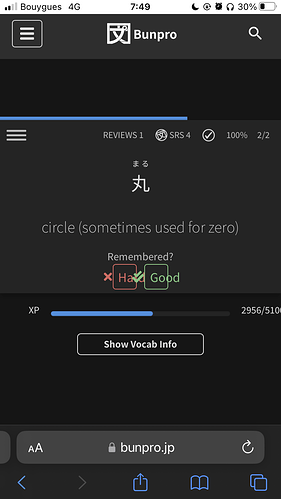
Minor issue : Iphone se 2020 (small screen), the Good/Bad buttons for flashcards reviews don’t fit the boxes correctly


