Reviews 2.0, and a whole lot more! [Beta]

bug report: review shown as correct when getting it wrong, then wrapping up without going to next review


steps to reproduce:

  1. start reviews
  2. write a (あ) as answer
  3. hit enter (just once, not twice = going to next review!)
  4. click wrap up in the top left

Also, this doesn’t record the review in the statistics (it still said 0 reviews for today after this in the review activity graph)

Btw, seconding the Yomichan sentence grab issue, it’s an essential tool for me.

1 Like

Does this similar type of issue occur on any other websites? I’ve read past examples of the same type of issue on reddit, etc. before. I just tested doing it on Twitter a couple of times and it also has the same issue where despite only selecting the text in question, it also pulls in other information like the users’ twitter handle, etc. inside the Anki field.

Obviously want to fix any issues however we can, but just want to rule out whether or not this is a yomichan/browser issue itself or if it’s solely just a Bunpro thing. Any help from you (or anyone else really!) would be super helpful :octopus:

2 Likes

A probable bug on the summary page: I made a mistake on an item in a review session and then ended the review session early before it came back again for a second attempt. This resulted in the missed item being listed as correct on the summary page.
When I completed my next review session the item came back and was the correctly listed as missed in the summary.

1 Like

It does occasionally have issues with other sites’ formatting; however, I mainly wanted to point out the issue because it is something that the previous version of the sentence reviews could do, but now no longer does. My main concern is that it works with you guys because of the disproportionate amount of words I grab from here vs any other site. It might be worth me trying to create a bug report on their GitHub, but seeing has how they have over 180 bug reports and their code hasn’t been worked on in months (plus, I don’t know if there will ever be a “perfect” solution to deciphering where sentences begin and end in HTML), I figured I would post the concern here, with greater hopes that a resolution can be found, at least on this site.

I can confirm this is an issue on Firefox, as well as Chrome.

3 Likes

Yeah I totally get where you’re coming from, thanks for bringing it to our attention. I’ve used yomichan for years and I somehow never knew about the sentence feature, never thought to try it out! Ever since you brought it up I’ve been testing it on a bunch of websites today and forwarding my findings to @veritas_nz

Hopefully the team can figure out what worked before vs now and nip this annoying problem in the bud~

3 Likes

Day 8 bugfixes are here!

The moment you all (well, some of you) have been waiting for - An overhaul of the mobile (and optionally, desktop) layouts!


Layout Overhaul

Optional fixed height & widths

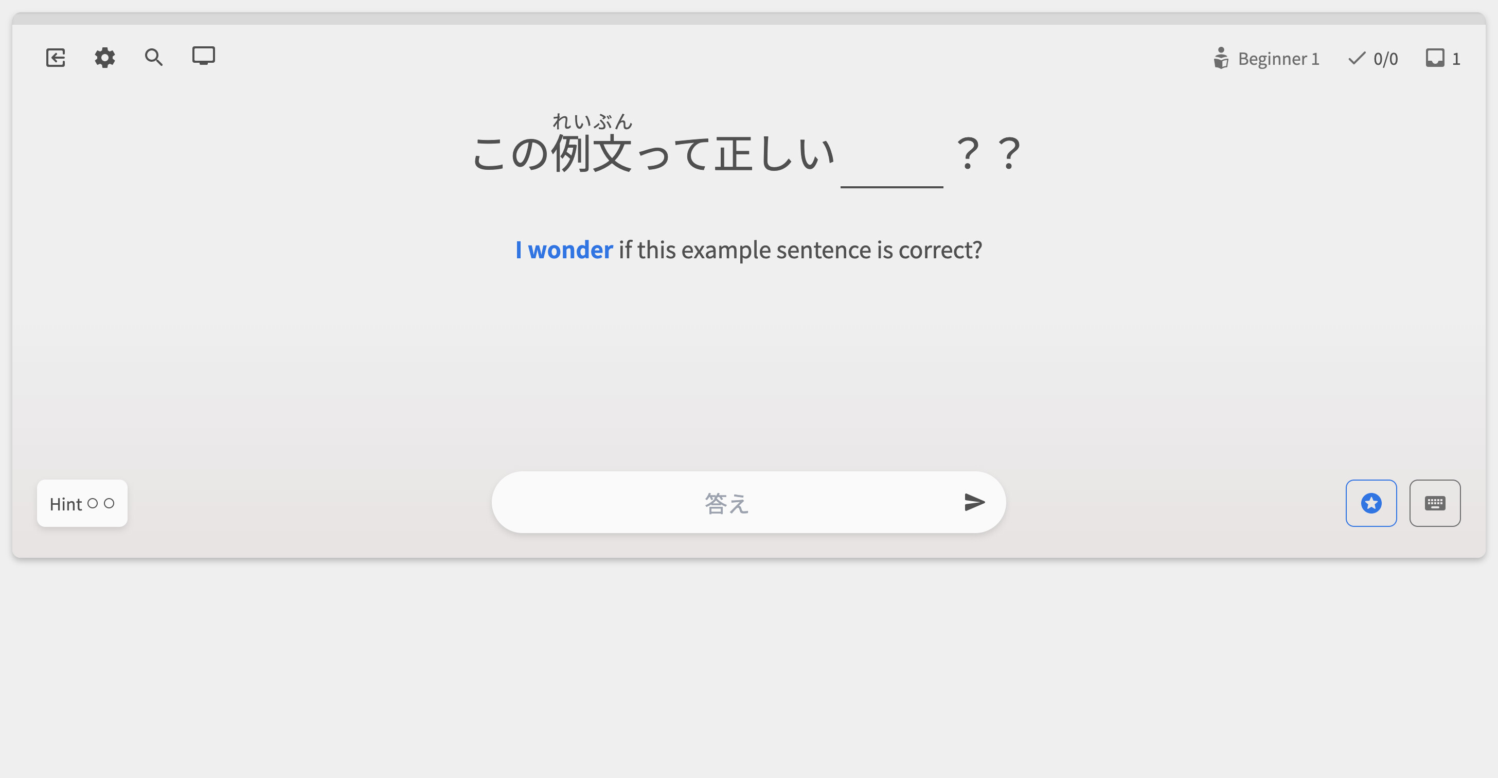
On larger devices, clicking the ‘screen’ icon in the top-left will open up the Display menu. Here you can switch between having a full-screen or fixed-height page layout.

  • Previously, fixed-height mode was forced on users that had smaller screens or touch screens. This led to a bad user experience, especially for users that had physical keyboards attached to tablets
  • We’ve now given you the choice on how you want the screen to display
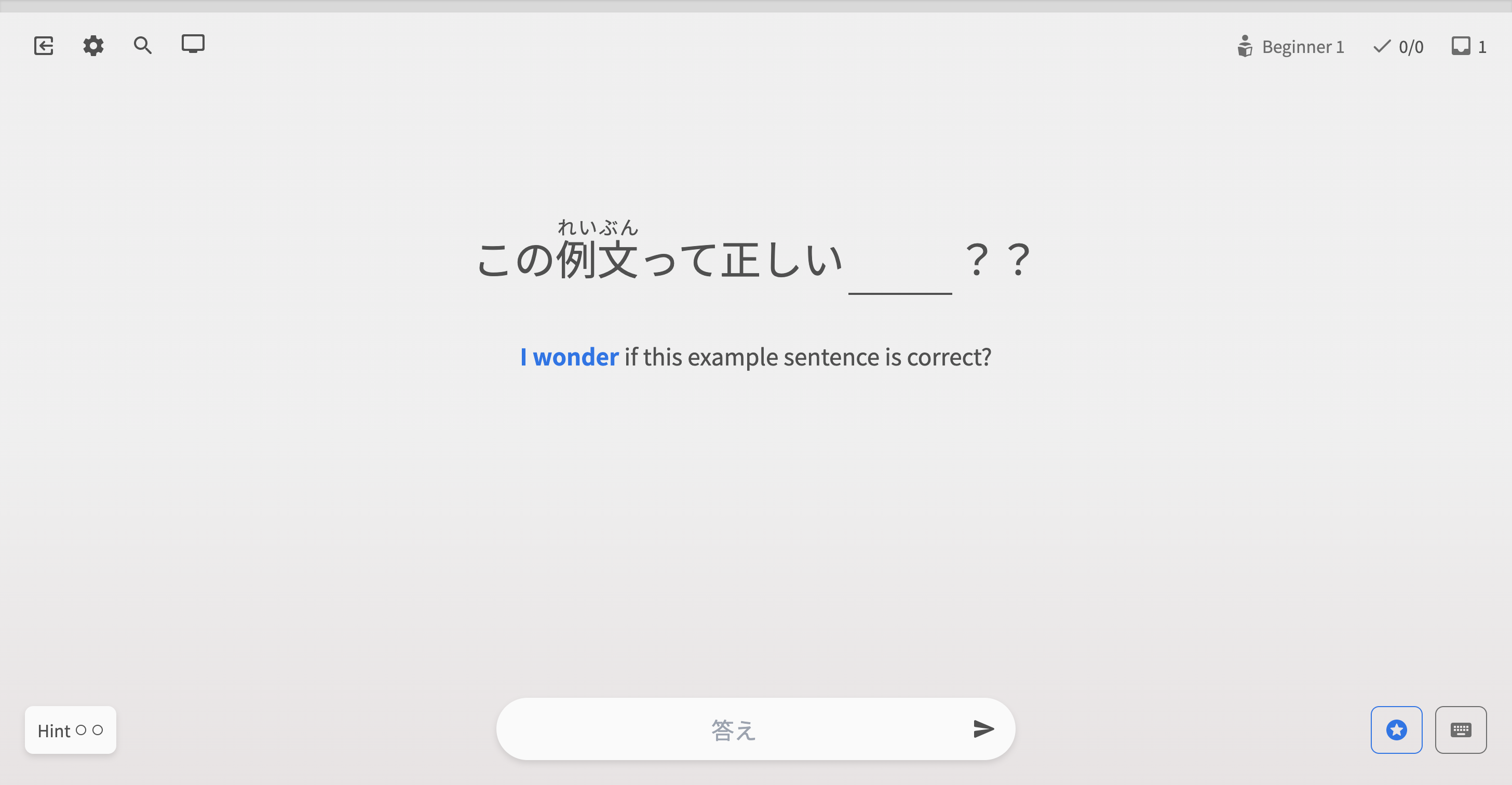
  • Fixed-height mode now fixes the Quiz screen to be set height (530px high)
  • This also much more closely resembles the old Reviews layout – so hopefully users that are pining for that to be back will also find it satisfactory!

Also in the Display menu, you can also choose to toggle between having a fixed-width too.

  • Note that, for devices where this setting would be irrelevant (sub-1280px devices), this option is not there, and is instead replaced by the ‘Use Fullscreen’ option

Here are all the possible layout combinations on desktop screens:


Fixed width fixed height

Full height fixed width

Fixed height, full width

Full height full width

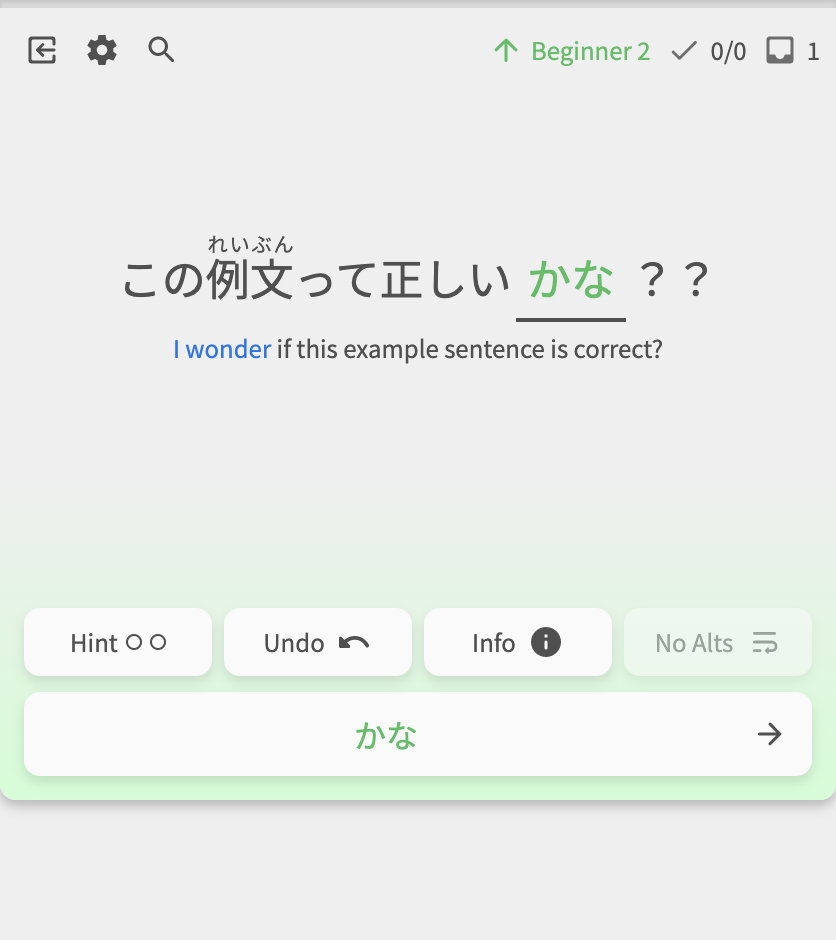
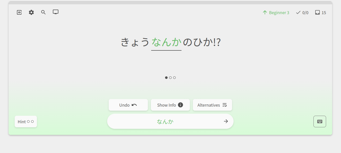
On mobile, the Hint button now always is available – regardless of if you’ve answered the question or not

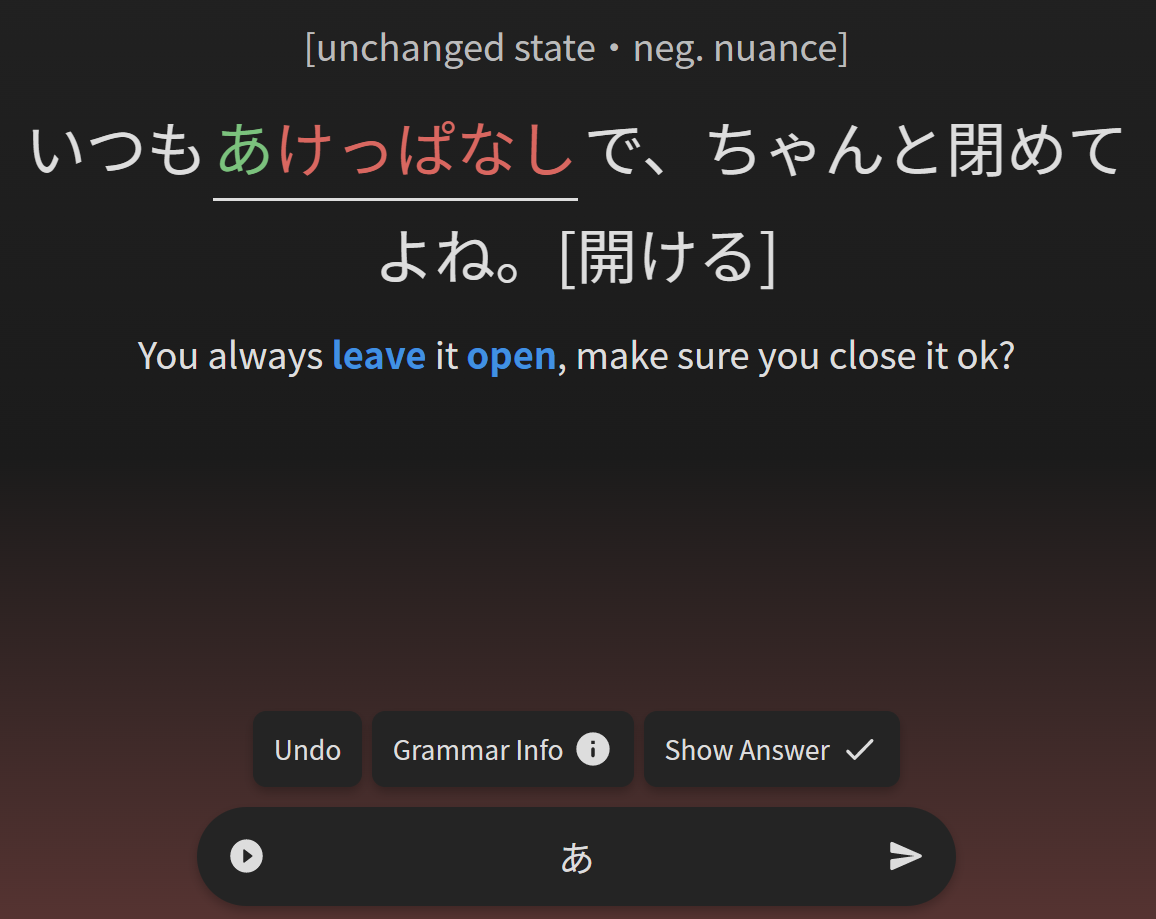
Alternate answer carousel is now beneath the question

The alternate-answer carousel has moved places. It used to be above the input, and would take over the post-attempt submenu (where the Undo, Show Info, and See Answer buttons are). This carousel stood out far too much and got in the way. Not good.

Now, it is much smaller and has been moved to where the ‘leading-hint’ gets displayed.

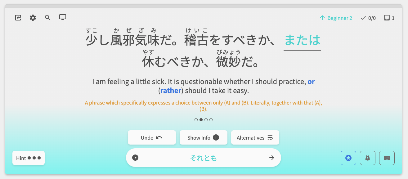
Grammar Info now always displays beneath the quiz

  • We tried displaying the Grammar Info inside of the drawer on mobile, but this was a bit clunky.
  • Now, the Grammar Points display directly beneath the quiz, as they do on desktop.
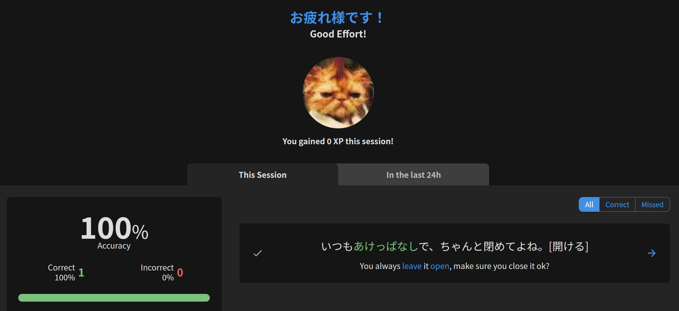
Updated SRS info

In the top right of the screen lies the SRS info. This has got a juicy update too!

  • Now when you get a question right or wrong, it will change color and number to represent your new level.
  • Also, the icon next to it will tell you what type of question it is – whether it is a custom study review, a Ghost review, or a regular review.

regular-review custom-review

ghost-slain level-up

Anyway, thanks for the patience guys!

@Gunta @TobyOne @chicharron @severian @Kioshen @Marcus @Marcus.W @bunnypro @CursedKitsune


Other Fixes & Changes

  • Hints should now properly reset after entering a correct answer/question change
  • Scrollbar appearing in the alternate-answers carousel

Next on the list

  • Fix bug that is causing Grammar Info to not show
    • This is the big one at large.
    • If anyone has any information that could lead to the solving of this bug, please send me a DM with what happened before the bug occured
  • Reviews gradient banding (visual bug) on Firefox
  • Add SRS progress badges to the bottom of the Grammar Point page
  • More Yomichan research and fixes
    • May or may not be a Bunpro problem, but will take a look!
    • @MC_2018 @Saimin
  • Stop ability to interact with the quiz while it’s loading
  • Strange results on the Summary screen when ending on a half-finished answer
15 Likes

Really glad to see things taking the step that we have been discussing for years come to fruition, great feeling.

5 Likes

We have a feeling this last patch will really improve tons of things. Like always, we read all of your comments and feedback! Hoping this helps you guys reach your language learning goals!

7 Likes

Mobile + auto expand is going to be my new method going forward, SO beautiful :hot_face:

4 Likes


:dancer: :partying_face: :+1: :grin: :champagne: :ok_hand: :tada: :heavy_heart_exclamation: :dancer:
Great stuff! Thank you!

6 Likes

Love this little chap too:
Screenshot 2023-01-28 12.17.03 PM

6 Likes

Hi! So I see what you did what the alt-answers carousel, but for me the dots are like in the middle of my screen. Seems a bit out of place but not sure if its just me? At first I didn’t realize what it was for :sweat_smile: Also… any way you can make the little dots clickable, I have the urge to click them to change the answers instead of using the “alternatives” button

Side note: Loving the lil ghost slain :sunglasses: :ghost:

4 Likes

Thanks for the latest update, some nice improvements there.
I like that the SRS level change is now shown.

Perhaps the display button should have some kind of hint the first time so users know they can change the mode to their liking?
It defaulted to full screen also on my iPad in portrait mode.

2 Likes

Ok, I checked i. I knew I was not hallucinating!


Reviews 1.0 accepts katakana(at least in first position), reviews 2.0 doesn’t

2 Likes

Thank you for your hard work. The layout feels much better to use on my various setups. Thankfully the spacebar bug has also been fixed. Lots of good QoL changes overall.

One small polish thing is that every button in reviews 2.0 has a tool tip except the magnifying glass icon that takes you to the grammar page.

1 Like

Just tested adding notes during reviews again, the issue with the spacebar is solved, it doesn’t scroll up the screen anymore when adding notes. However, there is an issue with “I” now :sweat_smile: it scrolls up the screen and with “F” it scrolls up a little. Also when typing “P” it plays/stop the audio every time. It seems its an issue with the shortcuts in general?

1 Like

I think there is an issue with the new SRS level indicators. If I get an question wrong, it correctly lowers the SRS level but if I then get it correct in the cleanup part at the end of the review section, it then shows that the SRS increases again which of course is not correct.
If I check the grammar point after the session, the level was correctly lowered.

2 Likes

プチ Day 8.2 update:

  • Make alternate-answer dots be clickable
    • Makes sense to just make the dots clickable, so that’s what I’ve done
    • As for their placement, and the large gap that can exist between them and the Japanese question text – basically we secure space/make room for the question translation and hint text at all times, so that if you do toggle them on/off, there is no ugly/distracting layout shift.
    • For the dot-carousel placement, we just used the “leading hint” space (the ‘we are looking for …’ style hint that appears after you enter an answer) – as this becomes irrelevant after answering the Q
    • We can have a think about where else we can place these dots. I’m actually curious to see how many other people do Bunpro with zero hints/translations whatsoever
    • @melisma
  • Allow Katakana input
    • This was a relatively easy fix – it will now convert your input to Katakana after submission.
    • Due to restrictions with Wanakana (the library we’re using) we can’t automatically have it convert Romaji to Hiragana
    • @Maykeye
  • Reviews hotkeys should now not intefer with input elsewhere on the page (e.g Notes)
    • Redid how hotkeys work internally
    • Nice find @chicharron
  • Fix SRS level indicator incorrectly showing increases/decreases during Wrap-up

As always, thanks ya’ll for the feedback, and the positive reception to the layout changes has been great :relaxed:

7 Likes

From my point of view at least, the layout issues are now solved and everything looks great :smiley:

2 Likes

Ive been thinking about the position of the answer dots the last few days and I can’t really think of anything better for now, and I’m satisfied with the dots being clickable :slight_smile: 
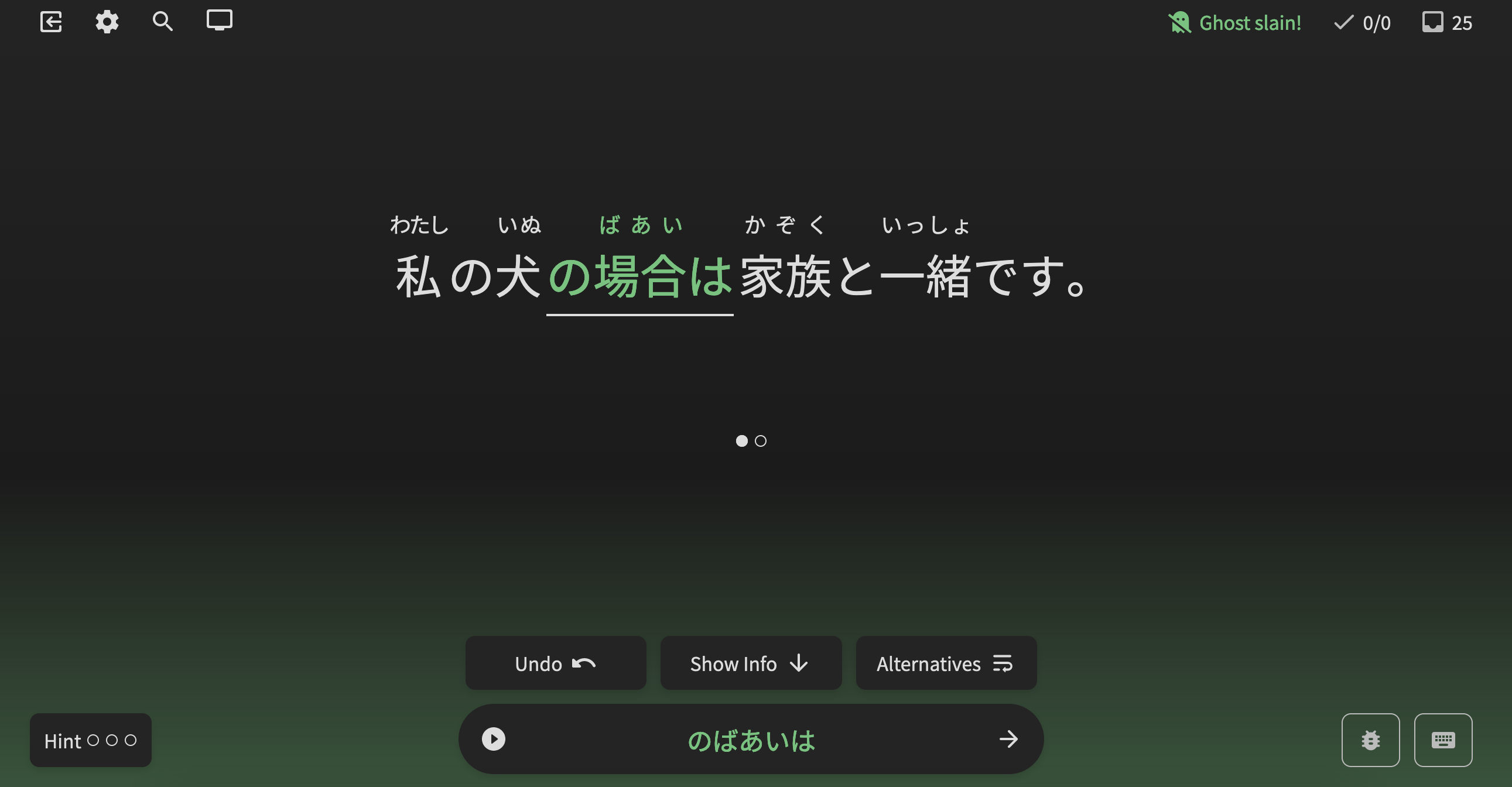
Haven’t found anything else to mention either. Thank you all for the AMAZING changes & really REALLY quick turnaround time on all the fixes!

3 Likes