Reviews 2.0, and a whole lot more! [Beta]

Is anyone else having an issue where some of the “missed” grammar points and the “correct” grammar points are switched in the final score after you finish a session? This happens to me nearly every time with 2.0. I do the right grammar points in my final review, but a different grammar point is marked “missed” in the final tally.

Also, the hint button disappears after submitting an answer; so, I am unable to see the translation unless I pressed it before submitting.

Yeah, same here, the “missed” ones don’t always actually correspond to the ones you actually got wrong.

Sorry if this was already mentioned… I’m having some issues with viewing the ‘correct’ answer after getting it wrong.

Example…

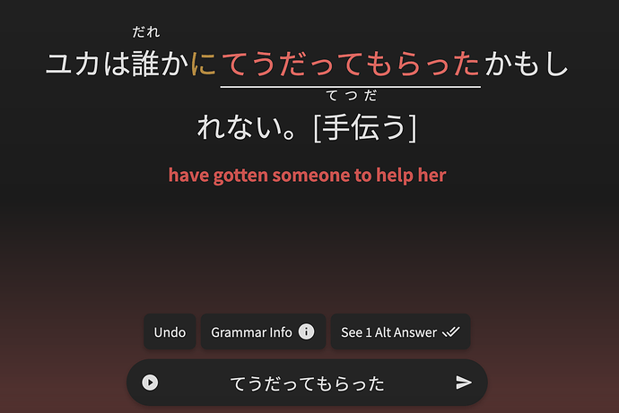
  1. I got this question wrong and I see the button “See 1 alt answer”

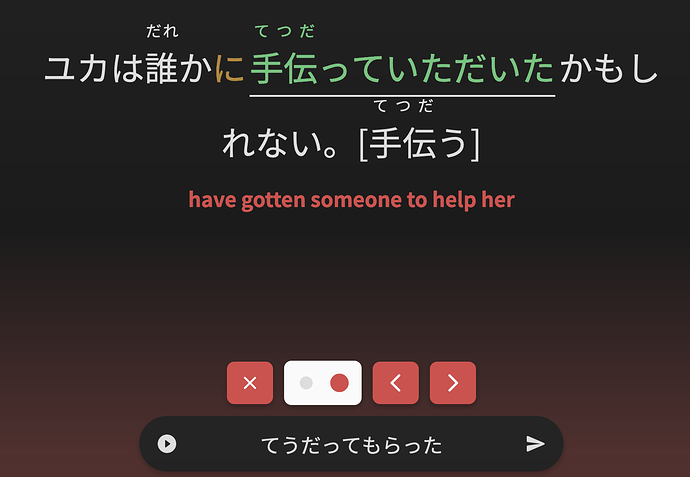
  2. I click the button and I see there’s actually 2 answers? And it’s defaulting to the 2nd one

I understand the 2nd answer is technically the alternate answer, but I never got shown the first/main correct answer. So now I have to click the arrow to see the main correct answer. Am I doing this right? I feel like I didn’t have this issue before :sweat_smile:

I guess I was expecting the “See alt answer” button to actually be a “Show Answer” button and it would show me the main answer first with arrows to see the alt answers. But it does seem like this “See Alt Answers” button only shows when there’s multiple answers, because I see the normal “Show Answer” button on questions with only 1 correct answer.

I think I was confusing so let me know if I dont make sense lol

Edit: I actually caught up on the thread and I see now this issue was actually mentioned already, whoops. This post below. Thanks!

1 Like

Is mobile-friendly review changed?

I’m pretty sure previously
オきなかったです and おきなかったです were treated the same at one point

The text is still small when I do reviews on my work laptop. Using Chrome. The laptop is a Fujitsu Lifebook (I think). I can give you more details if you want but at this point I am not sure if the tiny text is intentional or not…

I am sure you are working hard on the next update and maybe this will be addressed in then.

3 Likes

Yeahp, fixes are on it’s way! Should be out within the next 48 hours.
Until then, the weird half-screen will unfortunately stay there :sob:

I’ll add you to the list of people to ping when this change gets made though

2 Likes

Couple more bugs I noticed - apologies if I’ve missed them in the above thread!

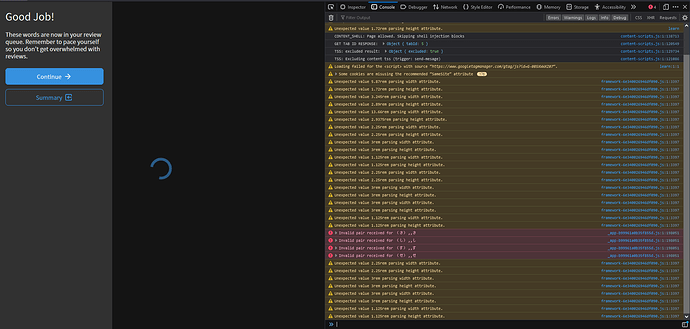
After setting a grammar learning path and completing the standard three new lessons the screen hung with an infinite loading icon - not too major as there is a button to exit, but still not a pleasant experience.

Replication:

  1. Set Minna no Nihongo as the grammar lesson deck to use. (might not be relevant)
  2. Click the Learn 3 grammar button.
  3. Complete the lessons and quiz.
  4. Once complete the transition back to the main screen gets stuck with an infinite loading icon. There are errors in the console mentioning Invalid Pair received - no idea if that is relevant.

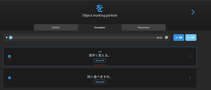
Not a bug, but a possible UX issue - on larger monitors the play button on the lesson examples page is on the far left of each sentence when it previously used to be central. This means that the mouse has to be moved a fair distance between clicking Show English and then playing the audio.

Browser: FireFox 109.0 64-bit
OS: Win10

1 Like

The new summary page is a nice improvement but perhaps it could default to show only the missed ones? Now I each time click on “missed” after each session to check only those items.

1 Like

We currently have it set up so that despite defaulting to All when you land on the page, it puts all missed items first and then correct answers after that. This way you don’t have to spend the extra click going to missed and you can just seamlessly scroll from the start. Does that help you any at all?

1 Like

Nice catch on the Learn bug!
The spinner was OK, it was just the fact that if you closed that drawer, there was no way to continue doing anything without refreshing the page.

This will be fixed in the next update :bowing_man: :+1:

The current setup works, I would just prefer to have the correct ones either excluded from the list shown directly or more clearly separated.

I think the current displaying of Incorrect questions first and then Correct questions on the same screen is fine.

There could however be a little more contrast between the two – maybe adding a colored border around the sentences or something would help keep them more clearly separated.

Not sure if this is related to Beta at all, but I like the new look of grammar points, especially the neon lights around fun facts :laughing:

image

However, I don’t seem to be able to do the “quiz” after looking through info about the grammar point and going through the example sentences and just had to manually “Add to reviews” without a quiz.
Is this intentional?
I know the “quizzes” followed the Reviews 1.0 format, so perhaps this is why one didn’t appear?

Those neon lights are actually pretty sick, I might need to use dark mode more now. :thinking:

I think I know what you’re talking about, feel free to call me an idiot and correct me though. When you study points via Learn, you read as much as you want about each point in the Learn queue (whatever # you set) and then after you’ve read everything it quizzes you on said points.

If you go to add points manually by searching for them in the Grammar Points page, then yeah you hit the bottom Add to Review button and then have to start a review session manually to actually get quizzed on them. This is for a few reasons, but mainly if you plan on adding more than 1 during any given session, you won’t have to keep going in and out of the grammar all page each time.

A test case would be if you’re doing your own special path, you could read one point + add, click the arrow to go to the next point + read + add, click on arrow to go to next + read + add then once you’ve finished your additions and reading, you do one quiz at the end instead of 3.

i hope that rambling made a little sense, it’s late :sleeping_bed:

1 Like

OK, I’ll try and test it out when the new look is back!
Just “learning” another new grammar point and it seems to be back to the old look for now.
I wonder if only specific points have been converted to the new look because the one in the new look I did before was an “outlier”, i.e. I skipped ahead to an enticing one before jumping back onto the usual course :thinking:

Hmm that’s a little strange. Don’t think that should be happening unless I’m mistaking it for something else.

If the Learn button is not bringing you to the beta style of paging, you can manually enter the url bunpro.jp/beta/learn and that should do the trick.

I think? I think. Probably. :octopus:

Ah, accessing through the “Decks” tab brings up the new style!
(In contrast to accessing through the normal “Learn” button).

Just tried Bunpro – Japanese Grammar Explained and that also brings up the new style.
I’ll try to remember to do that, but will probably forget!

I’ve tried to access a quiz on Learn 2.0, including marking all “resources” as “read” (even though I never read any of them :sweat_smile:) but can’t seem to access a quiz on there.
Actually that might be a good reason to stick to Learn 1.0 for now.

2 Likes

Hey! I’m gonna chime in here, hopefully I can be of some help.

The “Learn” button on the top site-navbar takes you to the old Learn page? And you’re signed up for the Reviews. 20 Beta?

The Quiz at the end of your Learn lesson will appear if you click the next arrow until you get to the last item and hit it again. Is it not launching the quiz at all for you? :thinking:

1 Like

Day 7 bugfixes are here!

The changes for the half-screen/mobile/touch-screen issue are not included in this update, but I am in the process of implementing them.
Before I make those changes I thought I’d release all the other bug-fixes I’d been working on below:


Fixes & Changes

  • Fixed Spacebar not working in Notes in Reviews
  • Fixed Alt Answer showing second answer if incorrect
  • Show session-ending spinner if exited through new ‘0’-hotkey
  • Add check to remove duplicate alternate-answers if DB data is incorrect
  • Bumped the Japanese example sentences in the Writeups to be larger
  • Increased User profile-picture size to properly match the size of the pic on the Summary page
    • Might take a bit of time (a few days) for this to take effect
    • @eclipse77x
  • Added SRS indicator icon to Grammar Synonyms/Antonyms
    • This was previously just text before
  • Summary page now uses the Kanji answer for a question (if one exists)
    • Previously just showed Hiragana
    • Might take a bit of time (a few days) for this to take effect
  • Fixed up the experience when finishing Learn
    • Added custom text to the drawer that pops up if you end the quiz prematurely
    • Fixed the functionality when you close the drawer (not clicking ‘Continue’ or ‘Summary’)
    • @ThePurpleOrange thanks for the feedback!
  • Fixed audio issue where if there is no audio, hitting ‘P’ played the audio from the last question that had audio
    • I think this might be the fix for another issue – the “audio lagging behind by a review”
      • Not guaranteed that this fixes it, so let me know if any of ya’ll still have audio issues
    • @JandroSantiago @TobyOne

Next on the list

  • Changes for the half-screen/mobile/touch-screen issue
  • Fix bug that is causing Grammar Info to not show
    • This is the big one at large.
    • If anyone has any information that could lead to the solving of this bug, please send me a DM with what happened before the bug occured (no reward)
  • Reviews gradient banding (visual bug) on Firefox
  • Add SRS progress badges to the bottom of the Grammar Point page
10 Likes

Love it, thank you! I’m amazed at what Bunpro has become since I joined in 2021!

2 Likes