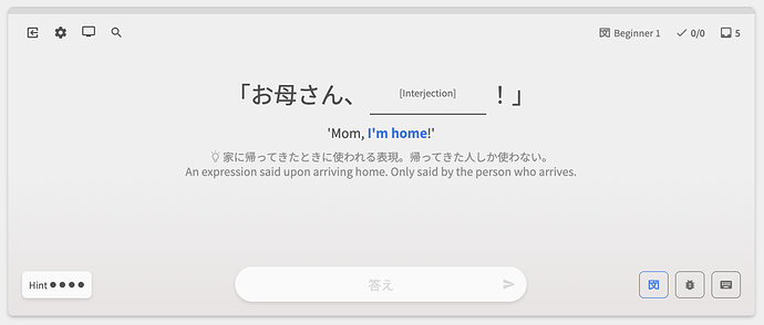
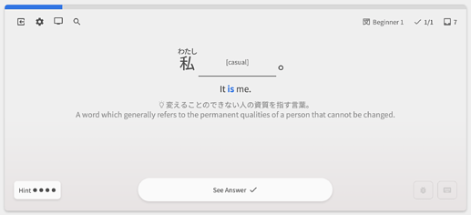
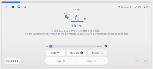
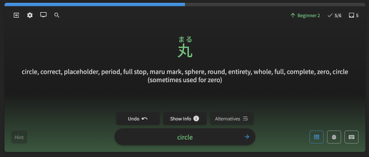
Could your send us a screenshot of what you are seeing please?
It looks like this when you start the reviews and when you move to the next one, without doing anything. I switched to Reviews 2.0 and it was fine there.
and for me, I feel the opposite. I feel like the hint gives it away too too much for me, while the English is just nice.
I guess it’d be nice if there would be a way to choose what shows up first or at all, hint and/or English.
Will there be an option to use the old functionality? I dislike this so much that it’s making me second guess using Bunpro entirely and I’ve been using it for quite a while now. I wish I was exaggerating. Like @okayfrog said above, the hint gives away way too much context.
I just wanted to say that I really appreciate the way you roll out updates. Especially how with big changes you have an extended beta where you take into account user recommendations and feedback instead of just dropping major changes out of nowhere.
@okayfrog @Rukifellth @Kellamity
Hey guys! Thanks for all the feedback.
At the moment we’re absorbing and processing it all, both here and on the main thread.
Once we’ve given it a wee bit more time, we’ll make a decision about what to do with it all.
Thanks for the positive feedback! Yeah I feel like the approach has been working well.
The Deck Review Type feature has been really flaky – sorry for the inconvenience!
Where are you accessing the Deck?
From the Deck screen or from the Dashboard?
Or are you getting this error regardless of where you access it?
Vocab fixes #4 (2023-3-28)
Features
- Integration with the Vocab ‘Hint’ update
-
Original post can be found here.
-
Adds Japanese translations for nuance Hints (currently only N5 is available)
-
Switches ordering of Hints – now the order is:
- Hidden
- Japanese Hint (if available)
- English Hint (if available)
- Translation snippet (highlighted words)
- Full translation of sentence
-
A lil preview:
-
Fixes
- Fixed Left-direction key breaking in Learn if on the first Grammar Point/Vocab
- Fixed Learn defaulting to Bunpro path if main deck has Vocab
- Redid how XP is calculated in the Summary
- Should be more accurate now
- @amph1ptere
- Reset the state of hidden/shown JA/EN on the Example Sentences tab
Thanks as always, and keep that feedback coming guys!
Everywhere:
1- Old reviews - dashboard
2- New reviews - dashboard
3 - From the vocab deck itself
I did one fill in the blank and the review is coming back fill in the blank too
Sorry to get back late with this. We’ve been busy with all the new Hint stuff mentioned in this thread.
I’ll have a chat with our lead dev and see if there is any way we can make this experience better.
Vocab fixes #5 (2023-3-30)
Features
- Add support for the new Grammar Hint Order / Vocab Hint Order settings
- As mentioned in this post by Jake in the Big Vocab Update thread
- We received lots of feedback about the change in ordering for Nuance/Translation, so we decided to give you the option to choose the order!
- @Rukifellth @Kellamity
Fixes
- Changes to the new Hints lightbulb icon
- Added support BTS for Grammar Flashcard (Reveal & Grade) questions
- This is coming soon!
Up Next
- Revamp the Alternate Answer system for Vocab
- IDK (I don’t know) feature – for those times you just don’t know an answer
- Add “Add to Reviews” / Review updating functionality to the Furigana tooltip
Thanks as always, and keep that feedback coming guys!
Literally so excited! Been waiting for years!
Pre-release Review changes #1 (2023-4-4)
To prepare for the move of Reviews 2.0 out of Beta, we’re releasing a large batch of new features.
New Review Type
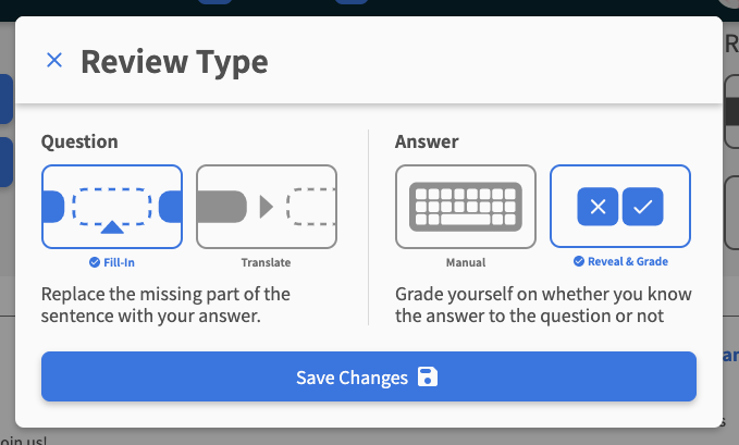
New Review Type added – "Fill-in + Reveal & Grade" (Cloze + Flashcard)
- You can change the Answer type to Reveal & Grade for Fill-in style questions
- All the hotkeys and interactions you’re used to with the Translate + Reveal & Grade style are still there
- To change to the new Review style, edit it in your Deck’s settings, or in Review Type section of each Grammar Point / Vocab page.
Accepted Inputs
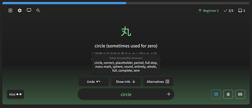
Redid the way that accepted-inputs (alternate-answers) work for Translate + Manual Input questions
-
Now the accepted inputs are all separate from the official translation
-
This stops the following use case:
-
And instead, when opened, displays it like so:
-
Hover over the Alternatives button, or hold down the
Akey to activate!
I don’t Know ¯\(ツ)/¯
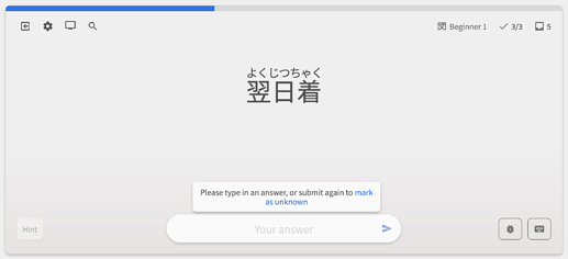
Introduced “I don’t know” (IDK) feature to the Quiz
-
Now if you submit (type
Enter/click the right-arrow) once, it will warn you that there is no input, and that if you submit again, you’ll mark the question as unknown -
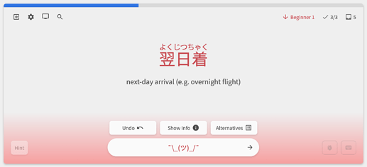
Submit a second time, and you’ll have submitted “IDK” as the answer
-
Submitting a question as IDK is the same as marking it incorrect
-
Until now, the classic move to mark a question you didn’t know as incorrect has been to just type ‘あ’ or any other nonsense hiragana
-
Now you can officially say IDK ¯_(ツ)_/¯
-
We initially considered a button for this, but with such limited space on the Quiz screen, we went with this ‘double-tap’ system
-
This is another feature that’s not on the Legacy system, so we’re looking forward to your feedback on how this feels
Changes
- For the Reveal & Grade (Flashcard) input type:
- The ‘Answer’
Ahotkey now doesn’t reveal the answer, instead,Enterdoes!
- The ‘Answer’
Fixes
- Fixed another edge case where wrong input-type is quizzed in the Learn Quiz
- Fixed Firefox gradient banding dithering in Quiz
- Minor style adjustments
Up Next
- Add “Add to Reviews” / Review updating functionality to the Furigana tooltip
Thanks as always, and keep that feedback coming guys!
I tested this but it still isn’t working for me, let me know if there’s anything in particular I need to do!
So sorry this is still happening 
Will DM you!
I tried to turn on the 2.0 reviews again to see how they were now since I haven’t tried them out in a couple months. I immediately ran into an issue. I know the website’s not exactly designed for mobile, but I’m currently on my phone (on Android) where I often do quick morning reviews… I thought at first that the reviews had completely failed to load because all I was seeing was an input box, but then I poked around a bit and saw the issue. The blank space between the question and the input box is big enough that when the keyboard comes onto the screen, it pushes the question off the top and I have to close the keyboard to see what’s being asked of me. It’s not broken exactly, everything that needs to be there is there, but it’s initially confusing and subsequently awkward to have to close the keyboard on every question to see what’s asked before opening it again to answer.
Please separate the furigana settings for the two review decks. I want vocab to be furigana on hover and grammar to be always on, but there’s currently no way to do that, so I have to switch it back and forth.
it was suggested in this thread that people use Nuance first then translation. So I finally decided to give that a try. The problem is that without the translation, I’m not exactly sure sometimes what the answer being asked for is. For example
Without the English translation, how am I supposed to tell that it’s “like that” and not “like this?”
Has anyone else found that, over time, their percentage correct is absolutely plummeting?
I used to get pretty good percentages, but they are just going down and down, like I’m doing the opposite of learning … ? 


