Reviews 2.0, and a whole lot more! [Beta]

Day 6 features & bug fixes:

Added Features

  • Added Finish Session/End Session hotkey
    • Use the “0” (Zero) key to switch to wrap-up mode if you have unfinished items, or end the session instantly if you have nothing to wrap up
  • Save user’s preferred audio voice (male/female)
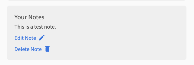
  • Redid how Notes looks when a note exists
    • Before
      • notes-before
    • After
      • notes-after

Bug fixes:

  • Fix styling and input issues on tablet
    • Finally got around to fixing the issues around input on tablet
    • @Marcus.W
  • Improve end-of-quiz experience
    • Properly clear question content at end of Quiz
    • Switch to loading spinner while loading the Summary page
  • Submitting a correct answer displays the main correct answer first
    • When you submit a correct answer, it now shows the first/main correct answer
    • This is to match the question audio
    • @TobyOne & others
  • Always display form field description, even if there is an error
    • Previously the description for the input field would dissappear if there was an error
    • The description will now stay there permanently
  • Increase duration of gradient animation during Reviews
  • Fix furigana by removing depcrecated tag
    • Removed tag from furigana rubies
    • Should behave much better with Yomichan now!
    • @Mapletree @Terrylee
  • Properly order Example Sentences (Vocab/Grammar)
    • Orders GrammarPoints by internally decided order
    • Orders Vocab by JLPT level
    • ナイキャ @melisma!
  • Re-introduced fade-in-out animation between questions
    • Let me know if you notice any bugs related to this again
  • Other minor bug fixes and UX improvements

Next on the list

  • Fix bug that is causing Grammar Info to not show / Audio to be delayed
    • This is the big one at large.
    • If anyone has any information that could lead to the solving of this bug, please send me a DM with what happened before the bug occured (no reward)
  • Reviews gradient banding (visual bug) on Firefox
  • Increase resolution of profile image in Summary page
  • Add SRS progress badges to the bottom of the Grammar Point page
5 Likes

Yes please! Looking forward to that one! They really used to help me see at a glance where I was. Thank you!

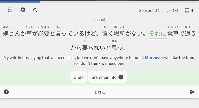
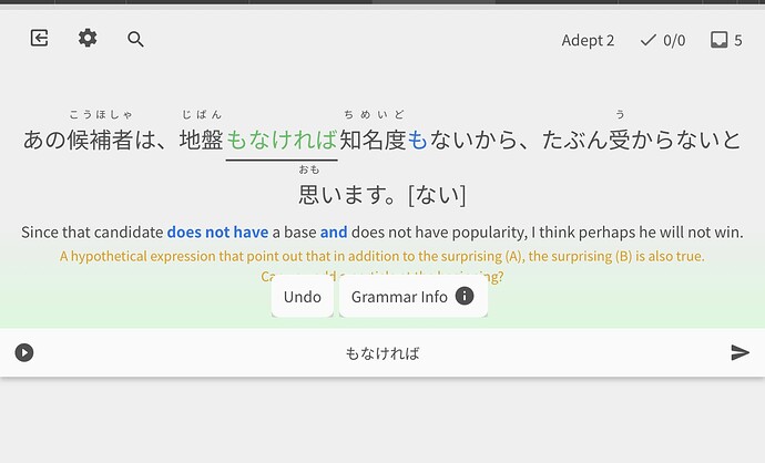
I think I could get used to the smaller/squashed format, but just would like to point out a bug where hints seem to be hidden behind “Undo” and “Jump to Info” buttons:

Aaaargh!!! Now it’s gone and changed again!

Just as I’d got used to the new style, just as I was forgetting the old one, it’s changed!

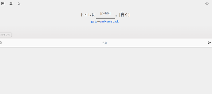
And it’s tiny! I can’t read writing that small!

It’s even worse when I come across a self-study sentence. I simply can’t read a thing!

Tears of frustration here! Please bring back the old new style!

Looks like we’ll need to adjust the font size a bit, it’ll be changed in the morning no worries :sweat_smile:

We could always go smaller though…

2 Likes

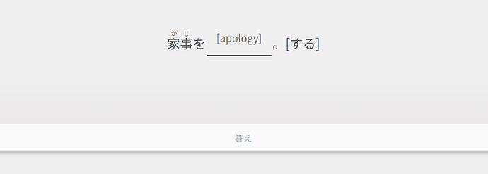
Not only is the text too small to read, only half the screen is being used!

Phew, thank goodness for that! I was thinking this was the end of Bunpro for me! I simply can’t see the writing!

1 Like

@veritas_nz Now the scrolling issue when using an iPad in portrait mode is gone. Thanks a lot, now I can use the new review tool.

1 Like

I noticed three small issues:

  • The buttons are shown on top of the hint texts after answering.
  • The bottom corners of the buttons have some strange effect.
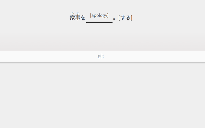
  • The font size when entering the answer is a bit too small.


1 Like

Love the new more compact layout but there’s no more button for keyboard shortcuts reminders and when you answer a question, you can’t adjust the hint system either with an interface button nor with the keyboard shortcut to cycle through it in case I want to confirm the translation and such.

1 Like

@Marcus.W @bunnypro @Kioshen

Just thought I’d shed some light on what the changes were for mobile, and the new screen sizing.

Basically, I set the whole Reviews screen to not take up the whole page if:

  • You are using a touch screen device OR
  • The useable screen space (accounting for the browser URL bar etc.) is below a certain width or height.

This fixed height is there to give room for virtual keyboards on mobile devices, and what happens when these open (they auto scroll so that the input is at the top of the page – unfortunately not a lot I can do about this)

The font-size changes are only based on screen size. Sounds like they need some readjustments too. The reason they feel small is likely because we have to factor in some really long sentences. Some sentences (usually ones with multiple parties involved in a convo – Aさん Bさん ones) get reaaaaaally long.

Again, all this will require adjustment. Nothing should have changed for desktop users on large screens.

That being said – are ya’ll (tagged in this post) able to tell me what devices you are using? I’ll try make sure the font sizes and everything scales cleanly.

@Marcus.W @bunnypro
The buttons covering up the hints should not be like this – I’ll get this fixed ASAP

Sorry for the inconveniences ya’ll! It’s been a learning curve trying to get sizing and stuff working for different devices, especially when it’s based on width, height and touch-enabled-devices.

3 Likes

@veritas_nz I’m using an iPad Air 4th generation.

1 Like

Hey! What device are you using? My gut says iPad but I wanted to confirm.

1 Like

Surface Pro 6 with keyboard attached. 2736 x 1824 at 200% scale. Font size in styling is set at 20px.

1 Like

Is it just me or did the text become much smaller on PC? (笑)It is a bit small now. I can read it just fine but it looks a little strange to me. On some old fujitsu laptop at work, screen size is 15inches or something, not sure. Maybe I am imagining things. I can test it on my laptop at home when I finish work.

1 Like

Surface Pro 6 with keyboard attached. 2736 x 1824 at 200% scale. Font size in styling is set at 20px.

Damn you are like the final boss for me :rofl:

Ahhh so it’s picking your device up as touch, and giving you the mobile layout, which hides the hint after you answer.
Weird that Spacebar on a physical keyboard isn’t working to cycle hints though… Will look into it!

3 Likes

Nah you’re probably correct.
It’s shrinking the text a bit too small.
Going to roll out an update later today once I’ve fidgeted how the font-sizes are tied with screen sizes

1 Like

Looks good on my end, thank you!

1 Like

Chrome, on an Asus Chromebook.

This morning, the writing is a little larger, but it is still uncomfortably small and difficult to read. I can’t do reviews if the writing is this small. And it seems so unnecessary seeing as most of the screen isn’t even being used.

I’m ditching beta and going back to the old reviews for now (which were always just fine) because I can’t study otherwise.