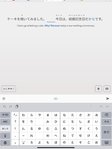
Great work, not sure if someone mentioned it (might even be preexisting issue), but when I go to the beginning of something I typed, when it converts to the hiragana it jumps back to the end of the word and I usually type more than one character to add so I get it wrong.
Day 5 bug fixes are here! Thanks to all the feedback and suggestions
The fixes:
-
Add “wide-screen mode” to Reviews
- Lots of users had feedback about the content spreading out too far on larger screens during the Quiz
- We have added an option to restrict the width of content during quiz
- The button is only available past a certain width, and can be toggled on/off
- Gonna poke all the users that commented about preferring the compact style of the Legacy review page:
- Remove “Show More” button from Example Sentences
- Fixed bug where incorrect answers wouldn’t show up in Summary if they weren’t wrapped up
- Fixed bug where last question sometimes isn’t included in the summary
Other notes & stuff:
-
Add wrapup icon and quesiton count to the Reviews header
- Now you can tell when you’re wrapping up, and how many questions are remaining.
- Temporarily removed Question transition animation
Next on the list:
- Yomi-chan investigation & bug fixes
- Notes re-style
- Store the preferred voice in the audio-player so it remembers the user’s choice across site visits
- Better tablet support
- Reviews gradient banding (visual bug) on Firefox
- Altering existing input is buggy @andrewkfiedler
- Hide last question if Quiz is ending (about to go to Summary page)
- Increase resolution of profile image in Summary page
- Add SRS progress badges to the bottom of the Grammar Point page
It is really difficult to read the info in the two column format, and all of the example sentences and form examples have line breaks, often in unfortunate places.
My suggestions: instead of splitting the first row half and half, I would split it into two thirds/ one third. I have never seen the full with of the details box be used. But you’ve seen more of the pages than I.
Then I would make the info box full width, with my notes, also full width, beneath it.
I use an iPad in portrait mode for the app, but even in landscape mode the line breaks caused by the layout are unfortunate and and manifold,
My 2¥
— Dave
@Sean For me using an iPad in portrait mode, the scrolling issue still remains. When the keyboard is shown, then the top part of the screen is no longer visible.
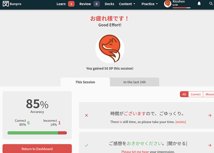
The more I see the summary page of reviews 2.0, the more I feel there’s wasted space up top now. I appreciate the encouragement, seeing my pfp and how many xp I’ve gotten but it takes nearly half the page before I get to the real useful information of how it went. Now, it doesn’t even show the future cram button so unless you scroll down you won’t even be able to see it. Maybe because I’ve set the font size to 20px ?
I didn’t know about the new wide-screen mode button but I’m definitely interested in this since I use a wide screen display and a lot of buttons have been pushed to the edge. Will keep a look out on my next reviews.
Edit: Forgot to add that I’ve also encountered the jumpy text input bug where when I try to edit my answer because of a hint, especially with ん / の, and it keeps going to the end of the text box. I usually have to completely rewrite from scratch my answer to get around it.
Was this bug reported already?
Steps:
- Open a browser window in maximum width (I’m using Firefox)
- On the dashboard, click to learn a new grammar point (Reviews 2.0 Beta page)
- Click on the “Examples” tab
- Make your window width a lot smaller (like 25%(?) screen size)
Expected Results: You’d still be on the “Examples” tab
Actual Results: You were automatically sent back to the “Details” tab
Other Info:
- Confirmed this is not an issue in reviews 1.0
- Happens the opposite way too, if you make your width bigger after being smaller
- Also occurs with the “Resources” tab
- Occurs in both Firefox and Safari (I did not check Chrome)
Yeah, it could do with some rearranging of the frames. The profile picture part could be off to the side a bit, above the percentage, and the rest of the left hand panels could move up.
Tomorrow should be the big day 
Just finishing some last minute checks on the translations and the code.
@Sean
Alright since you were nice enough to ping me I did give the new format another shot.
And it could just be repeated exposures but it isn’t hard to use. I do still prefer the original version but the new version is very usable. Besides one thing.
When you finish a review it gives you a few button prompts right below where you said your answer.
Why does it only give you half of the buttons? But do not worry I have come up with what I think would be a good solution. I call it, put all the buttons up there everytime. I cranked this out in a professional editing software for you (free of charge for you my friend)
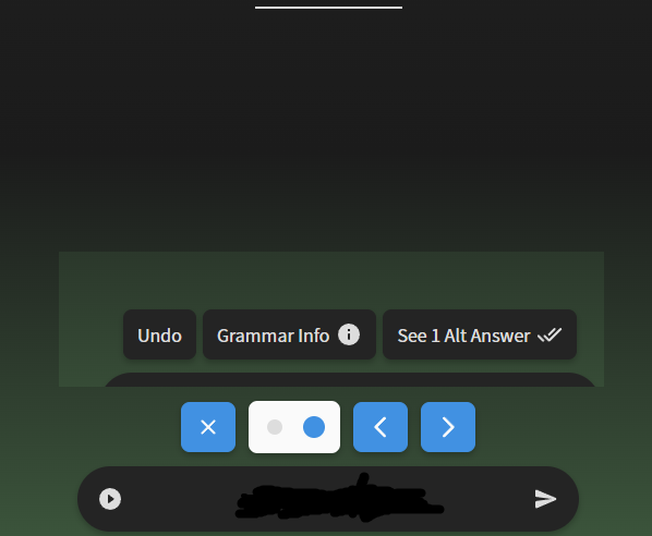
Because why wouldnt you just have all the options, there is clearly the room.
And originally I had thought instead of a written undo button you could just add an icon next to the left hand audio player button such as this.
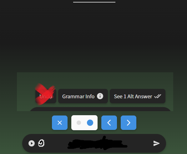
But then I really start looking at it and if you ask me, the bottom hand text box is kind of pointless for grammar reviews. Why did you bring this back in the new beta instead of just remove that and rely off the letters written in the example sentences?
I’m already looking at the example sentence. What is written goes in there anyways. I never really thought about it before because the original format is a lot more compressed.
But now that the compression is so far away it just kind of begs to me, why even have this answer box.
So that’s what I think. Either jack the answer box way up or just integrate it into the answer. And give me all the buttons all the time, don’t hide them!
Or I suppose you could make a button like that new one that tucks the left and right hand sides in more, but for the top and bottom.
Anyways that’s my two cents. The gradient colours that show up when you send in an answer. Love it.
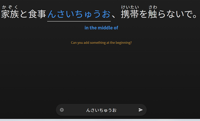
Uh in other words, the の turning to ん and tossing you to the end of what you wrote “feature” is still there.
As you can see, I didn’t write の in front for 最中に (I also forgot に) but the only way to get の is to either A) Copy paste の (never going to do that) or B) redo the entire sentence.
So I think the fix for that needs to be re checked.
But hey, don’t get me wrong. I really do like what you’re doing. I also do think it’s on the right track too, but it’s really hard to compete with a tried and true version.
I’m the same, I prefer the look and feel of the old version. What I dislike about the new is the way it takes up the whole screen, plus I dislike changing things just for the sake of changing them…
But I also had a few messages back and forth, regarding the self-study sentences side of things, and as far as I understand this new system isn’t just for the look alone, it also makes structural changes that will improve the speed and efficiency etc of the whole site, and so really does need to be done.
Someone correct me if I’ve got that wrong!
And, well, I know I’ll get used to the new look soon enough too!
I’m not sure if it’s only ghost generation on review 2.0 or on every item but it doesn’t seem to schedule down to the hour anymore. I’ve had items recently that say were up at noon but had to wait up to 12:30-12:45+ until it was finally available to review. I really like the way Wanikani levels down to fixed hours since it’s easier to plan around than not knowing when during the hour span every review will be available.
Edit :
Here’s an example for today at 4pm. I’m supposed to have a review at this time but it still doesn’t appear at 4:37pm.
Edit 2 :
Took until 4:47pm to appear as available. It was a ghost review.
Two more bugs:
Sometimes the grammar info wont open (when both pressing the button and the shortcut “f”). I noticed it especially happened after I had a typo, pressed “backspace” and typed the correct answer.
Sometimes the audio reads for the grammar point one before, instead of what is shown on screen. It has happened about once every reviews session I have had.
Great work with the new system!!
I had something similar as a bug(?) even before the new review system but I moved countries and when I changed timezones the bug(?) seemed to go away. No idea if it is the same thing causing your issue or not but thought I would mention it in case the devs are tryna work out what is happening.
Mine was with all reviews though, not just ghosts (I think - I don’t remember too well).


@EdBunpro - not sure what the status of this is, but I wanted to let you know that I’ve noticed something: The recognition error is tied to the furigana. Specifically, let’s say a word is made up of four kanji, for example: 弱肉強食. Let’s further say that on mouse hover, Bunpro shows the furigana for the first two kanji (弱肉) separately from the last two kanji (強食). In that case, Yomichan will also recognize those things as “separate”, even though it really is one word. The Bunpro furigana seem to introduce an arbitrary break between the words. The same happens between kanji and hiragana/katakana.
This becomes especially noticeable with words having hiragana attached. For example: 食べられる, 食 and べられる will be recognized separately, because 食 has furigana.
Hope this helps!
Edit: Just came across an actual example in my reviews: 吐き気 - the furigana for 吐 and 気 are separate, so Yomichan recognizes 吐, き and 気 as separate, even though the recognition usually works - if I paste this word elsewhere, it will correctly recognize 吐き気 as one word.
It’s there! 
Thank you! 
I am quite enjoying using it.
Will you be implementing a flashcard version of this?
See the sentence and the hint, click to see answer, self-assess pass/fail.

Do you mean a version where you see the full sentence filled in with the answer and just need to mark it as hard/good anki style?
We were actually discussing making this an option for grammar reviews as well recently 
I mean you wouldn’t see the answer filled in till you click. So the prompt looks the same as now, but rather than type, you just click/tap to reveal the answer. Exactly like default Anki.
Good idea for grammar reviews too.
Sorry if these have been addressed already. I’m generally really enjoying the review 2.0 tool, but having a couple of issues (on mobile internet rather than app):
a) after a correct answer, the grammar point pops up in the way of the sentence, which I’m trying to follow along with the audio - is there any way for this to return to the bottom of the screen rather than as a pop-out window?
b) I prefer to try and guess the English translation first and then check once I’ve inputted the answer, however there is now no way to show this after the answer is submitted (until the very end of the session where all the sentences are shown)
Thanks for all your hard work on this update though and looking forward to seeing further improvements in time! 

