Reviews 2.0, and a whole lot more! [Beta]

My favourite part of Bunpro is the ability to add self-study sentences. But it seems that with the update I can’t do this anymore! No matter how much I try, it just won’t accept the text I put in the first box.

I’ve tried using both English and Japanese for the 4 underscores and the question mark, but nothing works.

In the image above I even tried leaving out the underscores and leaving in the answer, but still nothing. Do I have to go back to the old format?

Yes, the old system works perfectly:

Screenshot 2023-01-08 7.24.23 PM

And I think the old system looks better too to be honest. I like things more compact on the screen rather than so stretched out!

Hoperfully they add a setting that let people make bunpro work like eachone prefers, but you need to remember there are multiple opinions on this, and bunpro uses the most popular one, witch is typing answers

Isnt this the whole point of having a SRS? If you got it wrong, you dont know it and the timer resets to a lower time interval

Press A to see the correct answer, press F to see grammar explanations

I think they are exactly in the standard, most japanese SRS systems work like bunpro

Again, most japanese SRS apps work like bunpro when reviewing, its just anki and a few others witch dont let you type the answers

2 Likes

Not exactly about reviews, but I think lessons could be improved when you go to the test after finishing learnign a lesson. Instead of just having to do just one review to complete a lesson, I think it would be better to have multiple reviews to do or even other type of exercise made for helping you learn the grammar item for the first time instead of helping you remembering them like normal reviews do.

Currently, since I dont get the first time enought exercises, I end up getting multiple ghost for the same grammar item, and until I dont do them multiple times, I dont start getting them right

1 Like

Eventually I think the option to include community sentences would be a good idea.

1 Like

I do wish the new format was a bit more compact, it’s rather spread out on my monitor.
And for the finish session, why is it two clicks? You have to find it by clicking the left pointing arrow in a box. That asks you if you want to finish the session or wrap up. Why wouldnt you just make two different buttons from the start? Because I only ever click on something when I want to wrap up. If I wanted to leave I’d just close the web page.

That being said, the new end page that shows up when you are done reviewing. Very much a fan

1 Like

Please don’t hate me; I’ve gone back to the old system and much prefer it. Will we have the option of keeping the old system in the future, or will everything eventually move over to the new one?

1 Like

Okay another thing, if you input your answer and then decide that you want to add "の” to the front of it
what happens is it adds ん infront of whatever you have and then throws ur text to the end of whatever you had. Effectively making it so you can’t add の you instead have to delete everything you’ve written

Thank you for your hard work. The new review system looks very promising.

I’m testing it out and and when I click the shortcut «F» to show the grammar info, it displays the grammar info as expected. However, when I try to go «Back to the top», I cannot find a keyboard shortcut. Has the shortcut «Back to the top» been implemented?

ps I tried also the default buttons «Home» and «Page up» and and it doesn’t go back to the top because the cursor stays in the fill-in field of the review. Actually it’s quite frustrating to use the mouse to go back at the top every time you check the grammar info!

Thanks all for your feedback! Some more Day 2 bug fixes are here.

The fixes:


Fixed XP not displaying correctly in Summary

It would take a while for the changed XP to display correctly in the Summary page header.
Thanks those who noticed it and pointed it out!

@Marcus @Megumin @Kioshen


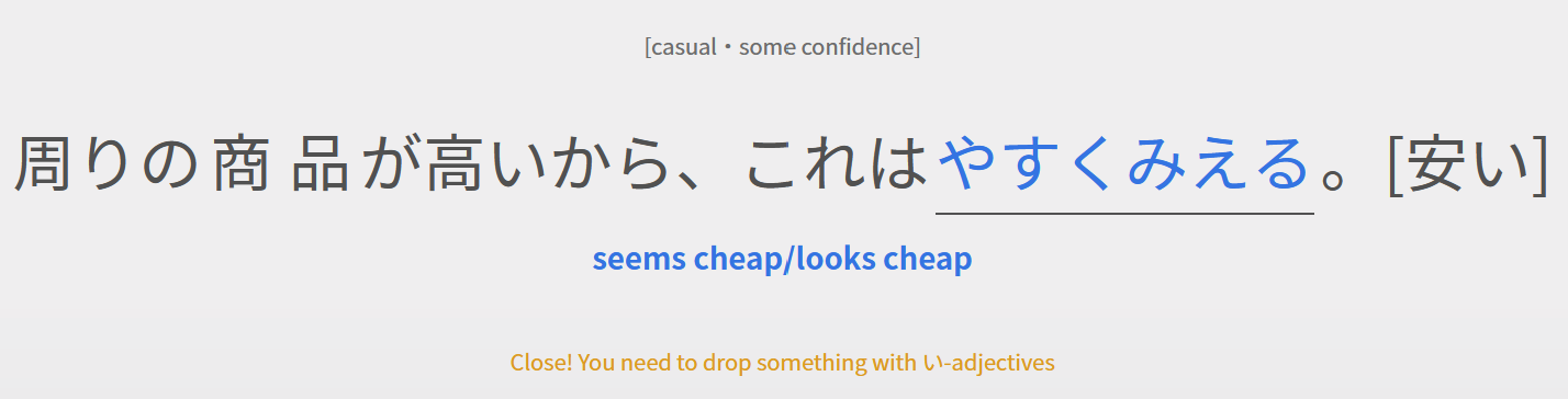
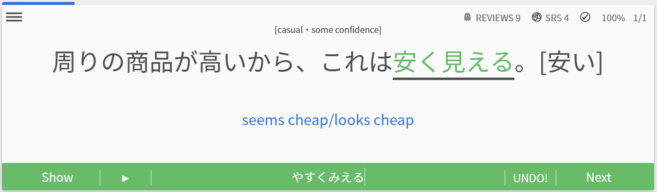
Some answers not being answerable / endless suggestion loop

For those getting into endless loops with hints – this should be fixed now – let me know ASAP if it is not, and let me know which question you found the issue on and want you attempted to answer with.

@eclipse77x


Pressing the [ I ] hotkey now scrolls the page up

After scrolling the page down to interact with Grammar Points, pressing the “I” hotkey will now focus the input and scroll to the top. I was a bit late to the party with what should have been an obvious addition.

For those curious, we purposely shifted the ‘Enter’ key so that it only submitted the inputted text when the text-box was selected/focused.
This was an accessibility decision, and allows keyboard/screen-reader users to tab between buttons on the page and interact with them using the [ Enter ] key.
This new functionality might take some getting used to.
This also explains why we added the new [ I ] hotkey to re-focus the input.

@TobyOne @qazrt


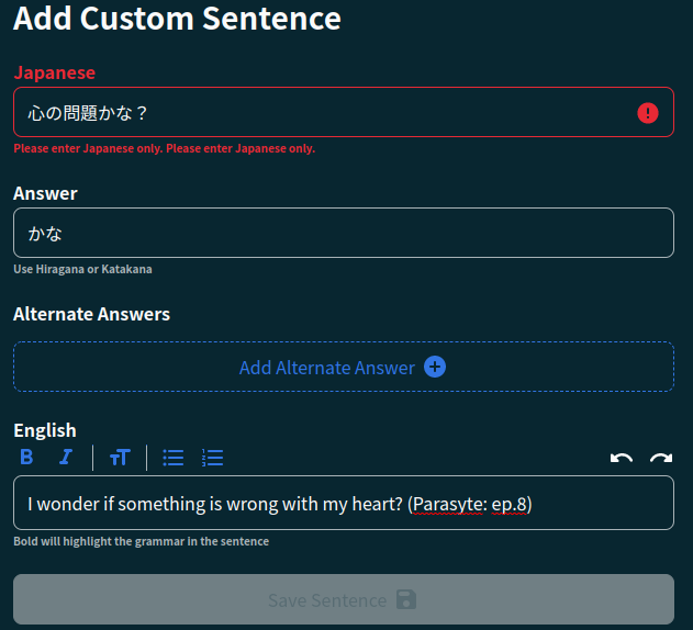
Custom Study Question fixes

  • “Show Grammar Info” functionality now added for Custom Study Questions
    • This should’ve been in there from the start.
  • Bug entering Custom Study Questions
    • This should now be fixed! Let me know if you have any more issues

Cheers custom-question power-user @Marcus for the heads up


Other misc fixes:

  • Fixed a typo in the Structure Legend – cheers @max99x for finding this!
  • Added the strike-through text effect to writeups/structure details – cheers @Travioli for finding this!

Next fixes:

  • Increase profile image size in Summary
  • Work out what to do for wiiiiiiide screen users so that the Quiz screen is a bit more compact – discussing this internally so watch this space!
  • Automatic conversion of ‘n’ to ‘ん’ add sentence end – thanks for catching this @Superpnut!

Apart from bug fixes, I’ve also implemented some fade-animations to Quiz to make the experience a bit smoother/nicer.

As an aside – if we have any users that preferred reduced motion on the web, please send me a DM to let me know how we’re doing with that part of accessibility on the site!

As always thanks for the feedback

5 Likes

Hi there! Thanks for the feedback.

Yeah I’m aware of this ugly display of furigana and how it stretches text.
Currently, we have left the ruby element and children to largely what the browser has by default (each browser handles and displays rubies quite differently).

In the future I want to move away from using rubies entirely (they’re a big PITA for cross-browser compatibility).

If you have any ruby-element-alternatives I’d love to hear 'em! Can’t find many resources out there on how to implement an alternative

Thank you fixing the xp display and adding a shortcut for getting back to the input box when checking out the grammar page.

Another bug I’ve stumbled upon is this question

This question works in the old review but not in the new one if I input the exact same answer.

I will do some research.

1 Like

Let’s have a look!

Fixed!

Fixed!

Fixed!

Fixed!


I’ve been checking it out this morning, going back and forth between the new and old systems, doing reviews and adding a couple of sentences, and everything I was moaning about seems to have been fixed! What a great team you have here at Bunpro! Amazing!

The only thing now is, I suppose, is if someone prefers the old compact style, or the new huge text style, and that will come down to taste I guess. Will both be available or will we all have to go over to the new style eventually? I think I prefer the compactness of the old style, but that’s just me and I’m sure I’d soon get used to the new!

Anyway, thank you so much again! Great work!

3 Likes

Haha you don’t have to research if you don’t want to!
I’m the one that gets paid to do this after all :sunglasses:
But yeah info on rubies is few and far between – in English and Japanese. I’ve only seen one implementation in my travels, that uses flex-direction: column and spans.

1 Like

Not actually fixed! But on the immediate horizon :sweat_smile:

2 Likes

Hypothetically something like this will work, but I can’t figure it out:

<style>
  .furigana:before {
    content: "ほん";
    font-size: smaller;
    vertical-align: top;
    margin-right: 0.1em;
  }
</style>

<span class="furigana">本</span>
1 Like

Yeah something like this would probably work!
That or some spicy solution with absolute positioning.
Until then we’re going to shrink the size of the furigana to help with the kerning issue.

And yeah the pain-in-the-ass is mine to be had :sunglasses: :peach:
I’ll see what I can come up with!

What ever works for me, just want to help!

2 Likes

I couldn’t see the keyboard shortcuts. Then I realized I was using a vertical screen. When I switched to the landscape screen the pop up showed correctly. It seem weird it behaves like that, but love the new design.

1 Like

It works great now, thank you @veritas_nz for the quick fix

1 Like