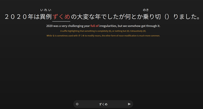
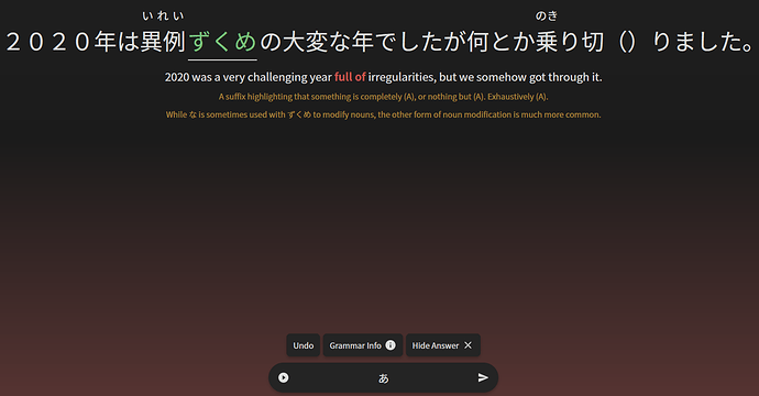
Noticed that, along with experience not being displayed during reviews, nothing pops up immediately when levelling up during reviews.
It would be great if these things could be included in Reviews 2.0!
Rubies are what I understand to be the “correct” html. I’m curious to hear about the cross-browser compat problems. Every furigana thing I’ve hacked around with always has some trade off somewhere. There’s so many situations where it all falls apart.
The “best” middle ground to me is use rubies, but enhance with JS somehow. If you’re doing a pop-over version, that’s an easy implementation. But if you want all furigana to be visible always, The “best typographical solution” is some kind of content aware magic and that’s the PITA. And I don’t think any Japanese sites themselves even bother with this to the extent that Japanese learning sites want to implement. As in, Japanese learning sites often want to have some capability to have every word with furigana, where real™️ Japanese sites tend to not do every word (unless it’s a website trying to teach people Japanese). And checking the first website I could think of that definitely has a bunch of furigana, NHK Easy, even they have terrible spacing on there (maybe not a good example, I’m wondering if anyone knows of a good example of good furigana web implementations).
However, looking through some Japanese text books (where you should have the typesetting power of Adobe products), it seems it can be a little varied on how much attention they put here. Some of the “lazier” books have some amount of spacing if there’s more than 2 characters (they seem to shoot for 2 kana per kanji for readability). However, some books do care about this spacing and attempt to do something. They seem to be horizontally squishing it? My first thought they were doing half width, but it was hiragana; which quick google search says there’s not a hiragana half width (maybe not widely used, if there is)? Which brings me to… have you tried playing with css transforming it horizontally (as in transform: scale(x, y))? I haven’t played with this in my random projects yet (usually just do the show furigana on hover). Likely need some limit on how much you actually allow it to squish for when you get in the really long reading cases. But you might be able to get a little bit further doing that before needing to shrink the furigana font size itself.
(TLDR: have you tried transform: scaling horizontally? sorry for the long post. This is an interesting problem that I don’t think a lot of Japanese sites themselves put a lot of effort into.)
I’m really, really sorry, but:
New system:
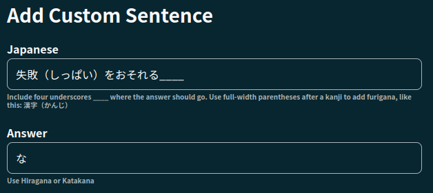
- still not accepting self-study sentences
- dark backround only, not great for my eyes
- squeezed to side of screen rather than a pop-up in the middle
Old system:
- works like a dream
I’m still not sure what the benefit of the new system is. Is it just the design? Because I prefer the old one. Will we all eventually have to change over, or can we stick with the old one?

Sorry to be a pain, because I know you guys work so hard to make a great site. When you introduced the new cram, that was amazing and I could see the benefit right away. This time I’m struggling.
Looks like the same thing happened to me, i made one mistake, but the summary showed 100% and not a single grammar point was marked wrong.
However when i refreshed the summary page, it showed correct percentage and the grammar point i missed, so maybe its some timing issue, but it does process correctly whats wrong and correct? If its just visual bug on summary page then thats all right considering its beta.
@Sean Would you please add an option to turn off the fade out/in transition when progressing from one review to another. When it takes a very short time to do reviews, or doing a lot of them, the transition sums up to a considerable amount of time.
Unfortunately, sometimes nothing shows up on screen during reviews.
I’ve found that pressing a letter on the keyboard will prompt everything to magically appear though 
Perhaps it is to do with the fade in/out?
@Sean Thank you very much for this update! I tried it out and it truly does look gorgeous!
I have two pieces of feedback I would like to give to you (didn’t read through the whole thread, so maybe this was mentioned already, but here goes…):
-
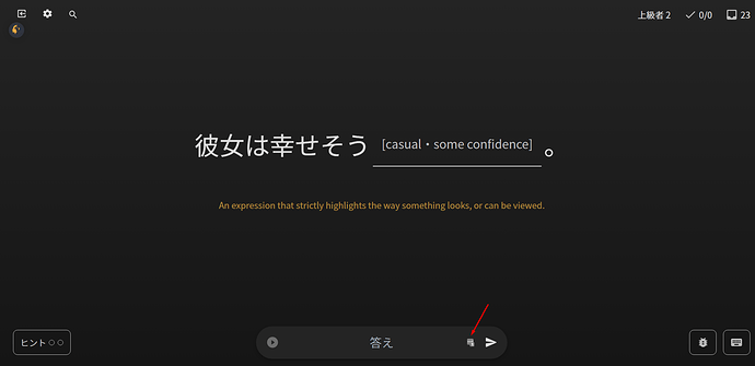
On mobile, the reviews 2.0 seems to have multiple issues. For example, I cannot make use the hints functionality - something is drawn over them and intercepts the click, from what I can tell. After entering an answer, the “hint” button disappears entirely, meaning you cannot get the translation for the sentence.
-
I am an obsessive YomiChan user and before the update, it worked on BunPro just fine. Now, it still works, but something about the new interface messes with the mouse-over functionality. Maybe there’s almost invisible spaces in-between the characters, but certain words do not get recognized correctly anymore. For example, in the sentence “育児というのは、親の思うようにはいかないものです。” (N2 Lesson 7: 1/21), the word 思う does not get recognized - instead, only 思 gets captured.
If possible, it would be nice if Bunpro remained “yomichan-friendly”, as it makes reading the example sentences a lot easier.
Thanks and best of luck with any future improvements!
Yeah space is pretty limited on smaller screen widths, so we made adjustments to factor this in.
The link for the Keyboard Legend on thinner screens is now in the settings menu – the cog in the top left hand side – we can always re-evaluate this if it’s a bit unintuitive.
I’ve been using the new beta and it looks quite nice! I wanted to bring some attention to LastPass thinking the entry field here is a password field. It’s not an “issue” as not a lot of users are using LastPass like this, but since this wasn’t the same behavior as Reviews 1.0, I thought I should bring it to attention!
Yo! Thanks for the detailed reply and for your thoughts.
Yeah rubies are definitely what should be utilised to display furigana, so I’m hesitant to stray away from it. From what I’ve seen, relatively, we’ve got a pretty complex furigana system. And as you said, hard to find other sites where furigana is used in such a way! Even Wanikani strays away from furigana entirely.
The current iteration we have for Reviews 2.0 is fine at the moment, but there are certain bugs that I think are just inherent with rubies (for example, if you hover over items in longer writeups, text occasionally shifts the content around).
This wouldn’t be an issue if the rubies were absolutely positioned, and/or were in super agnostic elements like spans and stuff. The default ruby is just the wild west in terms of browser implementation.
Transform scaling is an option! We’re about to push a fix that uses negative letter spacing, so if that doesn’t fix our issues, I’ll have a play around with your suggestion 
But yeah, if you see anything else that might be a good reference, flick me a DM! Cheers 
Thanks for the feedback! We’re currently brainstorming some ideas for extra user feedback such as this 
I have a major issue that is new as of today. Is it preferred to have Reviews 2.0 bug reports in the Reviews 2.0 thread or the bugs thread?
Details: Feedback - Bug Reports - #2892 by Eradin
I’m still not sure what the benefit of the new system is. Is it just the design? Because I prefer the old one. Will we all eventually have to change over, or can we stick with the old one?
…
Sorry to be a pain, because I know you guys work so hard to make a great site. When you introduced the new cram, that was amazing and I could see the benefit right away. This time I’m struggling.
You’re not being a pain at all! All your feedback is super helpful! It saves us lots time.
It’s mentioned briefly in the OP, but this update’s purpose is more internal in nature than feature based (Reviews is the only thing to really have changed), which might make it seem more or less pointless at first glance.
We were able to start fresh on the site’s internal code and design. The performance gains can’t be understated, and the more pages get replaced, the faster the site will feel. It also means in the future we’ll be able to push out updates faster and safer.
Bar the new Reviews design, we tried to change as little as possible with the new site (people hate change). But that being said, now is the perfect time to speak up with your feedback! We see every single thought, comment and idea that gets posted here and most of them get discussed internally one way or another.
Anyway, thanks for taking the time to post your feedback!
Hi there! I’m assuming you are using mobile?
I’m going to push an update out later today that fixes this bug! Will tag you in it when it’s done.
Also yes please post any bugs you find in this thread and not the other! Cheers 
Thanks all for your feedback! Some more Day 3 bug fixes are here.
The fixes:
Fixed more buggy sentences that were causing an infinite-hint loop
- This should be all of them. If anyone notices any more just let me know
Greatly decreased fade-in-out transition time between review sentences
Fixed the form Japanese filter to properly accept Japanese text
- There was another issue with validation and questions that had Furigana!
- This is now fixed
Fixed issue where Hints Button wasn’t clickable on mobile
- This bug was introduced after Reviews 2.0 Beta launch – sorry for the inconvenience

Made amendments to furigana sizing to stop weird Kanji spacing issues
- Reduced letter spacing and font-size of furigana rubies
Thanks again ya’ll for all the feedback!
Thank you! Of course, if the changes are for the good of the site, I’m all for them!
Thank you so much! It does indeed look fixed now! Just a request though, can we have this with a light background instead of a dark? Thank you!

Hey, not sure if it’s been mentioned here or not yet, but with this new review update (which I’ve just tried out and love btw, fantastic job!!) will it be possible to add an option to have the male voice be the default for autoplay?
Asking here because I’m not sure if it would be easier to implement it with the new background work that’s been done
Thanks 
edit: don’t worry, I’m just not very observant.
Thanks for adding that as an option within the review. I’ll take my leave now 
I have a few things, sorry if they were already mentioned, the thread is getting quite long!
#1 ~
^ I lied, it should be on the right because my mouse is already on that side when I hit next
#2 ~
Related to my mouse position… the play button for sentences when learning new grammar is reallly farrr awayyyy from other buttons on the page
#3 ~
I feel the answer input box is just too close to the bottom of the window, I’m using mac and I keep hovering over my dock bar on the bottom (which blows up the icons and then covers the answer input box). I know this is super minor and I could change some Mac setting to fix this but…yea thought I’d mention it
#4~
Every single grammar point I learn I want to see all the sentences so I’m not really feelin the “See More” button 
tl;dr i’m lazy and don’t want to move my mouse or click much
Oh, it works. Thanks a lot.


