Reviews 2.0, and a whole lot more! [Beta]

Thanks for the reply! I’m using Samsung Galaxy A50, the Bunpro app and the keyboard was English. Since I turned off Reviews 2.0 I haven’t had the same issue anymore.

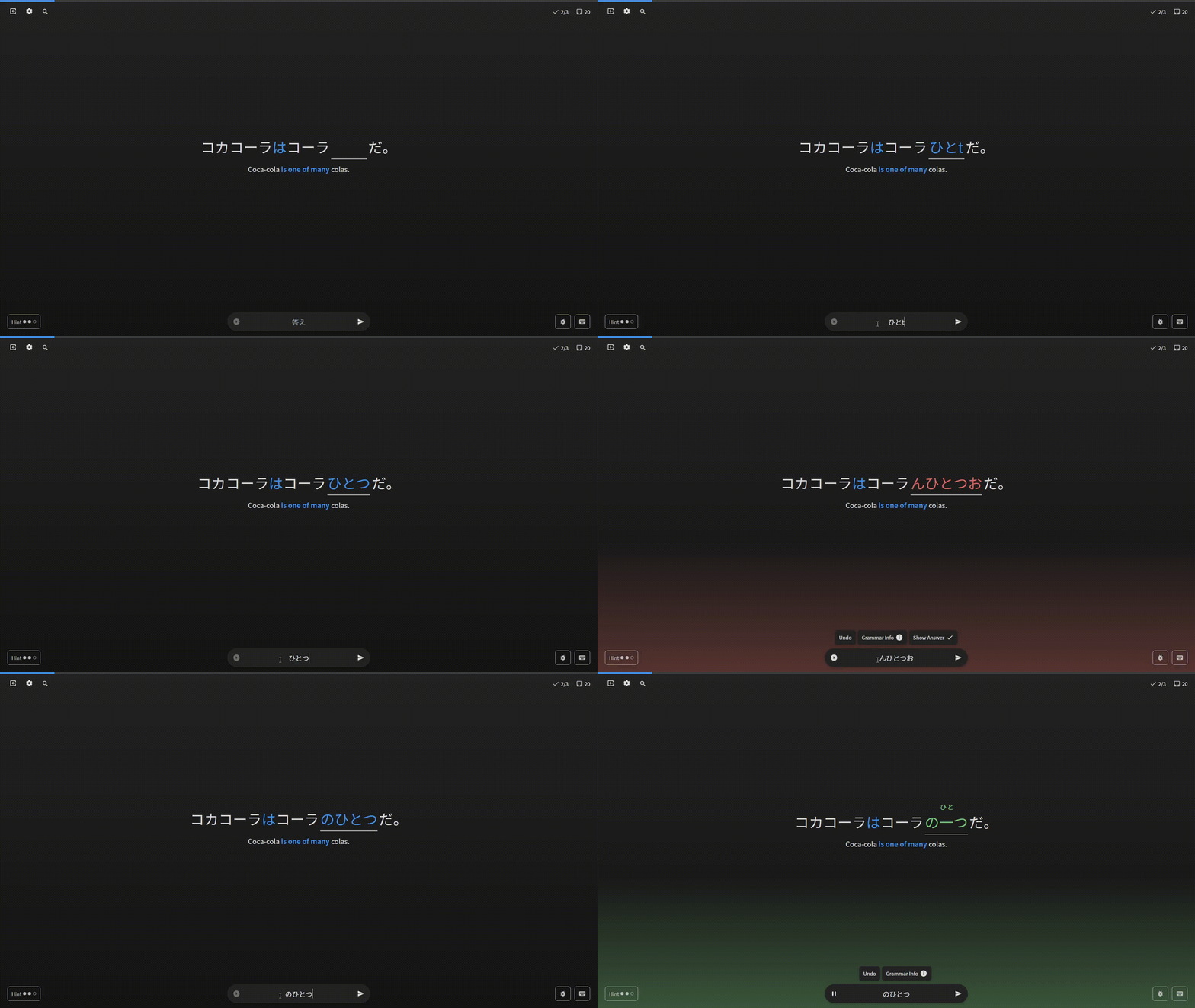
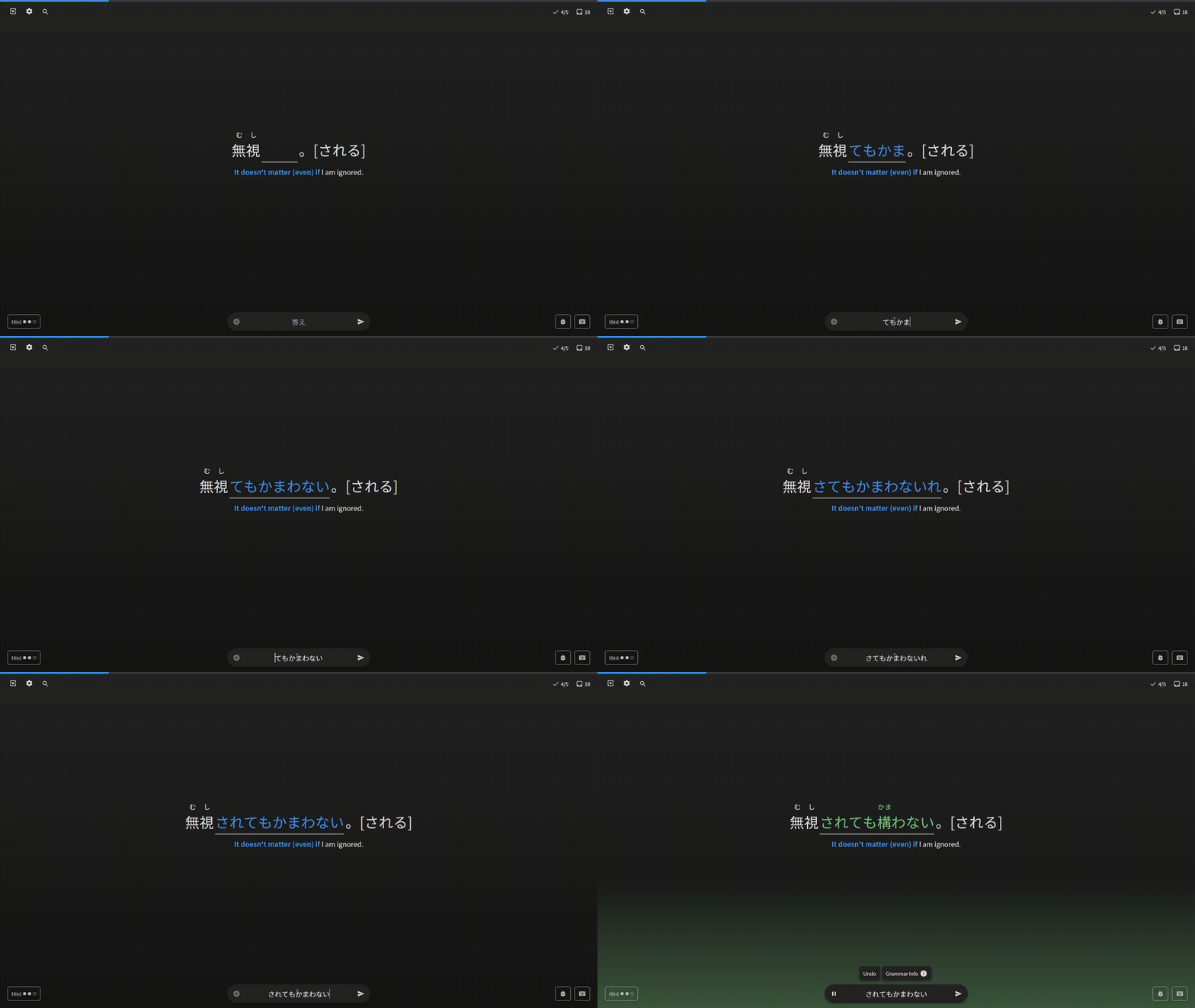
Btw, there was also the much less annoying bug that if I answered incorrectly but not “red” (i.e. got a remark e.g. that a の was missing) then when I type again I get English letters; only if I erase the whole word do I get hiragana again (so e.g. if I wrote わりに and was told that I need a の before, then when I try keeping the わりに and just add の in the beginning I get noわりに, instead of わりに).

1 Like

I got a bug where everything turned black. It happend after I pressed “f” and scrolled down to look at the grammar-point info, but I do not think I clicked at anything. It went away after typing in a random answer and pressing “enter” (then I pressed “backspace” and typed in my real answer).

2 Likes

Same here. I also got something wrong and checked the grammar point before it happened:

2 Likes

Will this interface also be used for cram?

1 Like

I really, really love the new Reviews! It feels smooth and polished, and it has a nice design too. I can’t wait for the cram feature as well.
Keep up the good work and thank you!

1 Like

Hello,

I’m really enjoying the reviews 2.0, and for some reason I find it easier to study with this interface.

I’ve just wanted to report a bug and another thing that bugs me a little bit.

If you want to go back to the beginning of the fill-in field, after typing a word, the interface will let you write the first hiragana. However, after the first character, it will jump to the end of the sentence. I’ve recorded two videos about this anomaly:

bug 1
bug 2

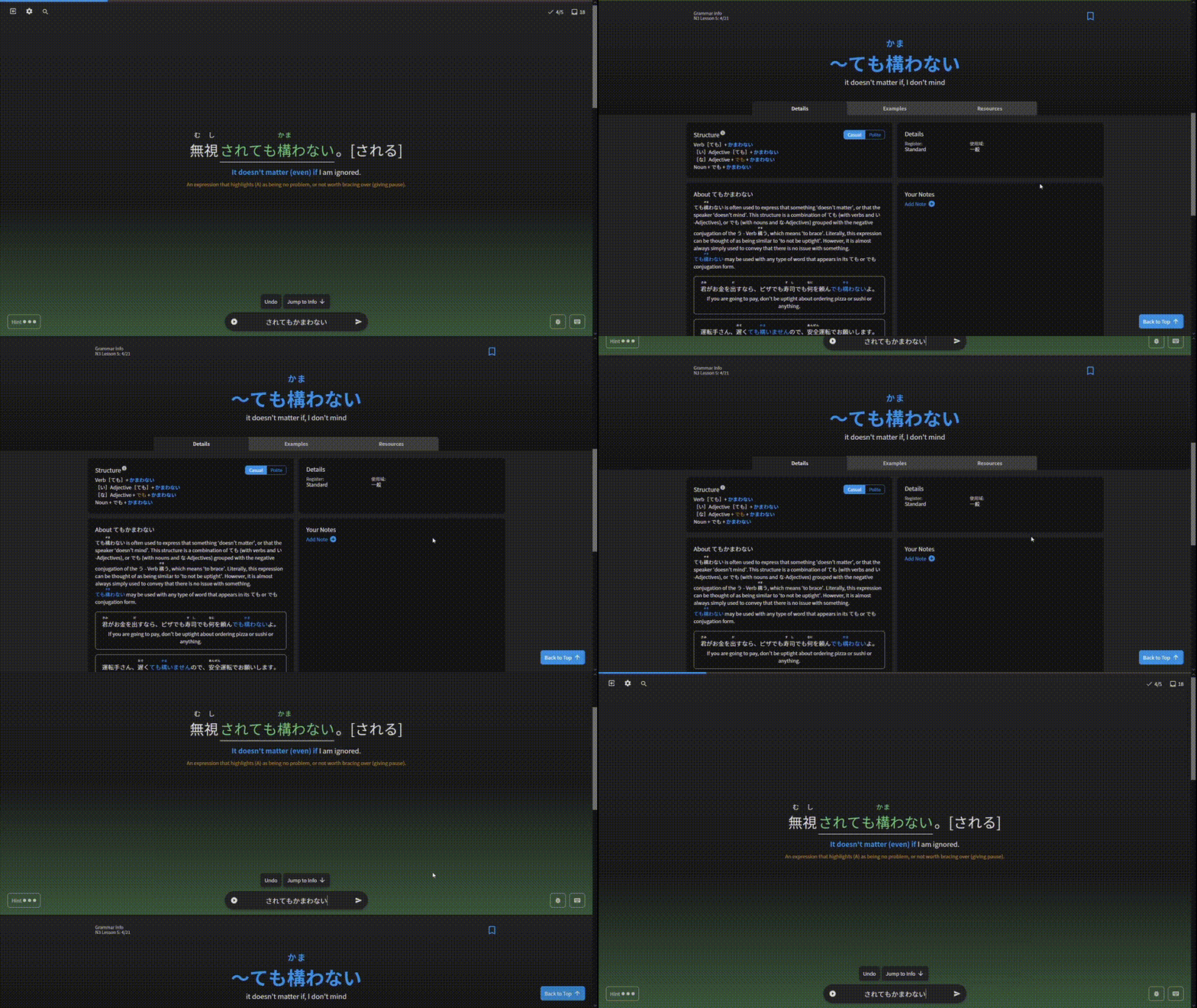
A thing that bugs me and IMHO kills the work flow when reviewing many sentences, it’s the fact there isn’t a shortcut to go down a screen when you see the grammar info. Let’s say you want to read the grammar info, so you click F. It works great. However if I want to read more examples, there isn’t a shortcut for that.

Take this with a grain a salt because I’m a backend engineer :joy: but could be interesting to add the possibility to go down a screen when you click again F, and then you go up a screen with I (after x number of clicks it will take you back to the sentence).
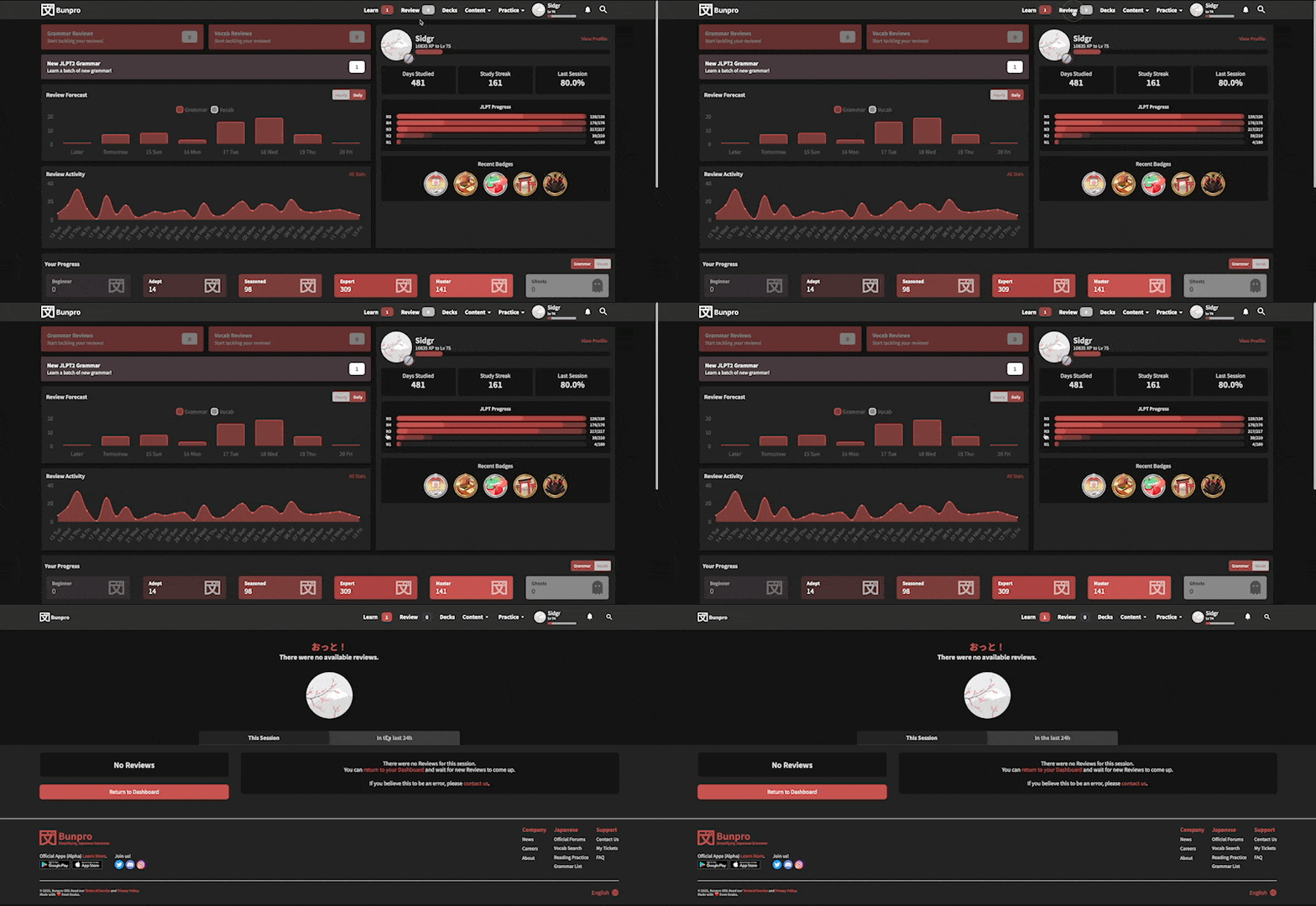
impossible go down a screen

I hope it helps!

I’ve tried the review 2.0 a few times and I can’t really stand it for more than a few reviews.
I understand that the site is trying to do something new but I just dislike it.
The old review screen was (is) fine and I really would just prefer if that was what was kept.

I understand it is in beta and the idea is to continue working on it but I just don’t see why you would.
There is the common expression “if it aint broke don’t fix it”

2 Likes

Re: the first issue, if you add -webkit-user-modify: read-write; to the element via dev tools, does that fix it? I’m sure the site devs will come up with a fix soon enough, but this is something that I did to fix that issue on the CMS connected to a site I work on

Thanks for the great feedback!
Good catch on the weird behaviour when trying to alter input.

@yndajas I get this issue on my end too, and unfortunately that CSS property doesn’t fix the issue! I appreciate the thought and the suggestion though.
I think the issue is that the input field is a controlled input in React, that I’ve implemented poorly. Will go back and try fix this.

As for the grammar info scroll feedback @qazrt, you can press ‘I’ now to scroll back up to the top of the page! Also, if you click outside of the answer input field, you will then be able use the keyboard to switch between the tabs of the grammar point!
We’ve got ideas for what we want to do for both the grammar info functionality and also for how we display the grammar info itself (like potentially getting rid of the tab system for starts), so we’ll definitely factor in your feedback in the next updates :sunglasses:

1 Like

Yeap, that’s the plan!
It will have some restyling to fit with the new Reading/Listening-type questions tho

@Marcus

Thanks for the feedback. Yes I’ve tried a few different methods to get this animation to work, but keeps buggin out on me.
Will remove it in the next update until I can get it fixed!

2 Likes

One more feedback:

The “default” answer is no longer the answer that is recorded with the audio, but what you typed in yourself for the answer. I think this can be rather confusing when there is a lot of answers, because it can take a while to navigate to the answer that the audio is using.

1 Like

Oh yeah, of course, React controlled inputs! It’s been a minute since I worked with those. Good luck with the fix!

1 Like

Only had five reviews today. Did not have any problem.

Have been noticeing that the loading circle wonders outside of its bounding box, and the graphic clips.

CleanShot 2023-01-13 at 12.52.55

2 Likes

Oof that clipping is hella ugly…
What browser/OS are you on? It’s an SVG animated with CSS, so it’s probably a browser issue.

1 Like

Safari, I wonder it a lot of the issues I am having are browser specific.

Edit:

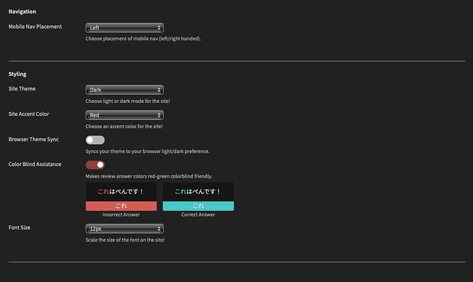
I changed my settings to this and set the browser to default zoom:
zooming the browser seems to be the issue.


CleanShot 2023-01-13 at 13.00.46

I’m able to replicate the issue with browser zoom!
I think this is an edge-case for Safari only. Thankfully with your help we got the culprit pretty quickly, otherwise that would’ve taken a lot of time to reproduce :sweat_smile:

I’m looking into a solution but there doesn’t seem to be a lot out there.

FYI this is what the generated code looks like
<svg viewBox="0 0 100 100" preserveAspectRatio="xMidYMid" class="mx-auto text-primary-accent" width="75" height="75">
  <circle
    cx="50"
    cy="50"
    fill="none"
    stroke="currentColor"
    strokeWidth="10"
    r="35"
    strokeDasharray="165 57"
    class="bp-anim-spin"
  ></circle>
</svg>
  .bp-anim-spin {
    animation: 1s linear infinite anim-spin;
    transform-origin: 50% 50%;
  }

  @keyframes anim-spin {
    from {
      transform: rotate(0);
    }
    to {
      transform: rotate(360deg);
    }
  }

Chat GPTs answer:

It appears that the problem is with the preserveAspectRatio attribute on the svg element. The value of xMidYMid tells the browser to scale the SVG such that the horizontal and vertical midpoints of the SVG are aligned with the midpoints of the viewport. When the browser is zoomed in or out, the SVG is scaled accordingly, but the animation is not. To fix this, you can try removing the preserveAspectRatio attribute or setting it to none . This will prevent the SVG from being scaled when the browser is zoomed.

My thoughts:
One thing is scaling and the other is not. Not a helpful solution lol, but it does help diagnose problems.

1 Like

Yeah this was a decision I made personally.
I made it so that it wouldn’t automatically switch you to an answer that you didn’t submit – I thought this would be disorientating. But I guess the reason it was like that, as you mentioned, was so that it matches the audio. I didn’t factor that in.
I guess one way or the other it’s a lil disorientating, but better to not change the original flow. Will add this to my to-do list.

2 Likes

Hahaha I tried asking ChatGPT the same thing and got the same answer :see_no_evil:
Removing it doesn’t seem to help on my end :pensive:

I’ll leave it removed for now. Might help someone somewhere :man_shrugging:

3 Likes