Reviews 2.0 Released!

Sadly that doesn’t do the trick.
I only want the translation of the prompt below, no hint whatsoever:

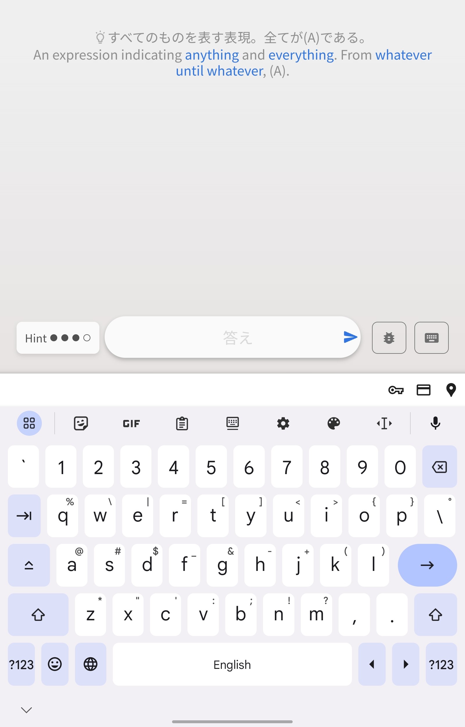
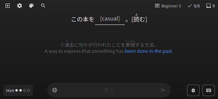
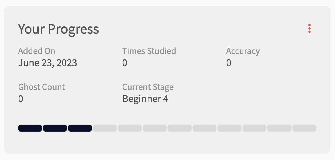
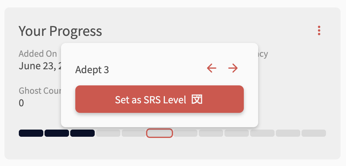
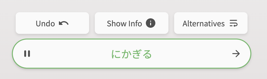
Grammar Hint is set to Nuance first.

Review English set to

  • hide just completely hides all hints
  • nuance shows the japanese hint
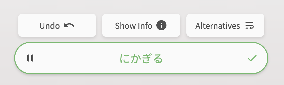
  • hint shows both a english hint and the translation of the japanese prompt (as from my first picture)
  • show just shows everything

It’s interesting, because if I click manually through the hints, the second setting is exactly what I’m trying to archieve:

1 Like

Ah I see what you mean!
So in addition to Hide, Nuance, Hint, Show, you want a Nuance Translation option!
I think we’ve talked about doing this in the past. Will discuss it with the team!

2 Likes

Selection of English translation text is broken after the recent animation update. I’d be nice to tweak z-index of the hidden text block.
output98

2 Likes

Nice find! This has been fixed.
Added visibility: hidden; to all of them, including the Nuance texts too.

2 Likes

Just did a quick review session, and got summary for a previous one I did during this hour. This summary doesn’t contain any items I’ve reviewed now, only from the previous session.


At the same time, /api/frontend/review_histories/last_session endpoint returns correct end time. But session_length counter have sum of reviewed points for my last two sessions. (Obviously, 29+9 from the screen above isn’t equal to 47.) data array have 38 objects inside it. Session ID is 2132645.
image

1 Like

You can now directly set SRS Progress for items!

  1. Click on the bar that corresponds to the level you want to set

  2. The little menu tooltip pops up – click the ‘Set as SRS Level’ button

  3. Voila! The new SRS progress has now been set.

Note: The next review for that item is timed as if you had just levelled up to that item.
E.g., if you change the level to Adept 3, it will treat it as if you just levelled from Adept 2 → Adept 3, and thus set it to 8 days in the future


Thanks @simias for the suggestion!

11 Likes

Check/Cross icon now fades into right arrow after submitting an answer

First, some context:

  • Previously there was confusion about where the button to go the next question is (especially on mobile) after answering a question.
  • This was because the ‘next’ button would change icon from an arrow to a check or cross (depending on correctness).
  • It was originally implemented like this so that there was a way to identify if the submission was correct/incorrect for color-blind users (before that the next arrow would just change color)

Now, the next arrow will change into a check/cross icon (same as before), and then switch back into the next arrow.

We hope this eliminates any confusion!

  1. Before answering a question

  2. Directly after answering question

  3. After 1.5 seconds, check-icon switches back to next arrow


Thanks to all those that submitted feedback regarding this!

@Jenkins @NearlyRemy

11 Likes

Amazing, thanks!

4 Likes

Really like Dashboard 2.0! :smiley:

It’s not a big deal, but I noticed the number above the bars on the “Forecast” bar chart disappear whenever there are no additional reviews for that particular timeslot when compared with the previous timeslot (10pm and 4am here):

Or perhaps it’s intentional, since I can see the bar colors are a little different at those times too :thinking:

3 Likes

It’s intentional!
Gonna make a post about the new Dashboard shortly :smiley:

4 Likes

Could I also ask to check if the first wrap-up point equals to the last queue point, then shuffle them again? :pray: 
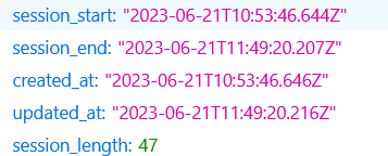
It happens sometimes when I fail the last review in the queue, and it shows up immediately as a wrap-up one by pure coincidence.
(Of course this check should not trigger when there’s only one wrap-up item.)

2 Likes

Nice catch! This will be implemented during next update to Dashboard.
So, probably in the next day or two if I don’t happen to ping you about it!

1 Like

I love the look of the new reviews page. Thanks!

As a frequent tablet and smart phone user, one suggestion I have would be to move the text entry box up to just beneath the review sentence.

While it does look very nice at the bottom of the screen, in practice it’s actually very frustrating, because when I select it the keyboard pops up, and the sentence is scrolled off the top of the screen to make space for the keyboard. And I have to keep scrolling it back down as I type of I want to read it.

3 Likes

Hey! Welcome back to the forums.
It says your last visit was 4 years ago! :open_mouth:

  • Are you able to switch Fullscreen Mode off in the Styling menu and let me know what your experience is like?

  • Are you using your tablet in vertical mode?

1 Like

プチ Reviews 2.0 Update

Features

  • If Mobile Nav Placement is set to Right-hand-side, make the drawer come out from the right side too

  • Add text detailing when the next Review is going to be if you manually set the SRS Level

    • You didn’t ask for this but it’s here now! Merry Chrimbus @simias

  • Add ‘Next Review’ details to the Your Progress grid at the bottom of the Grammar/Vocab page

Fixes

  • Make sure the first wrap-up item is never the last missed item
6 Likes

Thanks for the welcome. Actually, I’ve been here the whole time (1574 day streak) just not in the forum.

I am using vertical mode. And turning off fullscreen did seem to do the trick. This is great. Thanks so much!

3 Likes

Just while on that subject, can “%” be added after the accuracy figure?
I guess it’s a percentage anyway, but not totally sure.
I remember first seeing the number there and wondering what 52 or 71 or whatever meant :smiley:

3 Likes

Not sure why the percentage isn’t there.
Will add that now!

3 Likes

I have the same problem, but I don’t have that setting in my styling menu.

Vertical. iPad, website, safari.

— Dave

2 Likes

Hi Dave. If you don’t have that setting in the Styling menu, it will mean your screen is below the width threshold that we have set for that option, and your screen will have its height always set as fixed (not full-screen).

1 Like