Could I also ask to check if the first wrap-up point equals to the last queue point, then shuffle them again?  It happens sometimes when I fail the last review in the queue, and it shows up immediately as a wrap-up one by pure coincidence.
(Of course this check should not trigger when there’s only one wrap-up item.)
Nice catch! This will be implemented during next update to Dashboard.
So, probably in the next day or two if I don’t happen to ping you about it!
I love the look of the new reviews page. Thanks!
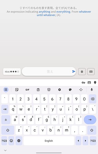
As a frequent tablet and smart phone user, one suggestion I have would be to move the text entry box up to just beneath the review sentence.
While it does look very nice at the bottom of the screen, in practice it’s actually very frustrating, because when I select it the keyboard pops up, and the sentence is scrolled off the top of the screen to make space for the keyboard. And I have to keep scrolling it back down as I type of I want to read it.
Hey! Welcome back to the forums.
It says your last visit was 4 years ago! 
-
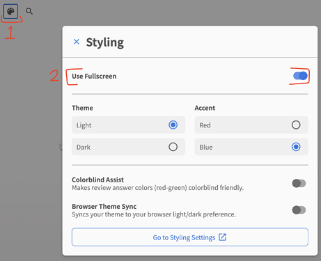
Are you able to switch Fullscreen Mode off in the Styling menu and let me know what your experience is like?
-
Are you using your tablet in vertical mode?
プチ Reviews 2.0 Update
Features
-
If Mobile Nav Placement is set to Right-hand-side, make the drawer come out from the right side too
-
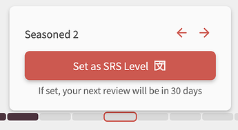
Add text detailing when the next Review is going to be if you manually set the SRS Level
- You didn’t ask for this but it’s here now! Merry Chrimbus @simias
-
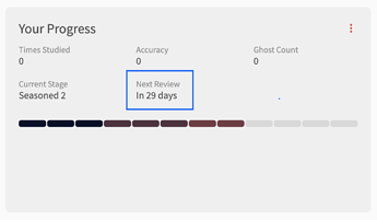
Add ‘Next Review’ details to the Your Progress grid at the bottom of the Grammar/Vocab page
Fixes
- Make sure the first wrap-up item is never the last missed item
Thanks for the welcome. Actually, I’ve been here the whole time (1574 day streak) just not in the forum.
I am using vertical mode. And turning off fullscreen did seem to do the trick. This is great. Thanks so much!
Just while on that subject, can “%” be added after the accuracy figure?
I guess it’s a percentage anyway, but not totally sure.
I remember first seeing the number there and wondering what 52 or 71 or whatever meant 
Not sure why the percentage isn’t there.
Will add that now!
I have the same problem, but I don’t have that setting in my styling menu.
Vertical. iPad, website, safari.
— Dave
Hi Dave. If you don’t have that setting in the Styling menu, it will mean your screen is below the width threshold that we have set for that option, and your screen will have its height always set as fixed (not full-screen).
Thank you!!! 
Can that be fixed? I have the problem, but not the solution.
— Dave
I don’t like that during reviews, it will show me my mistake immediately after I answer instead of after I tell it to reveal the correct answer.
This usually happens if most of my answer was correct and I was just missing a particle or something, in which case it will show the “corrected” version with the missing particle.
(For example, I answered かぎらない for a とはかぎらない card just now, and instead of just telling me I was wrong, it immediately showed me とはかぎらない.)
This really works against how I study, as when I make that mistake I try to remember what exactly it was I missed by trying out various options (and then usually marking that card as incorrect anyway). By showing the mistake to me immediately, I feel like it removes my ability to recall the mistake, undercutting the review process.
Would be nice if there was at least an option to disable this or something.
I have good news for you – there is a option to disable this!
The feature is called “Auto Highlight Errors”, and it’s enabled by default.
Disable it under Settings > General > Reviews
I believe so! The Content Team has been hard at work 
It’s nice to see some different messages appearing on the summary page after completing a review session.
I think it’s something difficult to get right and difficult to please everyone.
Just a suggestion to have “満点! Full marks!” for a score of 100%.
プチ Reviews 2.0 Update #2
Features
- The input bar now shakes when you are given a leading-hint (orange text)
- Change the message on the Summary page after finishing reviews
- This is based on the percentage of questions you got correct
- @kelth, and this is already live @bunnypro!
- Added Quiz Metadata element. Might be of some use to scripters!
Metadata of form:
<div
  id="quiz-metadata-element"
  data-meta-location="review"
  data-meta-input-mode="manual"
  data-meta-question-mode="cloze"
  data-meta-answers-array="['だ','です']"
  aria-hidden="true"
></div>
where:
data-meta-location: "review" | "learn"
data-meta-input-mode: "manual" | "flashcard";
data-meta-question-mode: "cloze" | "translate";
data-meta-answers-array: string; // A JSON stringified array of strings of either Japanese or English (depending on input language)
Fixes
- Fix issue where the correct answer wouldn’t show if you answered with IDK
- Attempted fix on Android Firefox where with certain question lengths, the page would zoom in
- @narfi Please update Firefox and let me know if this is fixed now
- Fix issue where you couldn’t edit an existing Custom Study Question
- Fix Enter hotkey not creating new paragraphs in Notes editor
- We updated the 3rd party editor we use for this
- @S_S
- Change “View Grammar
 ” / “View Vocab
  ” wording in the Grammar/Vocab footer to “Open in a new tab
  ” during Quiz to more closely match the action
Fixed. 🙇♂️
Phew… 😮💨
If that didn’t fix it I’d be pretty stumped 


