It’s time! The official release of Reviews 2.0.
This feature update includes much more than just a revamp to the Reviews system! Check it out below!
Note for Beta testers:
If you have already been following the Reviews 2.0 Beta and its threads, you can probably skip this post, as it mainly just announces the new features of the Reviews 2.0 Beta again
 Purpose
The classic Reviews system has been around since I signed up for Bunpro circa 2018. It is battle-hardened, and people know and love it.
It is perhaps the most accessed feature of Bunpro, it covers a lot of functionality and is the single part of the site you interact with every day.
However, with age, it has also become very difficult to update and improve. And even to this day, it’s still haunted by bugs that have evaded the team time and time again. It was overdue for a facelift!
The new Review system is faster, simpler, and more user-friendly than Reviews 1.0 was, without making any compromises.
 Update Overview
New Reviews experience
The features covered in the Reviews 2.0 update were coded and designed from scratch. With a fresh start, we have implemented new and existing features!
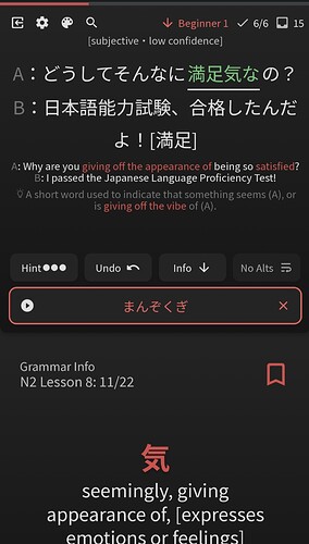
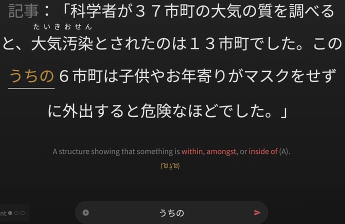
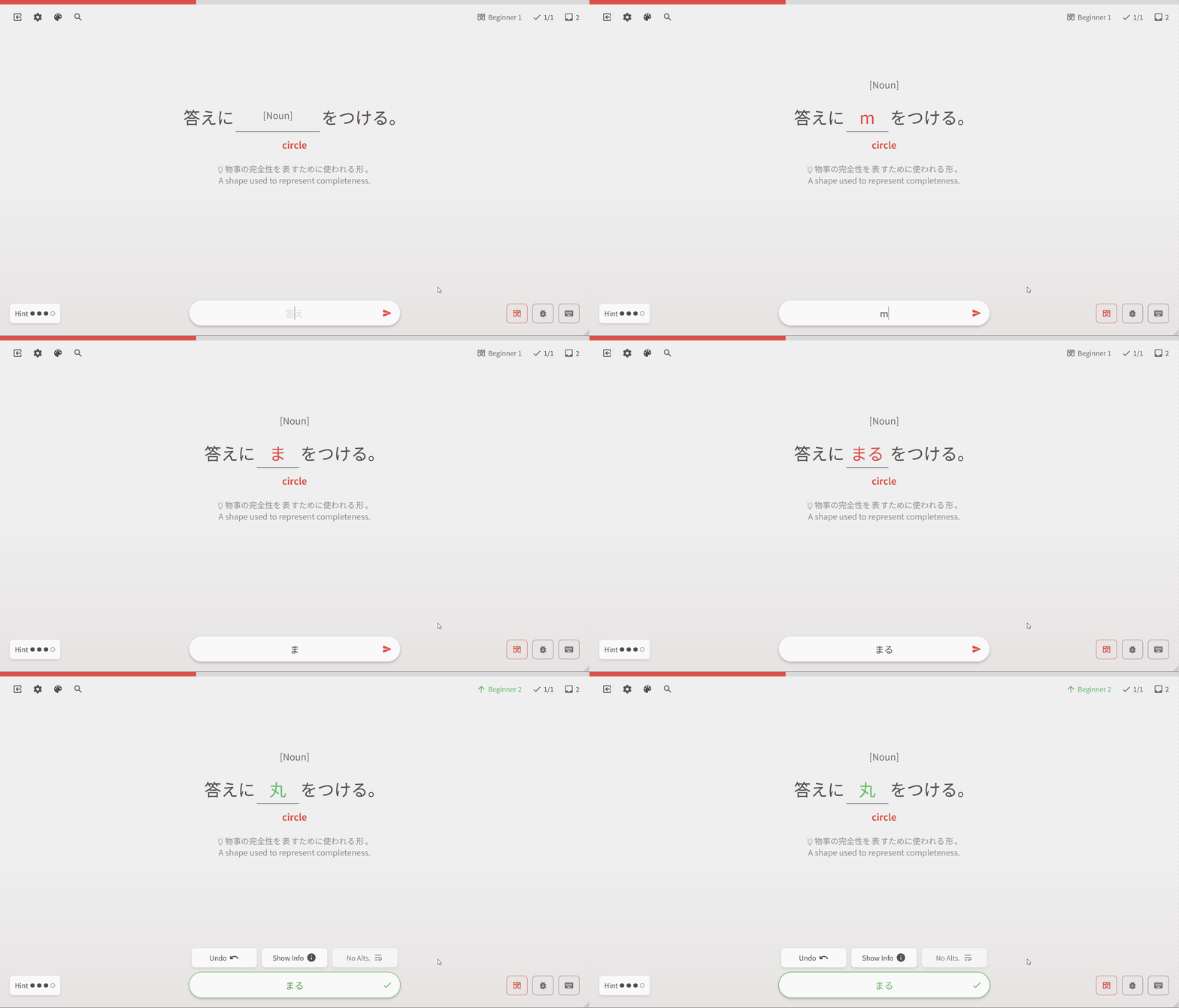
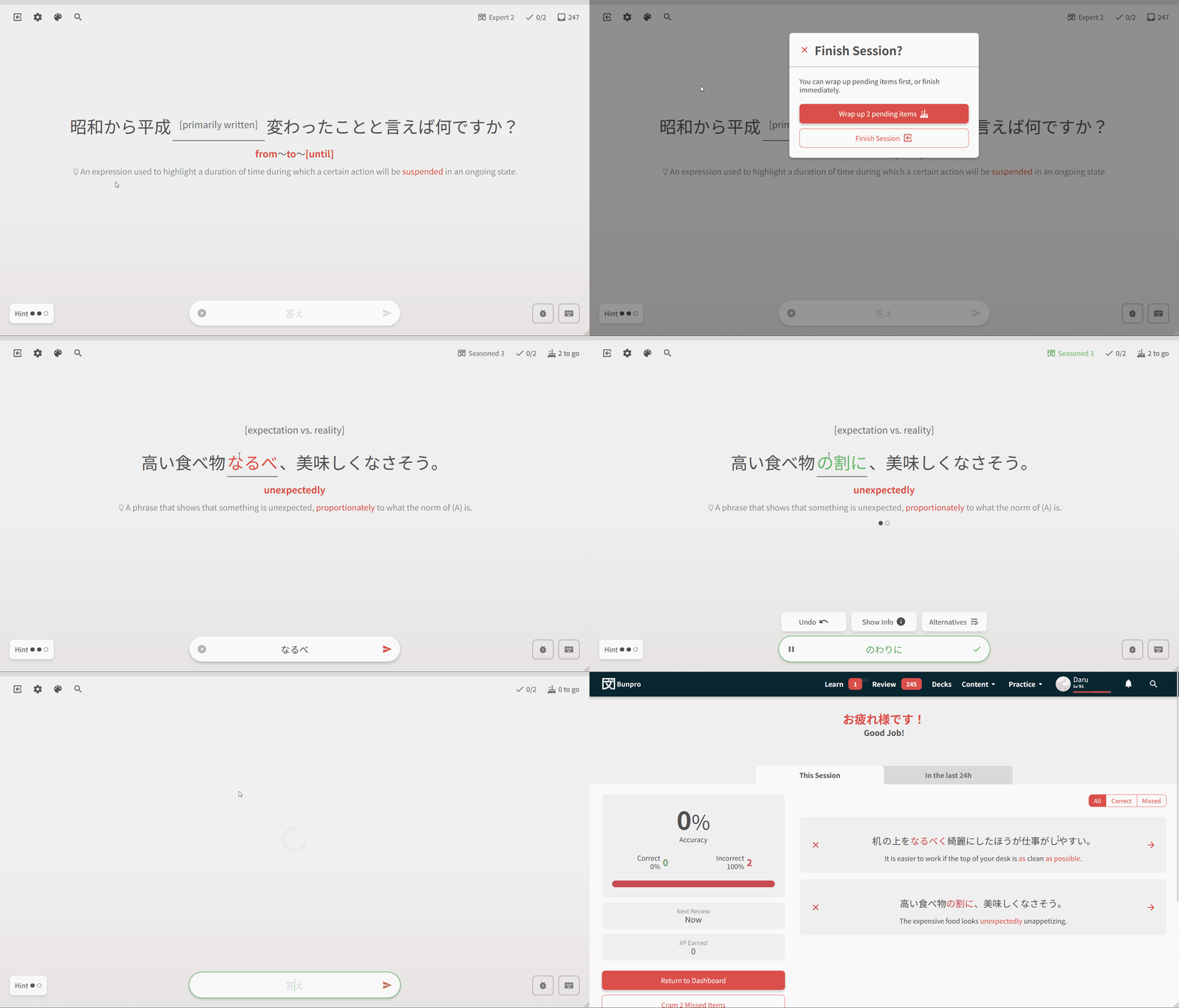
Redesigned quizzing experience
Experience a smoother and faster reviewing experience
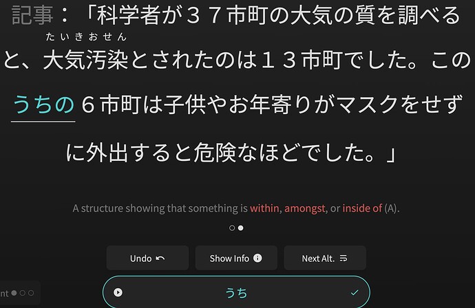
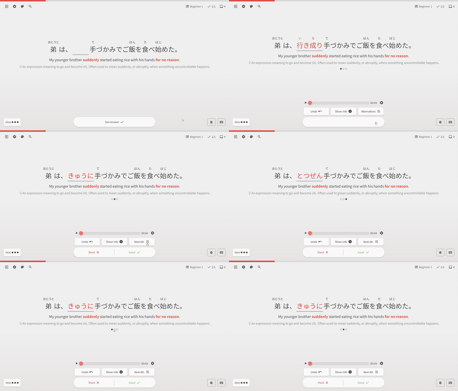
Revamped alternate-answer system
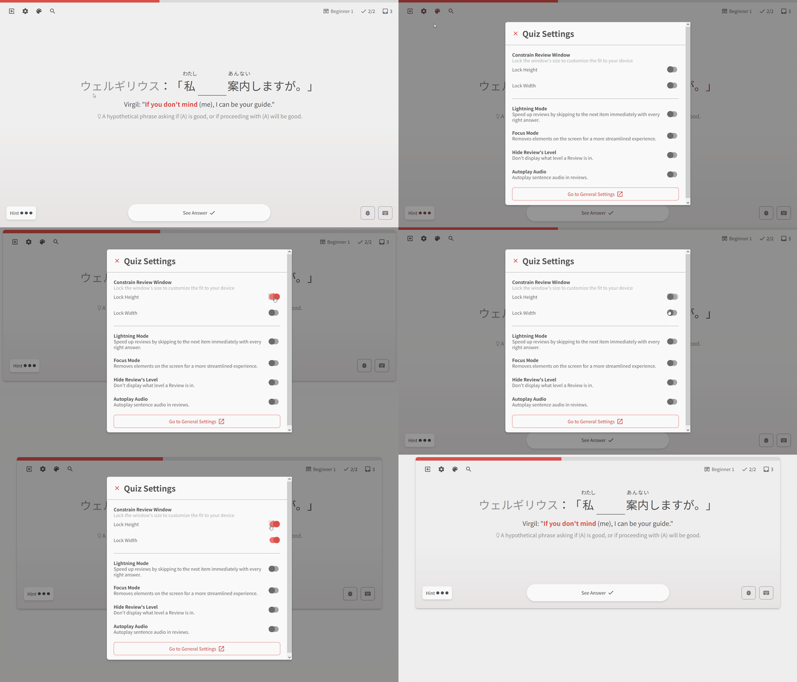
Visual Customizability
With new window width/height restriction options, and theme options directly within the Reviews quiz, it’s never been easier and faster to customize your Reviews experience.

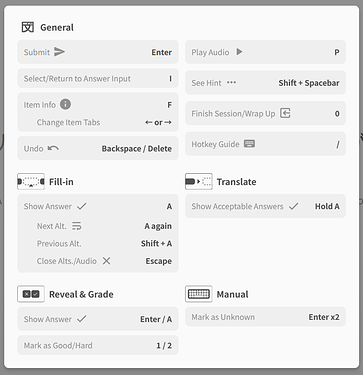
Keyboard Shortcut modal
We’ve added a new Keyboard Shortcut screen directly within the Reviews quiz, so you always know what hotkeys are available to you.
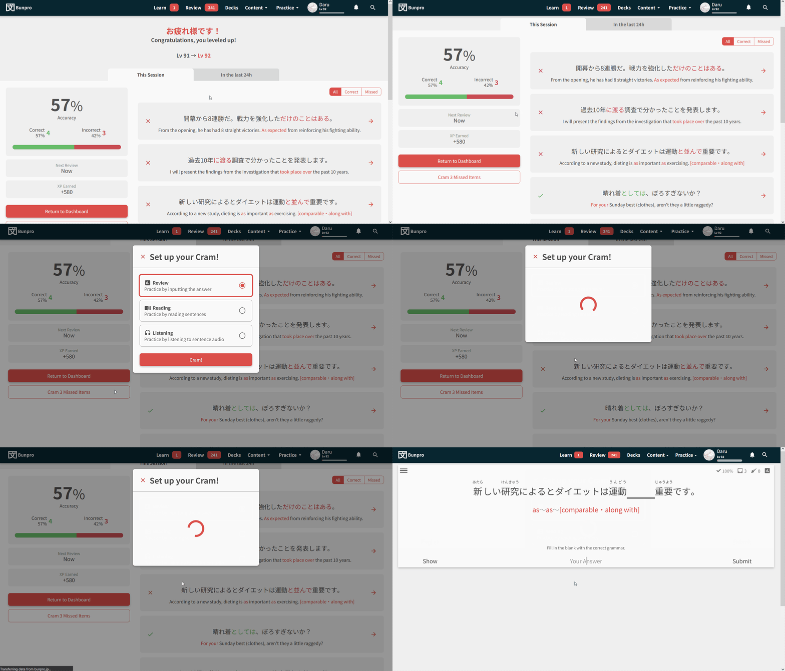
Summary Page
The Summary page has also been redone.
- You can now access it any time to view the details for your last session.
- You can also view all session data from the last 24 hours
- Sort correct / incorrect answers using the selector on the right
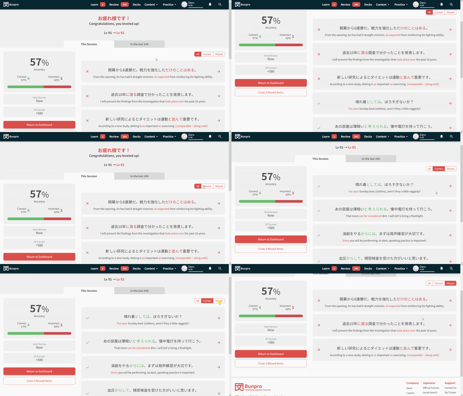
Cram Missed items
You can now cram your missed (incorrect) items directly from the Summary screen!
New Grammar / Vocab pages
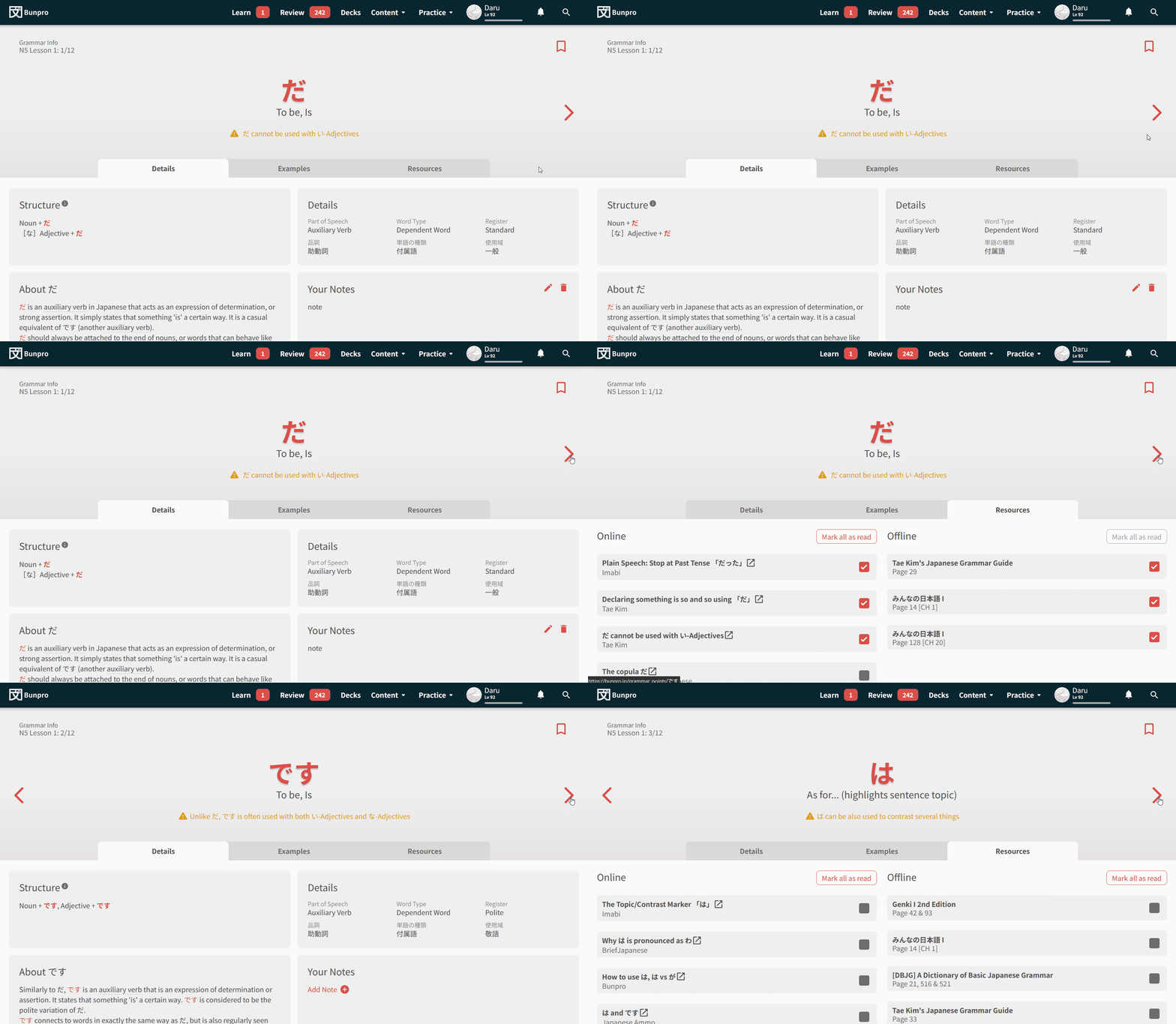
While well-known painpoints like the notes being too large will be addressed in a future update, we want to test this newer and more modern design for Bunpro.
Not too much is new here in terms of functionality, but much like the theme for this update, interactions should be faster, and you should get much more feedback on if your actions have been successful or not.
Going between Grammar Points is much faster now
With the new system, switching between pages no longer requires a page-refresh, so transitioning between Grammar Points should be much faster
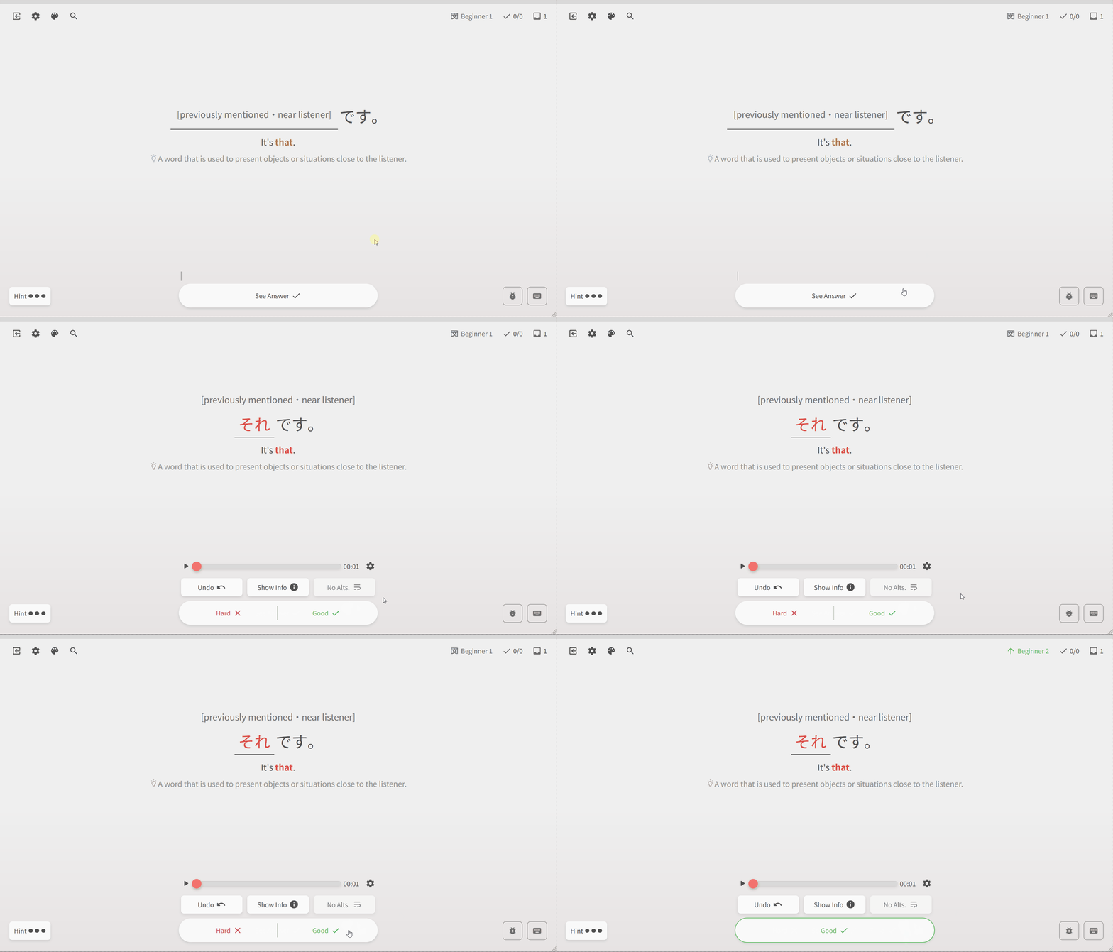
New interactive Review Type menu
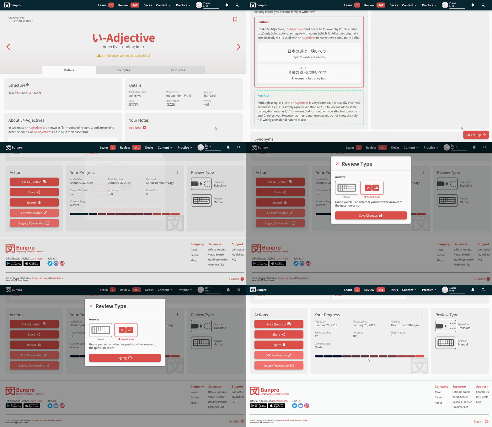
A while back we added support for Cloze (fill-in-the-blanks) support for Vocab questions, and recently we also added Flashcard-input support for Grammar questions. With the new types of Review-styles available, we also have added a new menu to choose your preferred Review Type.
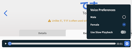
Persistent Audio Preferences
Now your audio preferences (found in the new audio menu – Male vs Female, Slow Playback) persist across sessions.
The new Reader
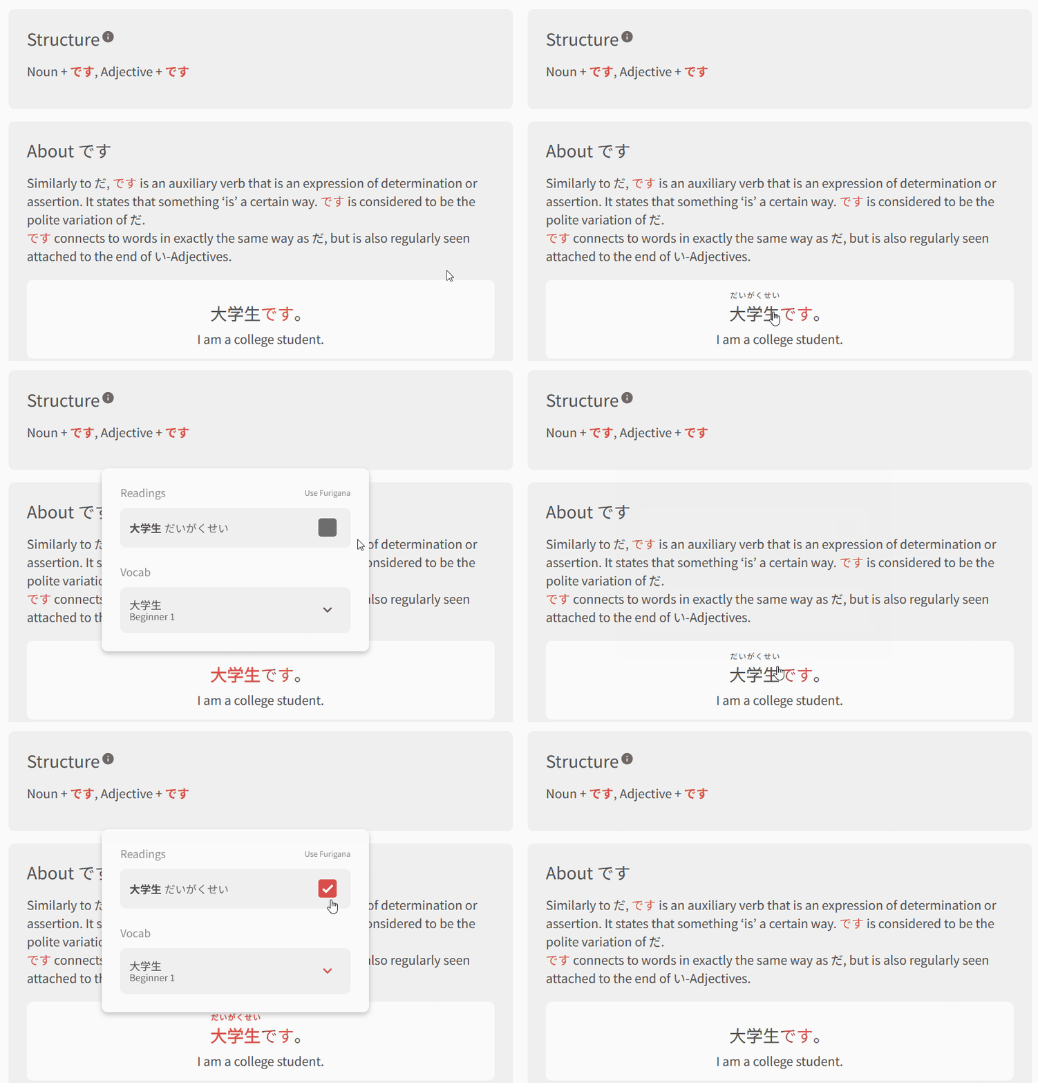
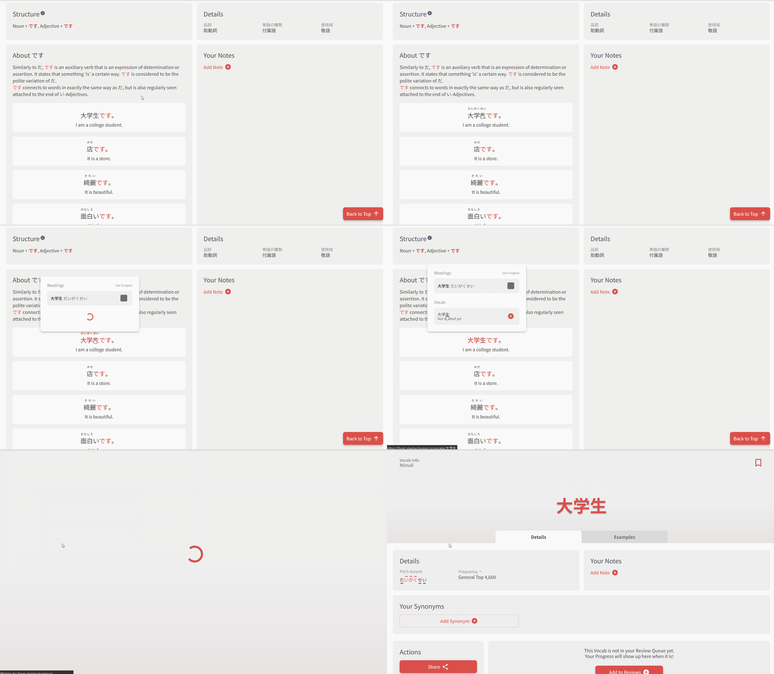
Previously, clicking on text with a Grammar/Vocab popout would simultaneously open the popout and toggle the furigana on/off.
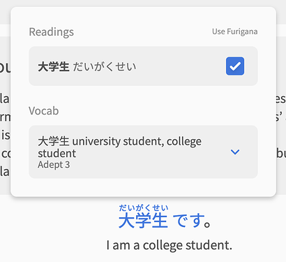
To address this, we’ve created a new pop-out tooltip for rich text.
It can do the following:
Show/hide Furigana
Displays all the possible readings for the selected word, and remembers your choice of whether or not you’d like to keep displaying that reading
Show Grammar/Vocab inside a sentence
Shows you any Grammar/Vocab inside a sentence or word.
It also allows you to click on an item to visit that item’s page.
Add to Reviews / Manage Progress directly within the Reader
Now you can perform all the familiar Review actions on a Grammar/Vocab item, all within the Reader
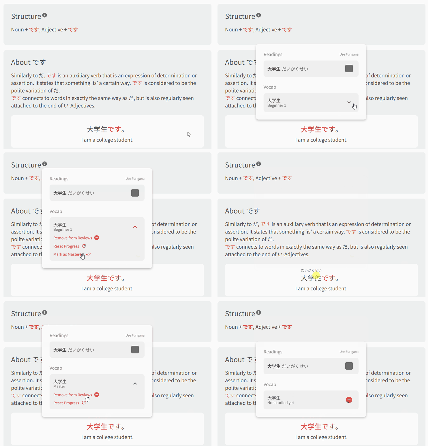
As a bit of a caveat, it’s worth mentioning that currently only a subset of our content is Reader-enabled. We are currently manually adding Vocabs/Grammar points to words to make them Reader-enabled. As time goes on, more and more of our content will be useable with the Reader!
Other stuff
With this update there are a few minor quality-of-life things we were able to implement:
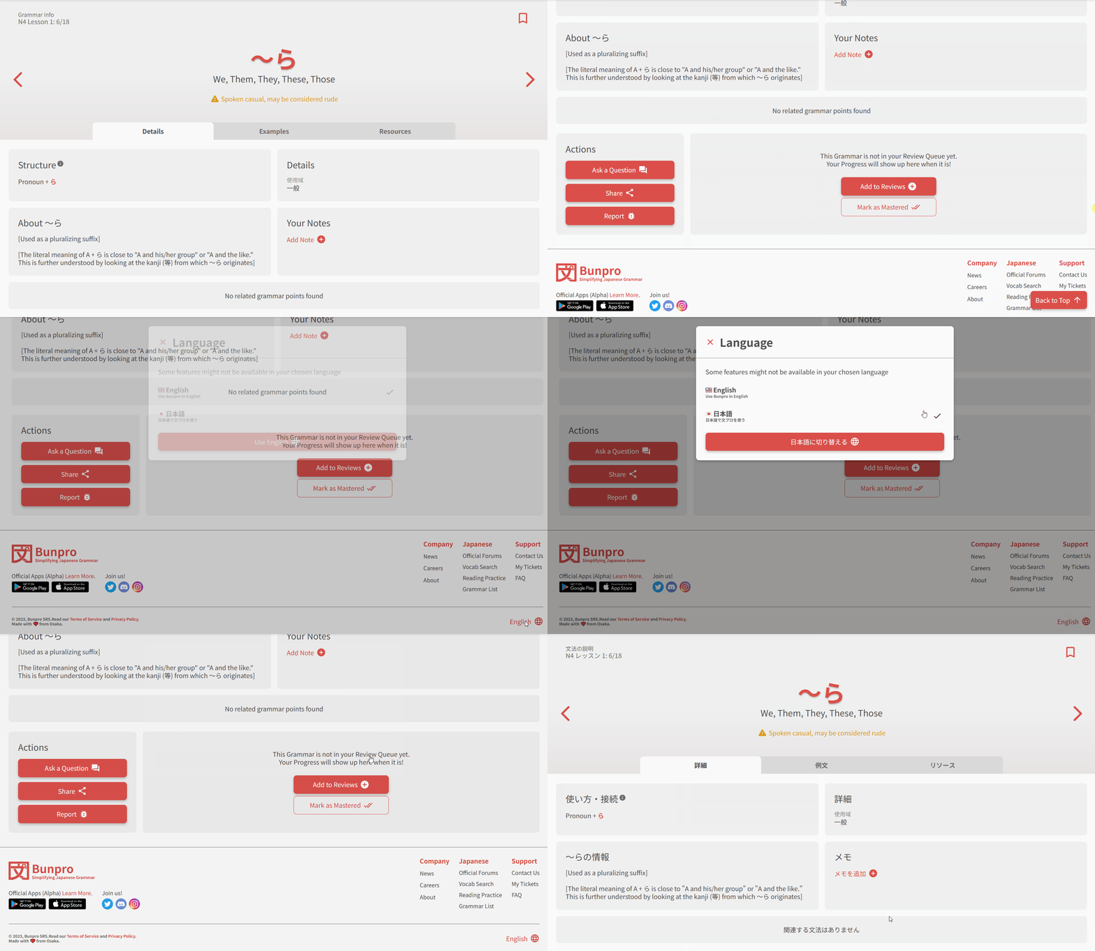
Open the Language-menu from the footer
You can now instantly change the language directly from the footer
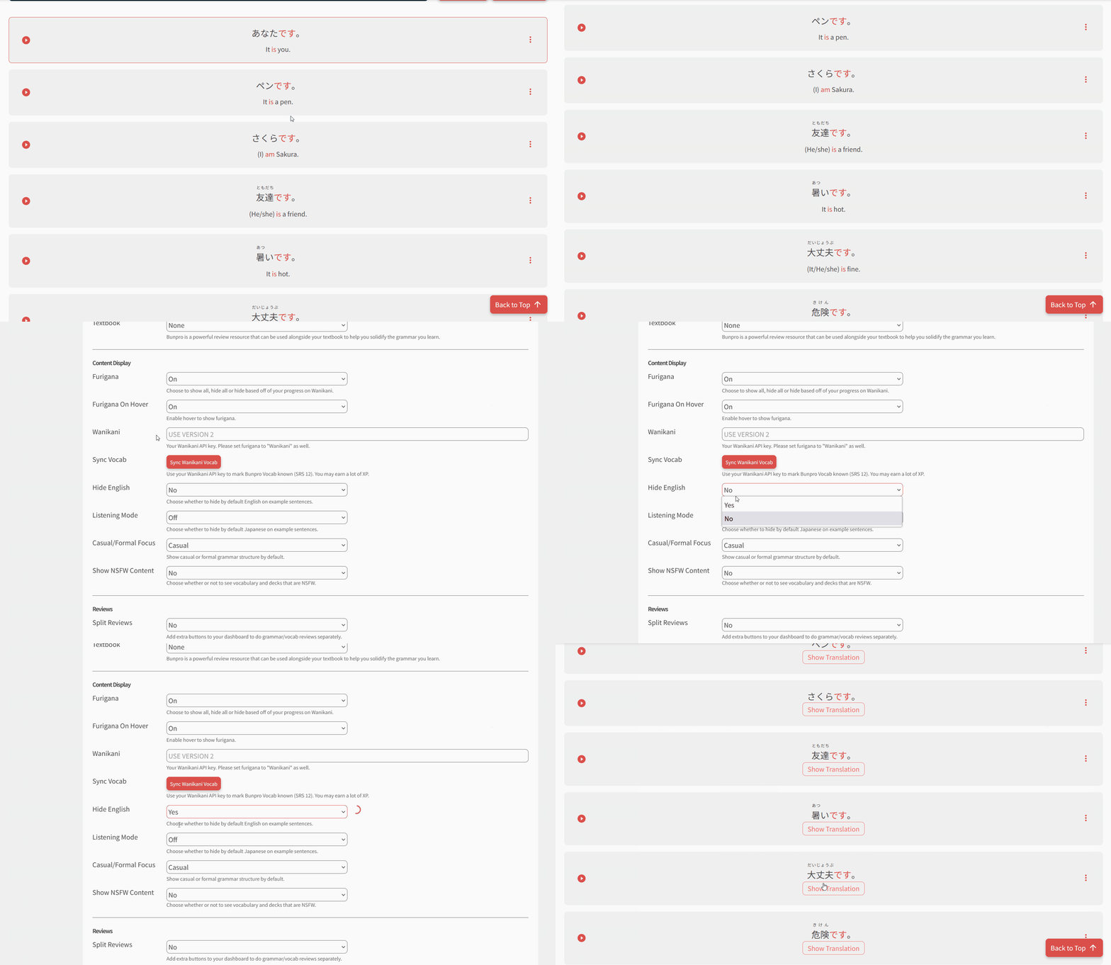
Changes to any setting now instantly takes effect
Any of your account settings that you change will now instantly take effect instantly, even across tabs!
🤓 BTS updates & tech details for devs
Along with the noticeable features mentioned above, here are some more stuff we’ve implemented some other QoL/BTS changes while we were at it:
- SEO Improvements across the board
- New swanky OG image – share us and check it out!
- Dynamic OG images coming soon
- A range of accessibility improvements over the original site
Our stack:
- React /w NextJS
- Typescript
- Tailwind for styling
- Vitest for Unit Tests
- Hosting /w Vercel
- Legacy to new site cutover achieved with NextJS dynamic rewrite
 What will happen to the old system?
As it’s getting close to the JLPT, we’ve decided to keep the old Reviews system accessible for the time being.
It can be accessed using the URL prefix ‘/old/’.
So, for Reviews for example, /study becomes /old/study.
Full list of old links
This legacy system will not be updated, and will eventually be removed.
 Shoutouts
A big thanks to the users that gave feedback, positive or negative, on Reviews 2.0. It went through many iterations to get to where it is today, and we couldn’t say thank you enough!
Here are the contributors, in no particular order:
@HotAirGun, @Talos, @Superpnut, @Sidgr, @Marcus.W, @bunnypro, @simias, @hexashadow13, @Slysoft, @suchifa, @Redglare, @if_at_first, @Tulip, @walter, @ahewgill, @kelth, @Scottd, @kammy_23, @Asriel, @SenorNope, @driscoll, @snime, @Marcus, @melisma, @Kioshen, @chicharron, @TobyOne, @VegasVed, @MC_2018, @Mapletree, @JamesBunpro, @ejw, @Bang, @nuflows, @zeno777, @ThisIsntTheWay
The end (not quite)
With Reviews published, we’re going to continue to monitor for bugs and other feedback.
We’ll also pivot our focus to some other overhauls of a similar style to this one. The next being an overhaul to the Dashboard.
Watch this space!

