Reviews 2.0 Released!

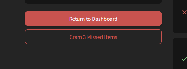
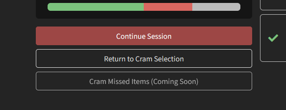
Not sure if it has been reported, I really like the Cram missed items button, but once you go to Cram, you get to see that button again at the end of the session, this time to not work and appear with a “Coming Soon”.
imagen
imagen

Also it would be nice to be able to set up the cram session with multiple modes, for example writing and reading, instead of going for one or the other.

1 Like

oh is it not added for non-beta yet? that makes sense, it works when I’m in beta mode but not when I have beta turned off

1 Like

Yes that was the reason, it was turned off. I didn’t think that hover would affect mobile since you can’t really hover over it.

The behavior is still different than it was before the update, the furigana automatically disappears when I tap somewhere else on the screen. But that actually saves me from the trouble of hitting the word directly again so it is a welcome change.

1 Like

I’m able to replicate the issue.
Indeed seems to be only the Learn page.

Will find a fix for this!

1 Like

Reviews 2.0 Post-release bugfixes #2

Fresh batch of fixes fresh out the oven!


  • Add support for capital letters for the f, i and p keys
  • Shuffle the missed items when wrapping up
  • Half the Quiz question transition time
    • A few people have asked for shorter/no transition between questions, so I’ve shortened it drastically for the time being
    • @darkness_rising
  • Switch to a better question translation-text animation
3 Likes

Thanks for the work on the major update, I quite like it! (Desktop user) While I don’t think I’ve made much use of any of the added features it just “feels” a lot smoother than the previous version. :slight_smile: The indicator for hint level is useful, and the page overall has less distracting looking things on it (idk, XP progress bar?) :slight_smile:

2 Likes

yep! just letters as far as I can tell. thanks for the hotfix!

1 Like

Really enjoying the new update. It feels natural to use and it easier to do on my mobile than it was previously. Well done team!

4 Likes

Reviews 2.0 Post-release bugfixes #3

  • Fixed the elusive Show Info error
    • With the help of @EdBunpro, managed to finally fix an error where if you answer a question with ‘Auto-Expand Info’ enabled and immediately hit the ‘Undo’ button (hit Backspace), it would jam the Info system, and when you re-answered the question, you couldn’t access the Info
    • This has been fixed
  • Hide the Review Progress menu if the question is a Ghost or Custom Study question
  • Fix highlights being removed when switching between politeness level
2 Likes

6 Likes

I really like the red theme overall,
but the text being red on input as well always makes me think my answer is wrong ahead of time since it will also be displayed in red if it really is wrong,
or green if it is correct. :persevere:

2 Likes

Reviews 2.0 Post-release bugfixes #4


Features


Fixes

  • Order Vocab sentences properly
    • Before, the sentences were only ordered by JLPT, not by the official difficulty order set by the Content Team
  • Fixed a bug where the “Learn” button for each individual Deck wasn’t working properly
    • This should now be fixed, and your Review Type settings should be working
    • The fix for the general Lean button in the main navbar should be out later tonight (JST) @purplecarrot @dschrute97 @I-k-d
2 Likes

Yayyy thank you!!

@purplecarrot @dschrute97 @I-k-d

The fix for the ‘Learn’ button in the navbar button is now out too.
With that, there should be no more issues with Review Style within Deck Settings!

Sorry for all the confusion :bowing_man:

2 Likes

It seems it has stopped collecting stats ever since the update? :thinking: In the stats tab it says 160 grammar points in N2 and 0 in N1 but I’ve since finished N2 and started N1…
The statistics for the crammed items are also not updating, so it could be a general issue.

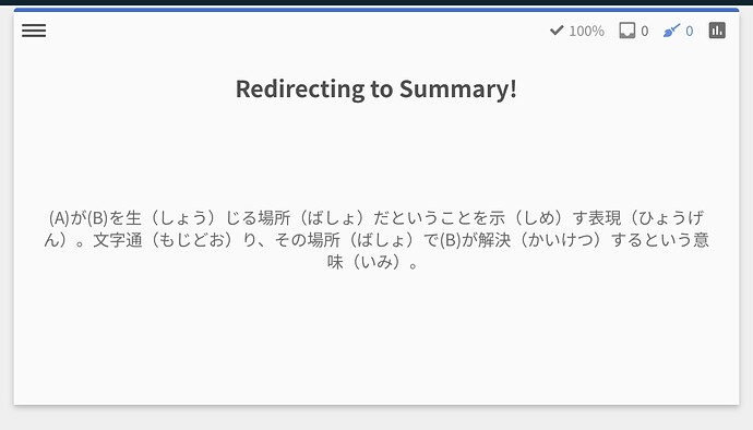
Today I’ve been seeing this strange summary page when doing a cram session after reviews.

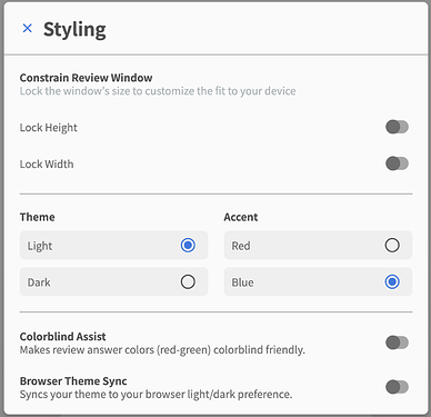
The grammar explanations and reviews are all accented as red instead of blue for me, even though it’s set to blue in the settings. Is anyone else having this issue? The main dashboard and the forum page are blue, but the other pages are red. :thinking:

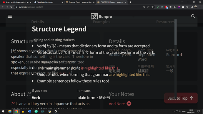
Also, is the pop-up window being transparent a bug? Because it makes reading extremely hard.

Hey there! Welcome back to the forums.

Are you able to try disable all your browser plugins and restart your browser?

I’ve seen this bug once before and it was a plugin issue!

4 Likes