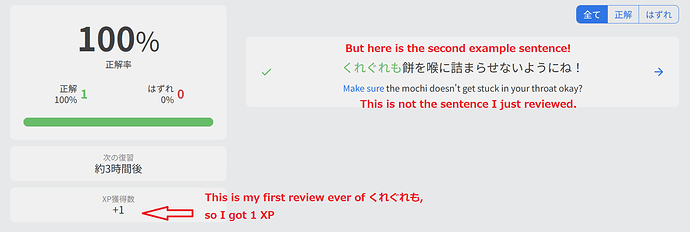
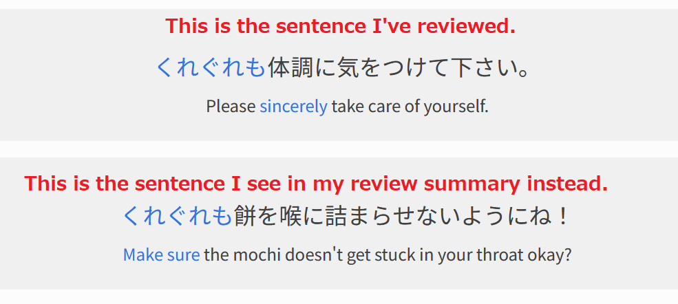
It just marks it wrong for you so that you don’t need to input a fake answer, and progress faster. In terms of how it alters your progress for that point, it’s the same as getting it wrong.
A lot of people usually just input あああ or something similar when they don’t remember the answer. After looking at the data, we didn’t consider this to be a common enough interaction to warrant a button (like you see for Undo, or See Info) so it’s slightly more hidden on purpose. Our intention is for you to run into it when you need it, to avoid clutter or over-explaining.
As for the clickable looking text, I think it’s a very valid assumption to think that as it’s using our accent color. We’ll change it to something that doesn’t look clickable, because it’s not.
Hope this clears that up, I’ll see that it gets changed. Thanks for your feedback!

 プチ Reviews 2.0 Update
  Fixes
Fixes
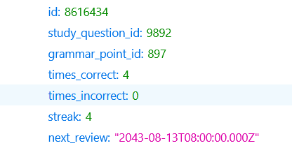
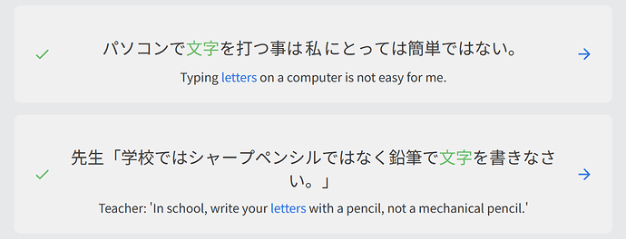

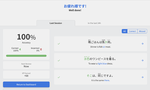
 Summary ‘loading’ feature update
 Fix To-do List

