Reviews 2.0 Released!

Yeah it is my main deck, and through the learn button.
(sidenote: lets go kiwis, on exchange so not living in nz right now but i was happy to see the nz after your name haha)

Edit: tried it by going through the deck section and it had the same result, then tried removing it from being the main deck with same results

2 Likes

Yeah this is a byproduct of switching to the new system.
Will become less and less noticeable as more pages get switched

Technical Reason

Switching from a regular framework to a SPA while also trying to maintain the SEO for each page meant that the page initially gets rendered in the guest state before switching to the logged in state.

I’ll see if there is anything I can do about it.

2 Likes

The Deck system is super confusing at the moment in terms of Review types.
I need to bump the urgency of getting this all sorted, because you’re not the first person that has mentioned it.

If you click the “Switch All Reviews to Manual Input” button in the Deck Settings and go to Learn again, do you get the same error?

And yeah Kiwis unite! There are only ~5-odd million of us but got-damn we represent :joy: :kiwi_fruit:

2 Likes

If you have the setting Settings > General > Start Page set to “Profile”, then clicking the Bunpro logo in the top left should take you to the Profiles page too!

I’d just like to point out that currently, the “[…] per Day” sections in My Profile > Stats appear to be broken, and the grids are not displayed at all.

Are you able to send a screenshot? We can look into this for you!

1 Like

The new system looks good so far, but I have some minor issues now:

Somehow the list of words where I activated furigana reset with the new 2.0 release, I get furigana on every word now and I have to disable it for every single one I already know.

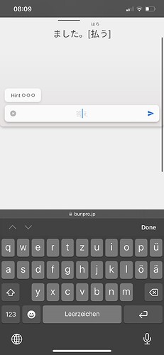
Also the screen scrolls down when I tap on the 答え bar, causing the sentence to be hidden. Not every time though. The screen height and with restrictions solved the problem on my tablet but these options are not available on iPhone?


2 Likes

Thanks for all the feedback!

Somehow the list of words where I activated furigana reset with the new 2.0 release, I get furigana on every word now and I have to disable it for every single one I already know.

What is your Furigana setting set to?

Also the screen scrolls down when I tap on the 答え bar, causing the sentence to be hidden. Not every time though.

I know why this is happening, but unfortunately there’s nothing I can do about it right now.
Essentially, because you’re forcing focus on the input field, your browser says “hey, you’re gonna type something, better but the input field higher up on the screen” and the scrolls so the field is higher up, even though we want it to be fixed all the time.
I unfortunately can’t change this default browser behaviour (trust me, we tried).

What we’ve done instead, is try force the screen to scroll back up when you focus the input, so that while you type, both question and input are in view.
Sometimes you have to tap the input twice to force this behaviour, which is a bit awkward, but there is always the mobile app to fall back on for the mobile experience!

The screen height and with restrictions solved the problem on my tablet but these options are not available on iPhone?

This is on purpose for tiny devices (phones etc.).
To get the interaction I explained above to work smoothly, we force the screen to be fixed-height.

Anyway, hope this helps!
Let me know if you have any thoughts/suggestions.

2 Likes

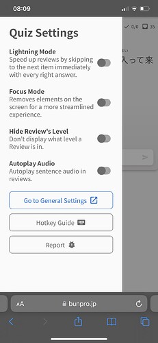
But I have kinda big one (it feels uncomfortable to have it in my pocket actually) with 1080×2340 resolution and 360px width viewport with 3x pixel ratio. It have some rendering issues and as @veritas_nz said to me these won’t be fixed because minimal supported viewport is 375px.
So it’s a false advertising here :stuck_out_tongue:

1 Like

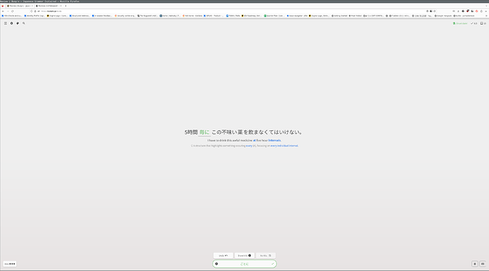
Generally the new design seems fine and response (although very grey???), but on the review site everything is sooooo far apart if you have a large screen. It feels very erratic to have to move my eyes around so much

2 Likes

I kinda solved it by increasing the zoom on the page to 200%

2 Likes

Have you used the Lock Height & Width toggle located in the cog wheel at the top left? That may be the better solution you’re looking for!

1 Like

I’ve somehow managed to remember wrong, the sequence of event is actually:

  1. Have the keyboard open
  2. Press to show furigana
  3. (Keyboard closes)
  4. Press the textfield to reopen the keyboard
  5. (Page gets scrolled down)

I have a Galaxy S10, so I’m using Android, and with it Chrome.

Edit: I just saw Dwrlesky’s comment and your response, it’s probably the same thing for me

2 Likes

yeah that works better. Thanks!

2 Likes

I was afraid of the change, but it’s a pleasant surprise on desktop!

6 Likes

Just completed my first session in version 2.0 and have to say it looks amazing (esp in dark mode), and the summary page is much improved. Thanks for your hard work :slight_smile:

3 Likes

Thank you for the reply!

Originally my furigana settings were turned off. With the old system I just taped on a kanji I forgot how to read, checked the reading and then taped again to hide it.

But with the update furigana stopped working completely, tapping did nothing. So I activated it in the settings and know it works again, with the side effect of having it turned on for every word.

The thing with the focus is a bit annoying but I can see how it is a behavior of the browser that you cannot change. It doesn’t happen every time, sometimes I also see the thing you mentioned with “scrolling up automatically”.

3 Likes

@veritas_nz Woah, adding Process key as a hint toggling shortcut was a bad idea I guess. Now it toggles on every keypress in Japanese layout.
output88

2 Likes

I have some furigana questions:

Do the changes to furigana toggles mean that we can now toggle furigana on a per word basis instead of just on a per kanji basis?
Will this synchronize between different devices, or is it stored in the browser?
Will this synchronize with the app?

2 Likes

Very cool, looks great! I had one slight hiccup, not sure it’s a bug. When I logged in the first time with the new update, I noticed I had a “Lesson (1)” in the top menu next to “Reviews” – which is odd, since usually it says “Genki I” (I’m following the Genki path).

I went into Settings, did not change anything yet, and when I clicked back out with the main Bunpro icon, it had reset to Genki I. Shrug! Just a heads up in case there is some weirdness for people with the Lessons track refresh.

4 Likes

I just do the lessons in cloze, then click the switch all to manual input so they are manual in reviews.
I’ve attached so many nz pins to my bag in hopes of a kiwi coming to talk to me lmaoo no luck yet though TT

2 Likes

One more bug: while viewing grammar point during reviews, pressing page search shortcut Ctrl+F scrolls page to the top of the grammar point. Perhaps it interferes with F shortcut?

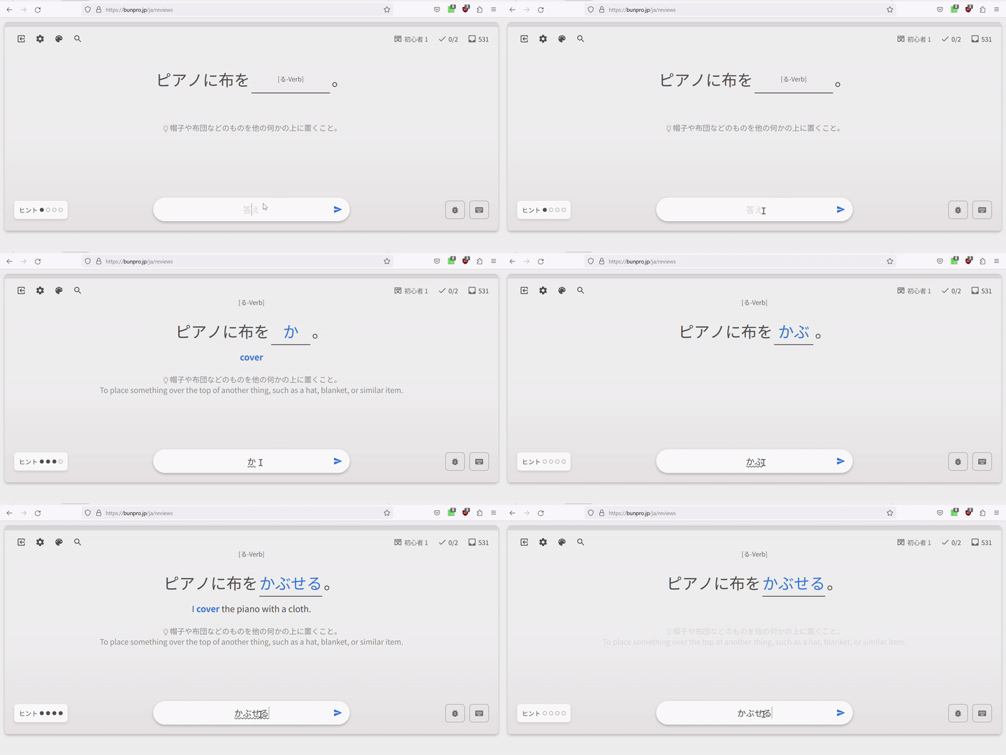
Also there are weird text flashes after going to the next question while doing wrap-up. English hint and translation for the next question is revealed for a half of second (I have only Japanese enabled by default) if I toggle it while answering it for a first time. And there’s no text fade-in fade-out animations as it is while doing regular reviews.
There’s no such issues with vocab, only with grammar points.

1 Like