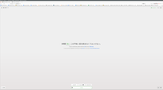
Generally the new design seems fine and response (although very grey???), but on the review site everything is sooooo far apart if you have a large screen. It feels very erratic to have to move my eyes around so much
I kinda solved it by increasing the zoom on the page to 200%
Have you used the Lock Height & Width toggle located in the cog wheel at the top left? That may be the better solution you’re looking for!
I’ve somehow managed to remember wrong, the sequence of event is actually:
- Have the keyboard open
- Press to show furigana
- (Keyboard closes)
- Press the textfield to reopen the keyboard
- (Page gets scrolled down)
I have a Galaxy S10, so I’m using Android, and with it Chrome.
Edit: I just saw Dwrlesky’s comment and your response, it’s probably the same thing for me
yeah that works better. Thanks!
I was afraid of the change, but it’s a pleasant surprise on desktop!
Just completed my first session in version 2.0 and have to say it looks amazing (esp in dark mode), and the summary page is much improved. Thanks for your hard work 
Thank you for the reply!
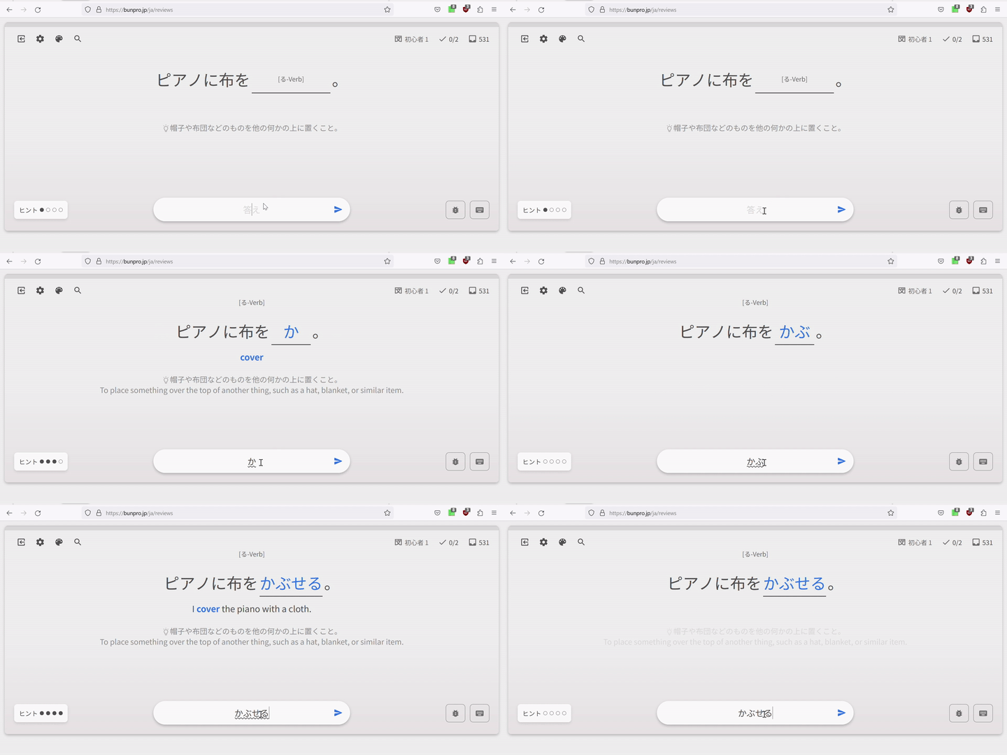
Originally my furigana settings were turned off. With the old system I just taped on a kanji I forgot how to read, checked the reading and then taped again to hide it.
But with the update furigana stopped working completely, tapping did nothing. So I activated it in the settings and know it works again, with the side effect of having it turned on for every word.
The thing with the focus is a bit annoying but I can see how it is a behavior of the browser that you cannot change. It doesn’t happen every time, sometimes I also see the thing you mentioned with “scrolling up automatically”.
@Sean Woah, adding Process key as a hint toggling shortcut was a bad idea I guess. Now it toggles on every keypress in Japanese layout.

I have some furigana questions:
Do the changes to furigana toggles mean that we can now toggle furigana on a per word basis instead of just on a per kanji basis?
Will this synchronize between different devices, or is it stored in the browser?
Will this synchronize with the app?
Very cool, looks great! I had one slight hiccup, not sure it’s a bug. When I logged in the first time with the new update, I noticed I had a “Lesson (1)” in the top menu next to “Reviews” – which is odd, since usually it says “Genki I” (I’m following the Genki path).
I went into Settings, did not change anything yet, and when I clicked back out with the main Bunpro icon, it had reset to Genki I. Shrug! Just a heads up in case there is some weirdness for people with the Lessons track refresh.
I just do the lessons in cloze, then click the switch all to manual input so they are manual in reviews.
I’ve attached so many nz pins to my bag in hopes of a kiwi coming to talk to me lmaoo no luck yet though TT
One more bug: while viewing grammar point during reviews, pressing page search shortcut Ctrl+F scrolls page to the top of the grammar point. Perhaps it interferes with F shortcut?
Also there are weird text flashes after going to the next question while doing wrap-up. English hint and translation for the next question is revealed for a half of second (I have only Japanese enabled by default) if I toggle it while answering it for a first time. And there’s no text fade-in fade-out animations as it is while doing regular reviews.
There’s no such issues with vocab, only with grammar points.
Looks great so far. I noticed that cram hasn’t been updated to use the new review system?
Love the feel of the new layout - one thing I’m missing is that it’s not immediately apparent what the hotkeys are for each of the review functions, nor where I can find that info? You’d think I’d have all of them memorized by now, but alas
You can find the hotkeys guide on the bottom right corner! It’s the lil’ keyboard icon.
@theusaf Cram has a bit of different logic (though it’s 80% the same thing) but it is on our roadmap to eventually add it there too. Stay tuned!
Ah, I see what’s happening. So on the main dashboard, it shows Genki. But when I click into Reviews, it shows “Learn 1” – should it do that, or should it show Genki (or whatever track) on the Reviews page as well?
Wow, the changes took me by surprise! Already getting used to them, but I’ve had a few bugs pop up. Sorry for no screenshots; by the time I thought to report them it was too late.
- After doing a regular review session and clicking the cram button to review stuff I missed, the sentences chosen to cram are the sentences I just made mistakes on, which feels a bit pointless for reinforcing the missed grammar.
- Also, after finishing a cram session initiated by the review summary page, it always shows one cram left, even though I’ll finish all of them. Clicking on the Continue Session button brings me to the last crammed item I did; finishing it still shows 1 item left.
- It looks like cram sessions started from the review summary page don’t count for the total shown on the Stats page.
Thanks for your effort and good work
One thing I noticed is that the new design does not show if you click on a grammar point through one of the textbook paths. The design does work when the grammar point is accessed directly.

