Thanks for all the feedback!
Somehow the list of words where I activated furigana reset with the new 2.0 release, I get furigana on every word now and I have to disable it for every single one I already know.
What is your Furigana setting set to?
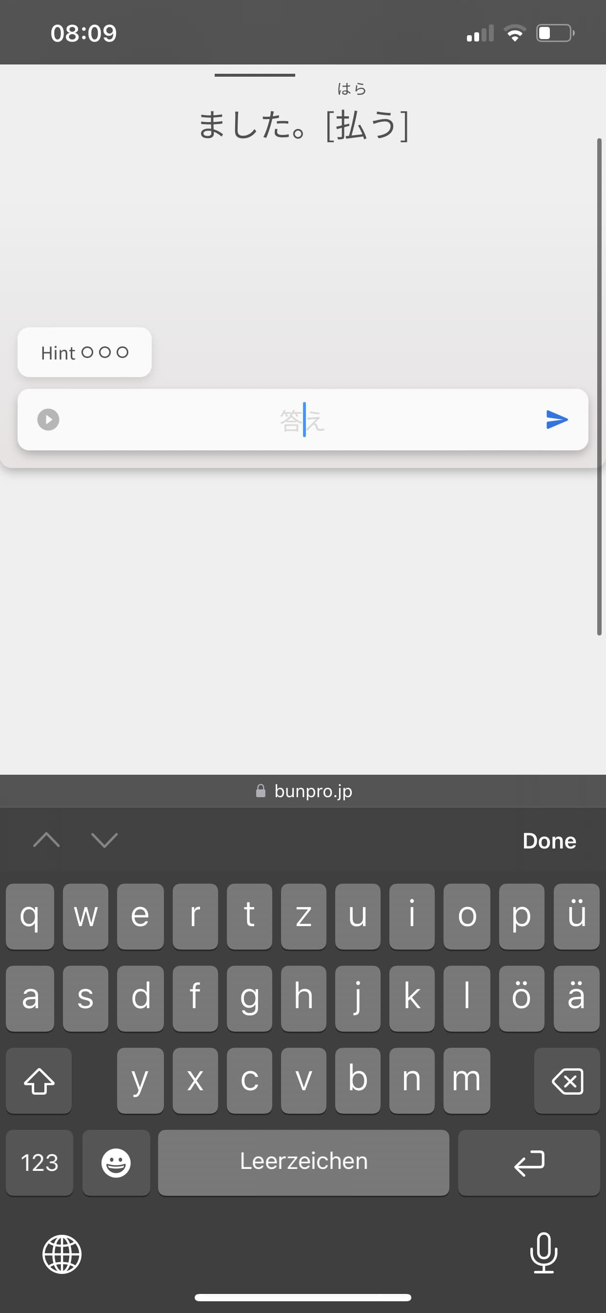
Also the screen scrolls down when I tap on the 答え bar, causing the sentence to be hidden. Not every time though.
I know why this is happening, but unfortunately there’s nothing I can do about it right now.
Essentially, because you’re forcing focus on the input field, your browser says “hey, you’re gonna type something, better but the input field higher up on the screen” and the scrolls so the field is higher up, even though we want it to be fixed all the time.
I unfortunately can’t change this default browser behaviour (trust me, we tried).
What we’ve done instead, is try force the screen to scroll back up when you focus the input, so that while you type, both question and input are in view.
Sometimes you have to tap the input twice to force this behaviour, which is a bit awkward, but there is always the mobile app to fall back on for the mobile experience!
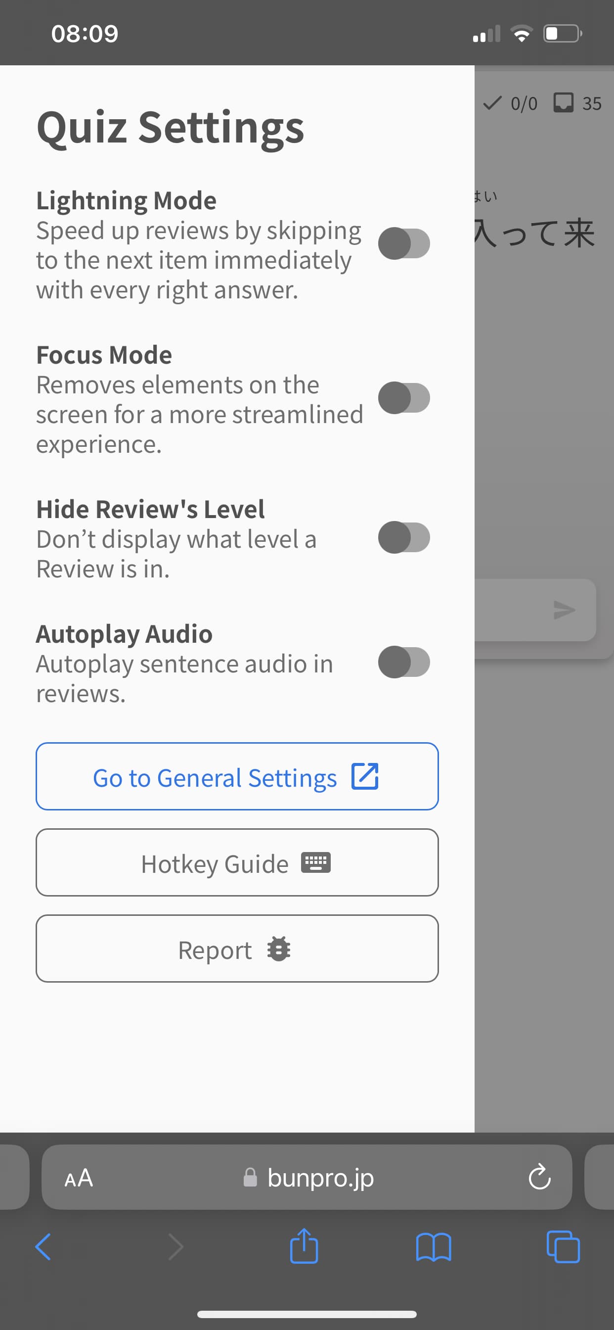
The screen height and with restrictions solved the problem on my tablet but these options are not available on iPhone?
This is on purpose for tiny devices (phones etc.).
To get the interaction I explained above to work smoothly, we force the screen to be fixed-height.
Anyway, hope this helps!
Let me know if you have any thoughts/suggestions.


 .
.