Thanks for the hard work!
Awesome! Looks great. 
Same here! I wanna review certain vocab in manual input, and others in cloze, but right now, all new vocab is in cloze! I think I like cloze better overall, but it takes way longer to do, and the JLPT is coming soon, and I’ve got like 700 more vocab words I gotta learn before then, so I gotta use manual input to fly through them!
I’m gonna have to switch back to the old version of Bunpro reviews for this reason!
Now this is how you do a big update!!! It is night and day difference compared to the disaster that was the WK recent big update. Just finished all my reviews and not a single issue so far. Really liking how smooth everything is. 
My one complaint that was already mentioned was the weird logout starting reviews that then jumps to logged in, feels kinda janky.
Also the little details… like the broom at the top when cleaning reviews is 
 chefs kiss
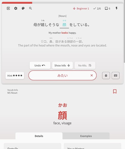
I like the idea of cloze, but its a bit clunky in terms of translations and highlighted words at the moment so i changed to manual
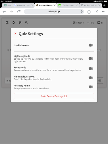
Another problem, i cant find the lock height toggles, do i need to change some settings to find them?
Edit: i dont think i even have version 2, i was on beta before and continued to use it but after turning it off it went back to version 1, do i have to do anything to get version 2?
Looks great! Very high end and reviews went super smooth. Love it! Thanks for all the hard work on this.
Good to hear~
You can also increase the font size in the Settings > Styling > Font Size !
Yeah I think it will be the same thing.
Does that not happen when you do the same sequence of events during the old Reviews?
Just to be sure – do you have Furigana-on-hover turned off under Settings > Content Display > Furigana On Hover?
Mobile is weird and will also treat a tap as a hover – so if you’ve turned it off it won’t work.
Woah, adding Process key as a hint toggling shortcut was a bad idea I guess. Now it toggles on every keypress in Japanese layout.
Just removed it! Will be gone in the next update.
One more bug: while viewing grammar point during reviews, pressing page search shortcut Ctrl+F scrolls page to the top of the grammar point. Perhaps it interferes with F shortcut?
Yeah currently the hotkeys do not factor in modifying keys (Ctrl, Shift etc.) at all.
Will make sure they do, unless specified otherwise.
Also there are weird text flashes after going to the next question while doing wrap-up
Thanks for all the details! Yeah this was actually on my to-do list. Was hoping no one would notice it 
I might remove the animation entirely as some people have not taken to it…
Thanks again for all the detailed feedback!
Basically the new pages are using a completely different system to the rest of the site, so it was just a use case I hadn’t considered!
Will add support for this now 
Thanks for the feedback!
Welcome to the community 
This is another thing I hadn’t considered. Will add it to the to-do list!
Thanks for the feedback~
I’m currently unable to replicate the bug you guys are seeing.
If the Deck is your Main Deck and set to ‘Manual Input’ they should be returning properly 
Until this is fixed though, Global Deck settings for changing the Review Type is coming really soon!
Thanks for positive feedback! 
Yeah this jank should hopefully be a lot less noticeable once we publish the revamped Dashboard and then the Profile update too. Watch this space!
What you’re looking at is the version 2! You shouldn’t need to change anything.
As for the screen size thing, because your screen is below a certain width, you only get the ‘Use Fullscreen’ toggle, which essentially acts the same as the lock/unlock height in this scenario.
Basically, depending on screen width, you get a different range of settings 
Reviews 2.0 post-release bug fixes #1
With the new influx of users of the new system, some bugs have been brought to light.
Fixes for them have been released, with the details below:
- Catch hotkeys activating if modifying keys are pressed
- This should fix the
Ctrl + Fissue for you @HotAirGun
- This should fix the
- Added the user’s learning path name to the Learn button in the navbar
- @8bg
- Removed ‘Process’ key from Hint hotkey list
- Fix Question transition animation not playing during wrapup
- Hide navbar items while the page is loading
- Fade in the User/Guest items once loaded
- This should greatly improve the loading visuals on initial page-load
- Decided making this transition look a lot better was worth sacrificing a few SEO brownie points @bunnypro
- Removed the “Question” part of the Review-Type widget at the bottom of the Grammar Point page
- Currently Grammar Points can only have Fill-in style questions, so there was no point displaying that at the bottom of the page
- Fixed an issue where opening the Reader in the Grammar/Vocab under the Quiz would cuz the tab to reset back to the first (Details) one

- Implemented the Path Chapter routes for Grammar Points
- E.g
/paths/minna_no_nihongo_1/chapter/81/grammar_points/です - @Fuba
- E.g
Feel the feedback coming~
Happy studying!
Thank you for the fixes!
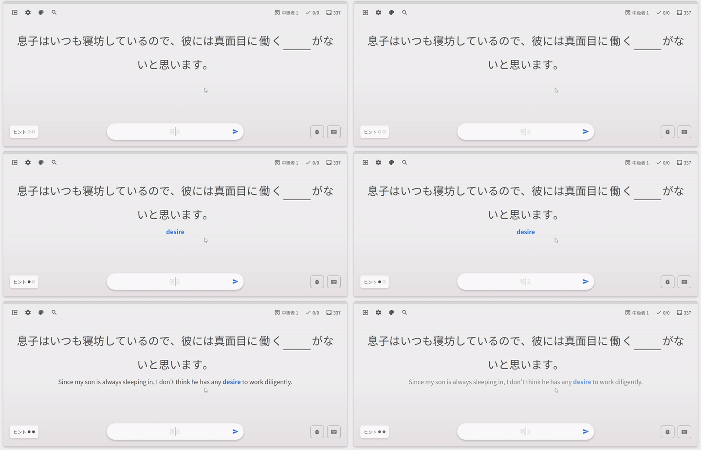
Is it intended that the blue word have fade-in animation, but the whole translation doesn’t?

Yeah that’s not a bug. Couldn’t think of a way to transition the text changing.
Think I thought of a way I could fix it though… 
Yes it did, it’s just for some reason more prominent in the new version, feels like scrolls more? But it could be my imagination 


