Really great update. Would love to see a slightly longer cram option, as I sometimes want to cram what I missed the previous day and don’t always study at the same time. Maybe like a 48h or 1 week option could be good?
Thank you!
Hi, thanks for that. Turns out it was simply the Dark Reader chrome extension. Both issues were resolved as soon as I toggled it off for the Bunpro website. Thanks!
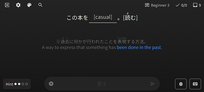
I like the change with the japanese prompt, however, at lower levels (I’m N5) it’s far too hard to read imho.
However, it feels like there is a step missing in the reviews settings.
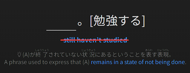
I’d like to have a translation of the prompt, but not what I’m supposed to write. The “Nuance” option shows none, the hint option on the other side shows both
The issue with language reverting back to English sometimes on Learn page has now been fixed!
Thanks for finding and reporting it, was a weird bug 
Somewhat related, ever since the new lesson layout, when I load a grammar lesson it loads the English page and then loads the Japanese page, which has two problems. The first is if you load the page and start scrolling before it loads the Japanese page, the page jumps back up to the top which is annoying. Second, if you want to go back, you have to hit back twice because the first back goes to the English page, and then the second will actually take you back
I have weird issue with scroll when an example sentence is long enough. I click into the answer field, and then the page scrolls to the top.
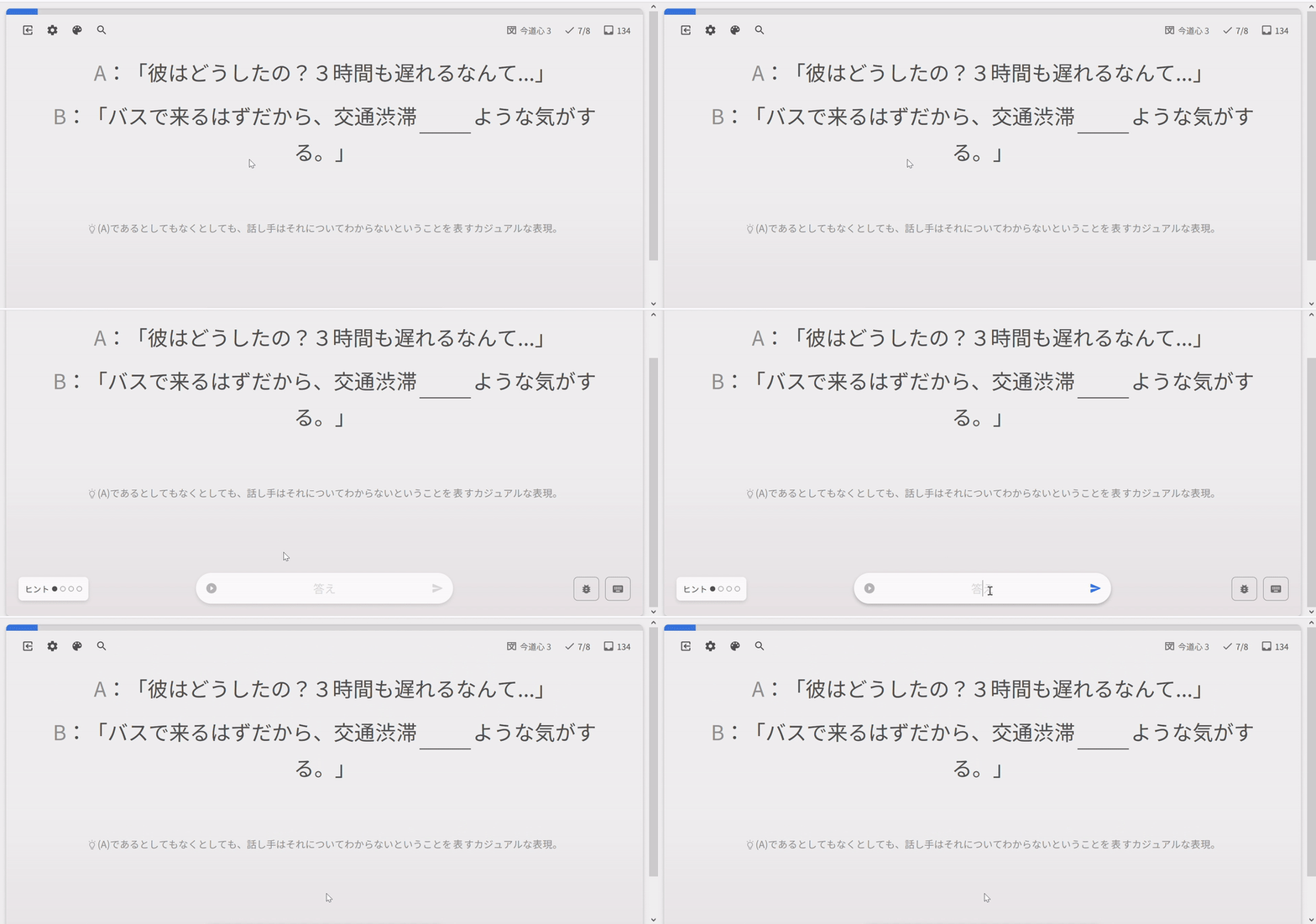
Yep, it annoys me too. I stumbled upon this weird behavior while reading grammar points. I start to scroll down and read the explanation, then the page suddenly scrolls to the top because it’s finally loaded completely.
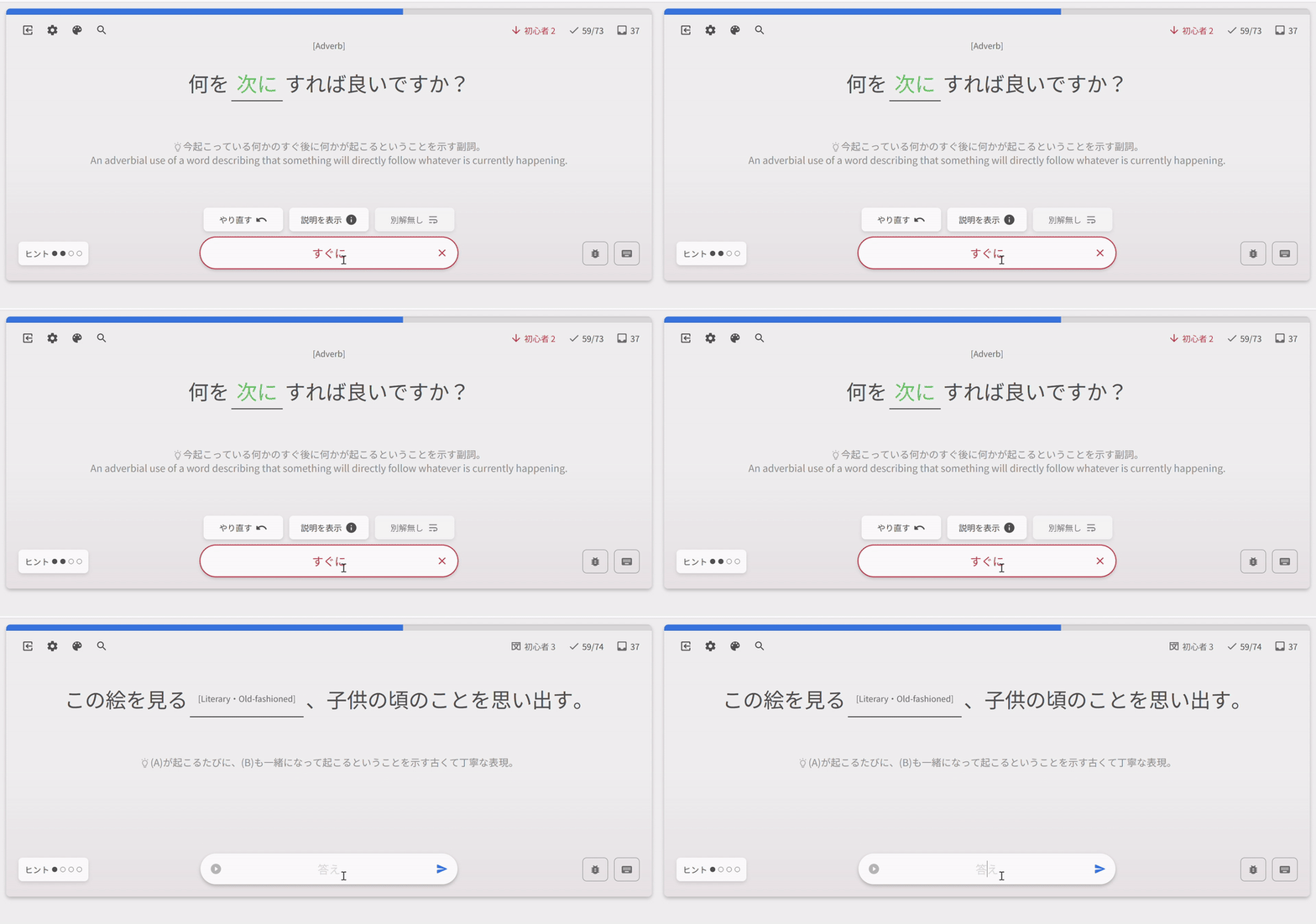
Animations are still a little buggy. These glitches happen not so often though.
Hints and translation for the next sentence flash for a tiny second:
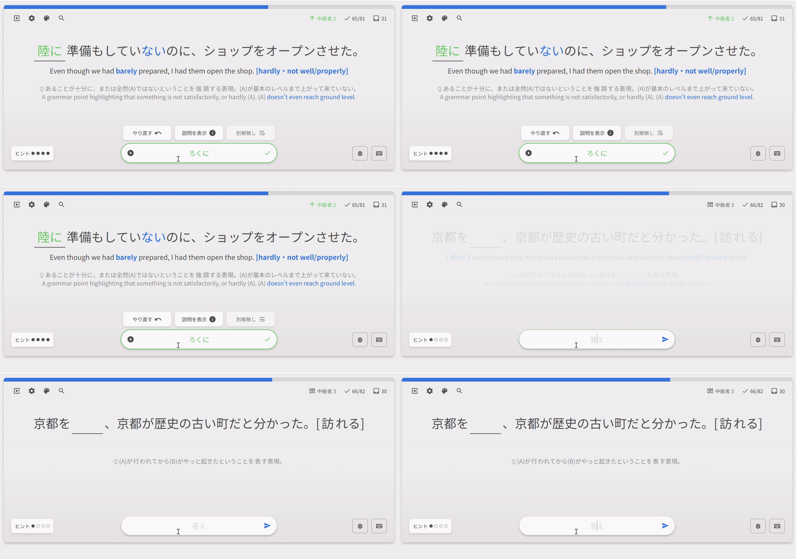
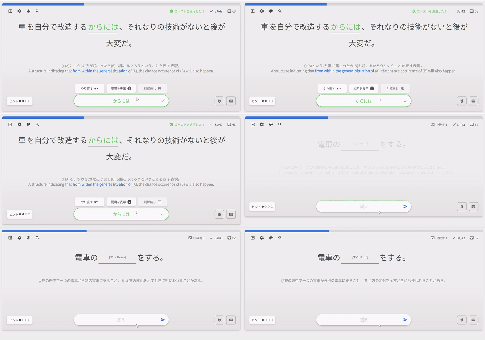
Sometimes there’s no any animation:
Hey there!
Have you tried changing the Nuance Order in Settings > General > Reviews?
Changing it to Translation First and then changing the Review English option to Hint / Show should achieve what you require!
Will fix the first thing (already know what it is) – the second one might require a bit more time!
Thanks for the find 
Sadly that doesn’t do the trick.
I only want the translation of the prompt below, no hint whatsoever:
Grammar Hint is set to Nuance first.
Review English set to
- hide just completely hides all hints
- nuance shows the japanese hint
- hint shows both a english hint and the translation of the japanese prompt (as from my first picture)
- show just shows everything
It’s interesting, because if I click manually through the hints, the second setting is exactly what I’m trying to archieve:
Ah I see what you mean!
So in addition to Hide, Nuance, Hint, Show, you want a Nuance Translation option!
I think we’ve talked about doing this in the past. Will discuss it with the team!
Selection of English translation text is broken after the recent animation update. I’d be nice to tweak z-index of the hidden text block.
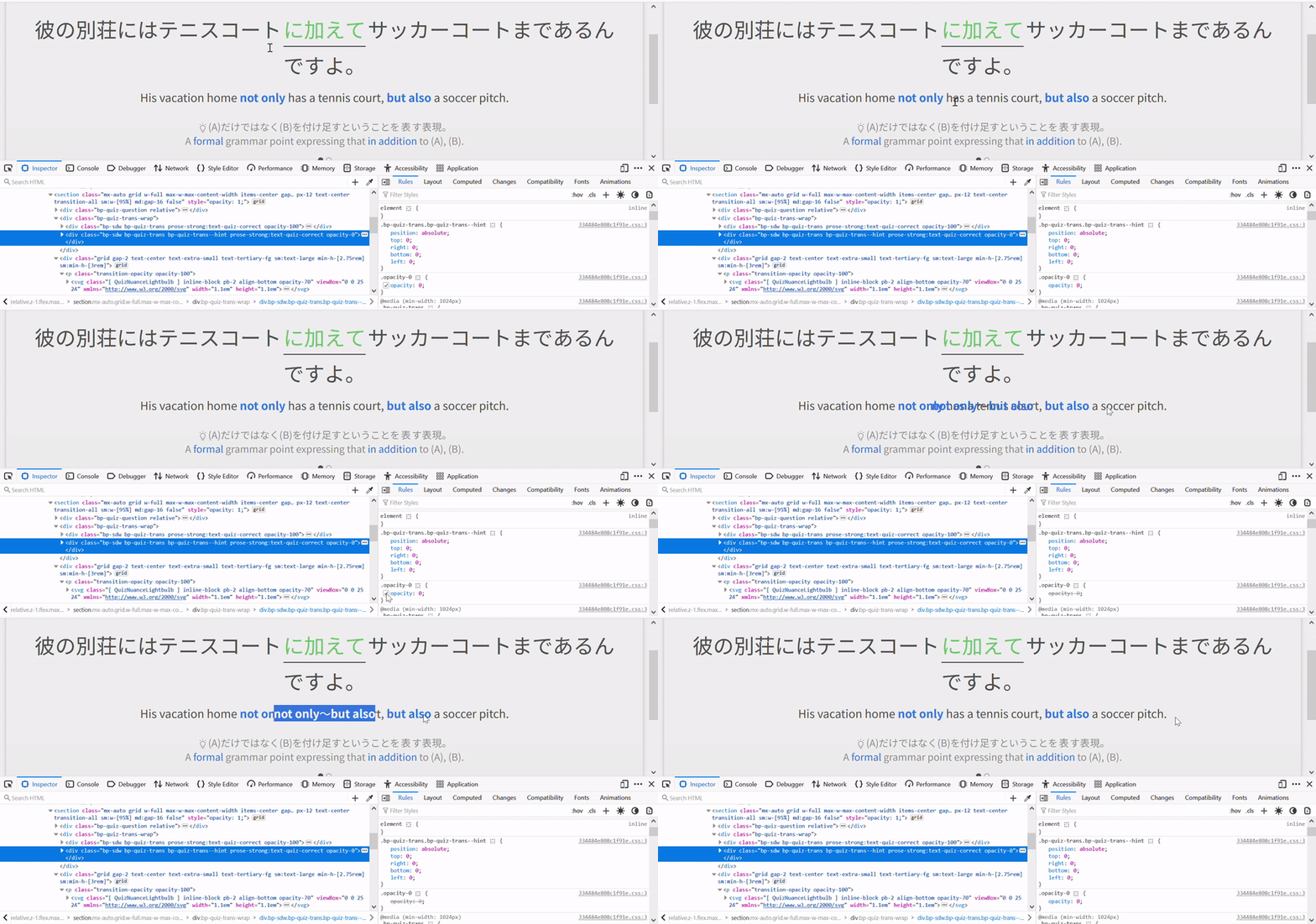
Nice find! This has been fixed.
Added visibility: hidden; to all of them, including the Nuance texts too.
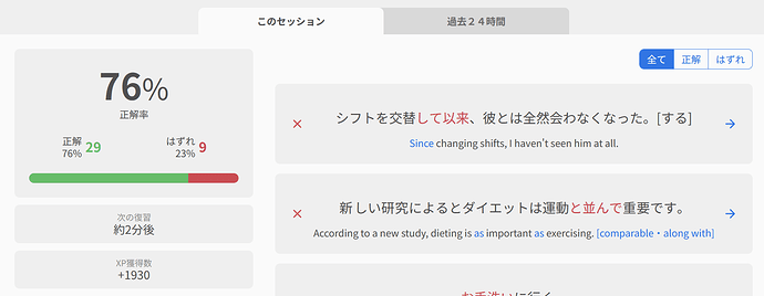
Just did a quick review session, and got summary for a previous one I did during this hour. This summary doesn’t contain any items I’ve reviewed now, only from the previous session.
At the same time,
/api/frontend/review_histories/last_session endpoint returns correct end time. But session_length counter have sum of reviewed points for my last two sessions. (Obviously, 29+9 from the screen above isn’t equal to 47.) data array have 38 objects inside it. Session ID is 2132645.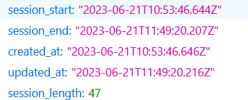
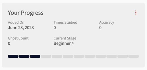
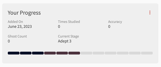
You can now directly set SRS Progress for items!
-
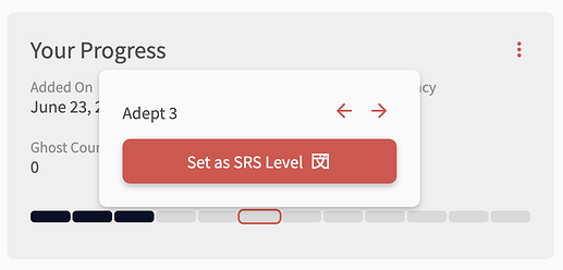
Click on the bar that corresponds to the level you want to set
-
The little menu tooltip pops up – click the ‘Set as SRS Level’ button
-
Voila! The new SRS progress has now been set.
Note: The next review for that item is timed as if you had just levelled up to that item.
E.g., if you change the level to Adept 3, it will treat it as if you just levelled from Adept 2 → Adept 3, and thus set it to 8 days in the future
Thanks @simias for the suggestion!
Check/Cross icon now fades into right arrow after submitting an answer
First, some context:
- Previously there was confusion about where the button to go the next question is (especially on mobile) after answering a question.
- This was because the ‘next’ button would change icon from an arrow to a check or cross (depending on correctness).
- It was originally implemented like this so that there was a way to identify if the submission was correct/incorrect for color-blind users (before that the next arrow would just change color)
Now, the next arrow will change into a check/cross icon (same as before), and then switch back into the next arrow.
We hope this eliminates any confusion!
-
Before answering a question
-
Directly after answering question
-
After 1.5 seconds, check-icon switches back to next arrow
Thanks to all those that submitted feedback regarding this!
@Jenkins @NearlyRemy
Amazing, thanks!
Really like Dashboard 2.0! 
It’s not a big deal, but I noticed the number above the bars on the “Forecast” bar chart disappear whenever there are no additional reviews for that particular timeslot when compared with the previous timeslot (10pm and 4am here):
Or perhaps it’s intentional, since I can see the bar colors are a little different at those times too 
It’s intentional!
Gonna make a post about the new Dashboard shortly 


