本日の文字 - Today's Character

According to Firefox, the font used for both taito and the ramen character is “Noto Sans CJK JP”, which you can see here: https://fonts.adobe.com/fonts/noto-sans-cjk-jp

What’s odd is that I can’t find this exact font on Google’s own Noto Fonts page.

I went digging in the Arch Linux packages to find where they get them from and as far as I can tell it must be these:

I think it should be this particular font:

It’s weird because on the web page if I try to display the characters in the sample text it doesn’t work, but if I download the fonts using the “download family” button and use a script to look into the files they do seem to support it:

Font static/NotoSansJP-Thin.ttf supports character U+30EDE '𰻞'
Font static/NotoSansJP-ExtraLight.ttf supports character U+30EDE '𰻞'
Font static/NotoSansJP-Light.ttf supports character U+30EDE '𰻞'
Font static/NotoSansJP-Regular.ttf supports character U+30EDE '𰻞'
Font static/NotoSansJP-Medium.ttf supports character U+30EDE '𰻞'
Font static/NotoSansJP-SemiBold.ttf supports character U+30EDE '𰻞'
Font static/NotoSansJP-Bold.ttf supports character U+30EDE '𰻞'
Font static/NotoSansJP-ExtraBold.ttf supports character U+30EDE '𰻞'
Font static/NotoSansJP-Black.ttf supports character U+30EDE '𰻞'
3 Likes

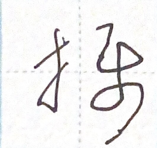
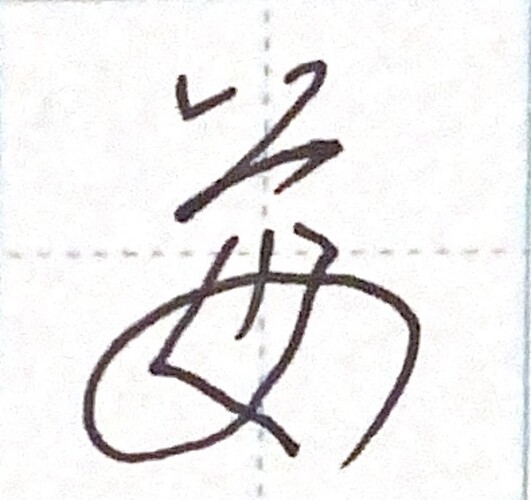
Yeah, a lot of the 草書 versions have only one or two strokes. I believe (although I might be wrong on this) that it was originally invented in China for speed purposes - I suppose like shorthand in English. However, not unlike English shorthand, 草書体 has become much less commonly read because everyone now has computers and smartphones, so it’s now basically just used as a form of art. The only times I really see it in the wild are on traditional signs for restaurants.

3 Likes

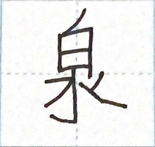
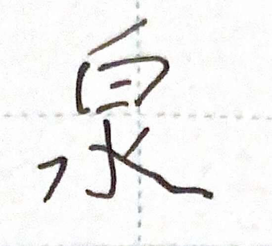
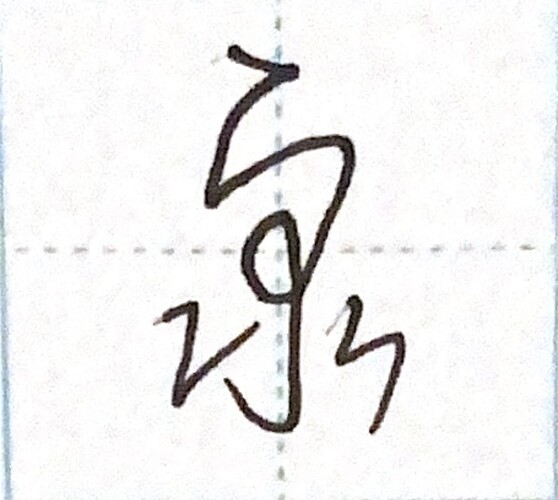
2024年1月14日(日)


訓:いずみ
音::せん
英:spring, fountain

書き順

楷書

行書

草書

メモ
I’ve just been to a hot spring with some great friends, so I thought I’d do this one tonight. My 行書 version is well off-centre, which is pretty embarrassing, but I think it’s important to publish mistakes rather than pretending my calligraphy comes off perfect every time.

7 Likes

Thank you for your answer, it would be like the gothic lettering for us then.

You seem to be right, in the light of this section of the article on 草書:

速く書くことができるように、同じく漢字の筆書体である行書とは異なり、字画の省略が大きく行われる。

5 Likes

Sadly, I still wasn’t able to make my laptop display the character…

However, I’d still like to thank you a lot for that awesome font that I discovered thanks to you :heart:

5 Likes

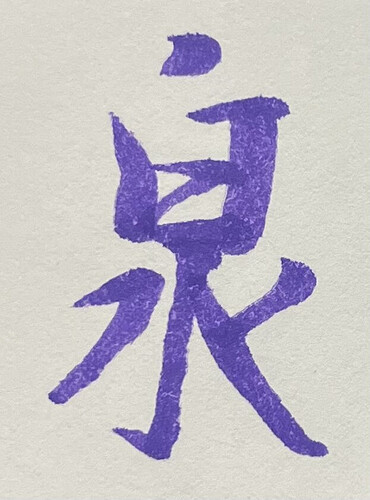
I decided it to give this one a try using the website you gave me earlier!

It took me a while to get the spacing and balance of the 行書 form to a point where I thought it looked good enough to post. I like that a “fountain” is a pillar of 白 coming out of a pool of 水。Beautiful character!

7 Likes

Nice!

2 Likes

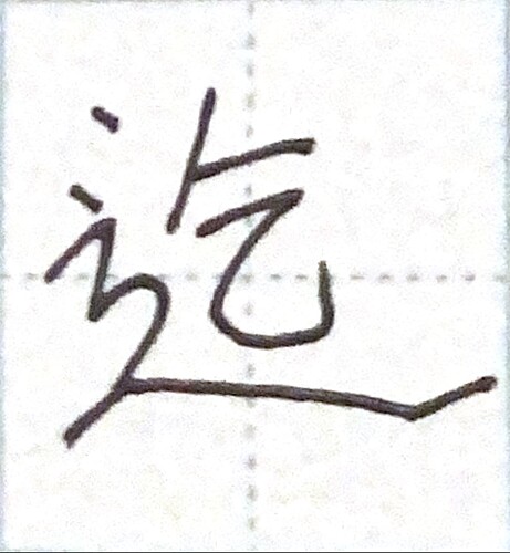
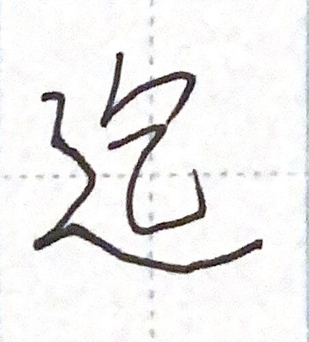
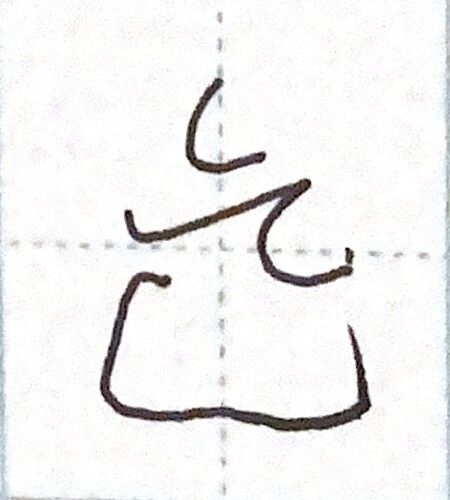
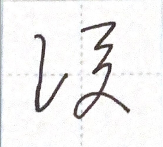
2024年1月15日(月)


訓:まで、およ.ぶ
音:きつ
英:until, up to, as far as, to the extent

書き順

楷書

行書

草書

メモ
I’d literally never even written this one until today when I saw it in my book and thought it looked nice. Notice how しんにょう is written in this one. It is one of the few that has two strokes on the top left of the character. The shape of the bottom section took me literally years to get right - and even now it’s a bit sketchy.

6 Likes

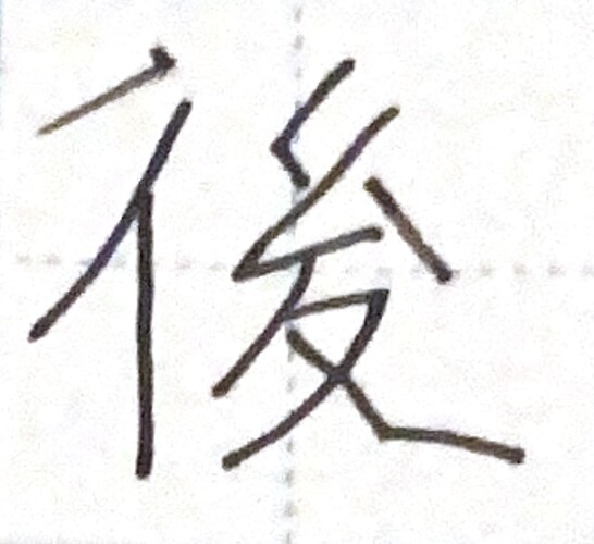
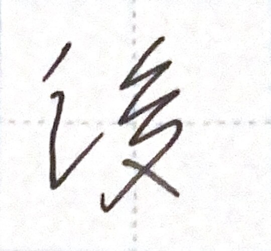
2024年1月16日(火)


訓:のち、うし.ろ、うしろ、あと、おくれ.る
音:ご、こう
英:behind, back, later

書き順

楷書

行書

草書

メモ
I always seem to write this one when I’m bored, for some reason.

6 Likes

I get it, everyone’s got their preferences. I’m more of a 前 guy myself, but I won’t scoff at what others enjoy. :wink:

3 Likes

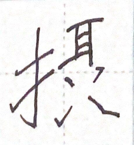
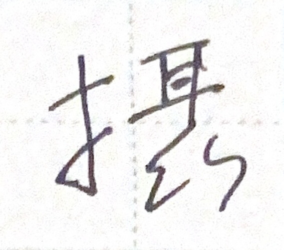
2024年1月17日(水)


訓:おさ.める、かね.る、と.る
音:せつ、しょう
英:vicarious, surrogate, act in addition to, take in, absorb

書き順

楷書

行書

草書

メモ
I was just looking at a few characters including 耳, so I went for this one.

7 Likes

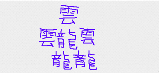
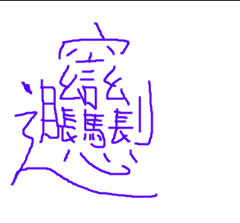
Here are my best attempts at writing taito and biang :rofl:
2e1fa00de717ae30fecea61b821e06c170bf1ccc

7a4d0995851249aae52223903596b6ebdd7fbc53

5 Likes

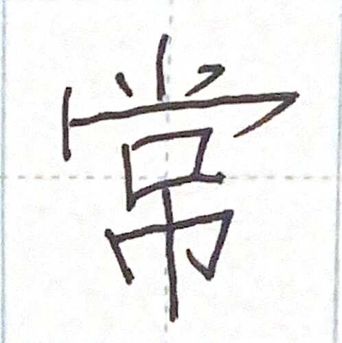
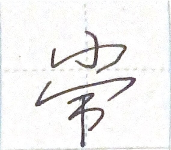
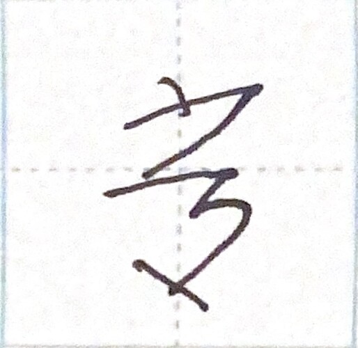
2024年1月18日(木)


訓:つね、とこ-
音:じょう
英:usual, ordinary, normal, common, regular, continually, always, long-lasting

書き順

楷書

行書

草書

メモ
This one popped up on my assignment this month and I couldn’t quite get it right. The top is supposed to be wide and the bottom is supposed to be slim.

6 Likes

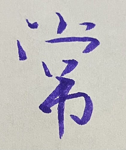
Gave a different 行書 form of this a try!

And here was my reference:

Instead of running the same thing over and over again, I gave this one a bit more of a methodical approach. Busted out the red (brush) pen after each try and added my own notes!

4 Likes

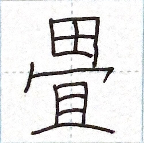
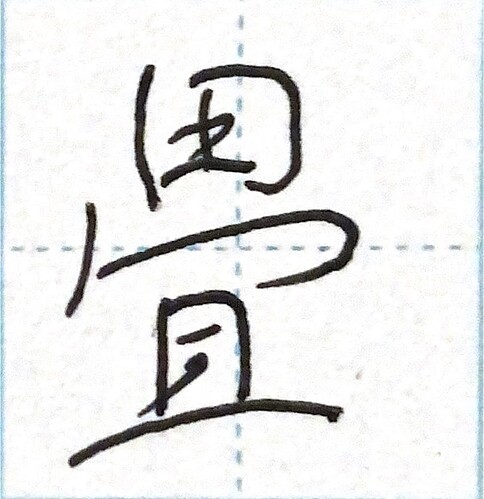
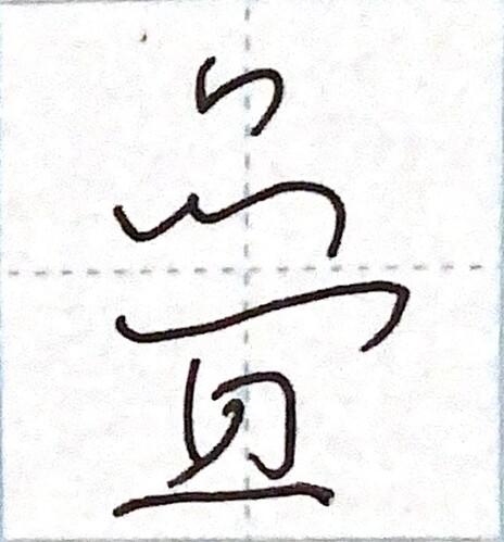
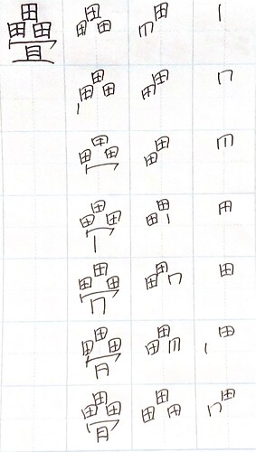
2024年1月19日(金)


訓:たた.む、たたみ、かさ.なる
音:じょう、ちょう
英:tatami mat, counter for tatami mats, fold, shut up, do away with

書き順

楷書

行書

草書

メモ
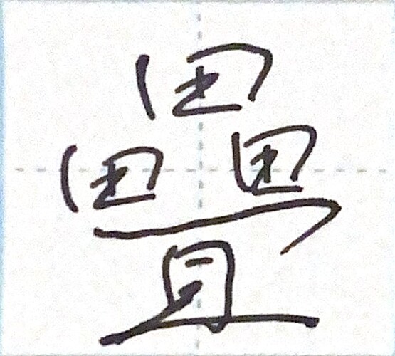
Sorry I’m late on again. I’ll use the opportunity to do a pairing-up one! Look at the one below for the explanation of the 草書 version.

5 Likes

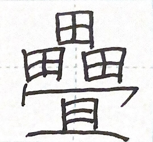
2024年1月20日(土)


訓:たた.む、たたみ、かさ.なる、かさ.ねる
音:じょう、ちょう
英:tatami, counter for tatami mats, fold, shut up, do away with

書き順

楷書

行書

草書

メモ
OK so I cheated a little bit here by using the same picture as I did in the previous post, but this is the original form of tatami.

5 Likes

No worries! Everyone has a busy day once in a while.

So both characters mean Tatami Mat? I guess people got tired of writing out 田 3 times so they just shortened it to one? I don’t think I blame them!

2 Likes

Yeah. There are lots of characters like this - they started off complicated and simplified over time.

3 Likes

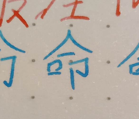
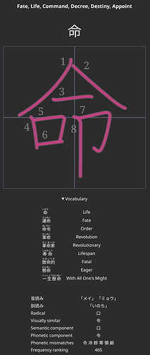
I thought my 命 looked cute today:

4 Likes

2024年1月21日(日)


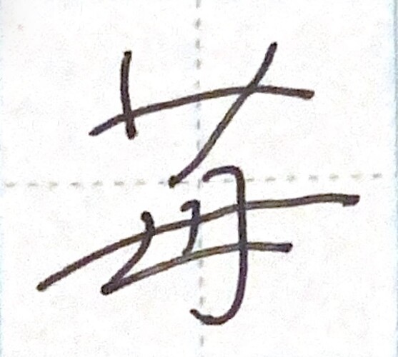
訓:いちご
音:ばい、まい
英:strawberry

書き順

楷書

行書

草書

メモ
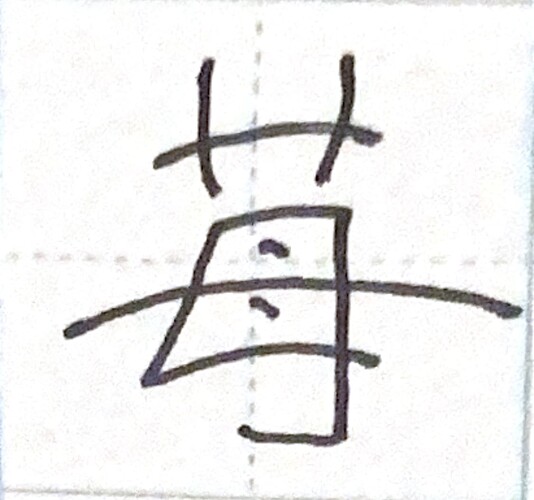
I bought some lively strawberries from my ex-colleague’s farm today, so this seemed like the natural option.

4 Likes