However, it says this under review activity for me:
Error Loading Chart: Chart.js - Moment.js could not be found! You must include it before Chart.js to use the time scale. Download at https://momentjs.com
Wow, that was quite the surprise this morning to log in to a whole new look. I’m liking it so far, though! I’ve always been a fan of seeing a whole bunch of info in one place; I’m especially liking the review forecast feature.
Would it be possible to be able to toggle whether we’d like to see latest community posts? It doesn’t really feel like it has a place among all the grammar stats, and it’s a huge portion of the screen as-is. I personally am unlikely to ever check it; if I want to see what the forums are up to, I can just click the Community link, which shows recent posts on that page anyway.
Overall I think you’re headed in the right direction, but there are still some minor flaws. I am seconding some critiques and adding my own:
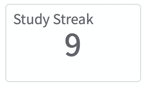
I would prefer to see the streak/xp/JLPT progress module first, but currently it comes in the third row on my (not particularly small) laptop screen and the sixth row on my iPhone. In both cases I have to scroll to see this information.
I am not sure why I need a module for my current path and a module to take me to reviews on the desktop version; I can use the exact same buttons in the menu bar a few pixels higher. I would remove these modules from the desktop version.
I don’t think the module with community posts fits in very well. Like @eefara pointed out, there is already such an overview one click away under ‘Community’ in the menu bar. At the very least, this module could also be removed on the desktop version.
The above three points could all be solved by allowing users to turn individual modules on or off and to re-order them on their dashboard. There seems to be some disagreement about which modules are useful and which aren’t, so you are unlikely to find a layout that will make everyone happy.
The percentage in Review Summary doesn’t seem correct to me. It says 25%, but when I click on ‘Full Details’ it tells me I got 80%.
I love Review Activity and Review Forecast, though there currently doesn’t seem to be any way to see review activity further back than 30 days, correct (besides going to the Stats page that is)? I think Anki has implemented their statistics quite well. You can choose between activity/forecast for 1 month, 3 months, 1 year and all.
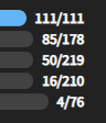
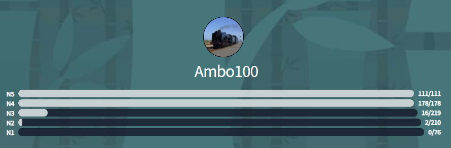
The differing lengths of the JLPT progress bars do look a bit funny, just like the oversized ‘study streak’ and ‘XP’ numbers, which are also centered a bit funnily:
The green “Sign in successful! Happy studying!” bar seems particularly jarring with this new design. I’ve always found it a bit superfluous (is it really that hard to tell whether you’re logged in…?), but for some reason I find the space it takes up extra annoying in this new design.
Some general bugs I’ve noticed just now (eta it seems this might have had something to do with the fact Bunpro went down for a few seconds immediately after I typed this):
It seems Bunpro is reeeeeaaaally slow at the moment. I am not sure if that has anything to do with this redesign.
When my reviews were over (full blue bar at the top), the same questions would just be coming back as if I’d never done them; a never-ending review session.
That would be super neat, though quite a bit of work I can imagine?
Same for me, it says 9.25%, but I’m pretty sure I did better than that today.
Like, a little slider function would be neat.
I would also love to zoom in on the review forecast, where you can see the per-hour reviews. “Reviews later today” doesn’t really tell me whether it’s going to be here in 12 minutes or in 12 hours.
Also not sure if this is a bug, when you press badges you go back to the old layout, which is not a problem, but when I press profile in this view, I go back to the old profile page. Wouldn’t it make sense to have that refer to the new profile page?
Hi, thank you for this new dashboard layout, I love it!
I agree with others that a per-hour review forecast would be great (at least for the present day and the next day), in order to better choose the review slot at work (during legit breaks, of course ).
I have got the same bug for the percentage in the review summary, and the length of JLPT progress bars (mine all have a different length).
Edit: and in the progress bar, the total numbers are wrong (it says 0/0 review, with a percent of NaN).
That’s from the user script BunPro: JLPT Percentage which is broken because the markup (HTML) changed. You can disable it until it is updated but the BunPro team can’t do anything about this.
Looking good! But one thing that bothers me a bit is that the progress bars aren’t a fixed width on the dashboard or profile, especially because the last levels have fewer items.
Your concerns are valid and I completely agree that with bunpro being a paid service, the expectation of receiving a quality product is quite high, but please remember when sharing criticism and negative feedback that the dev’s are still human like you and I. This small courtesy really goes along way and often improves the chances of your voice actually being heard.
Feedback like “This is such a mess”, “I’m disappointed you spent time on this” or “This is useless” is simply not constructive and can be incredibly demoralising to a dev team, particularly when the complaint is about a somewhat minority platform like safari on mobile (not to say it’s not an issue, but it looks great on PC).
Imagine you submitted a project to your professor or manager and you receive that sort of feedback and how it might make you feel (probably like punching them in the face ).
Source: Am a dev.
/End rant - Sorry for tangent. Not intended as a personal attack on you nekoyama, just asking that we be more kind. Let’s be thankful that improvements are actively being and that the team is somewhat responsive, it’s much more than you’ll get from alot of services!
Agree 100%. Even if there are things to fix, it’s counter-productive to personally attack the devs who spent time on improving the user experience when they didn’t have even have to in the first place.
I say the new dashboard functions really well as a summary of my progress, and it looks great! Good work devs, I’m happy to be a Bunpro user.
Aside from some basic design choices that I personally don’t like on the review forecast like the “now” bar and the inclusion of a number date even though it only shows one week at a time, it is also just broken (or really unintuitive).
When I check the API, it says that I have 20 reviews available next hour. Likewise, the forecast says that I have new reviews in a couple of minutes. However, the bar for “later today” is completely blank.
Also, speaking of, can you please add back the available next hour counter to the forecast? It was really useful for knowing exactly when I should check back to do my reviews (for instance, I could take longer breaks when I knew there would only be 2 reviews within the next hour).
The margins are great on Firefox, and it’s nice how it resizes itself with the window and on my smartphone.
The study button shows two new items and it went directly to the study screen.
The reviews button correctly shows 10 when I started and 0 when I finished.
The streak and xp numbers are huge, which is consistent with modern website design to be easily read on smartphones.
The profile progress bars are now formatted to make the numbers look neater than before. It probably could use a tweak to make the bars themselves even.
I’m glad you spent time on this. This has a clean, modern look to it, and I’m sure this addresses comments from users that you’ve received over the years.
And on top of that I’m glad that I can return to Bunpro everyday to learn a little more grammar and learn a little something special from the community. Bunpro is literally the first thing I want to do every morning.
I absolutely love the new graphical representation of the reviews coming up over the next few days. However, I lost the ability to see when my reviews are coming up later in the day. Bunpro is a high enough priority that I will plan things around my upcoming reviews and it is tough to do that without knowing when in the day they will be.
Thanks so much for spending time on this guys… Just a bit of feedback for you (mostly replying to others who have already replied.)
Seconded. This is pretty annoying as it looks like I have something I need to do.
This is really strange, as the more my percentage goes up, the more the percentage on the new home screen goes down…
As a PC user I disagree. I think on the PC interface it looks quite nice.
I noticed this too. Not aesthetically pleasing, but I imagine this will fix itself soon, whenever the N1 grammar point count goes over 100.
@nekoyama What time zone is your BP set to? I was doing it first thing every morning too, then the clocks went back by an hour in the UK and I lost my streak. I then changed my time zone to Japan and had @Pushindawood reinstate my streak. I don’t know if this could be your problem, but that’s just an idea.
Exactly. There are always teething problems with big changes. Just hang fire for a bit.
I’m not sure where to stand on this one. I think it looks OK, and we do need to attract more people to the community - we sometimes go whole days without even one post. But yeah three separate ways to get here does seem a little overkill… maybe…
I like this idea. Can’t see it happening soon just after a big update though.
Yeah I agree that this would be cool. With ghost reviews, I imagine everyone’s looks pretty similar - with most reviews being over the next couple of days and then hardly any afterwards.
This 100%! Please support the very small team as much as you can. They’re doing their best and want genuine feedback, nothing that’s going to make them think they’ve wasted their time.
Overall, I really like the new look and I think that although a few things need tweaking (not entirely overhauling) I think it’s a really good thing and a good step forward for the site. Looking forward to what the site has to bring us in 2021!
The naming of the hourly and weekly settings for the review forecast are a little inconsistent.
The weekly view shows a week’s forecast, but the hourly view shows a day’s worth of a forecast.
Thanks for adding this feature. I find this more fine grain information more useful.


 That would be super neat, though quite a bit of work I can imagine?
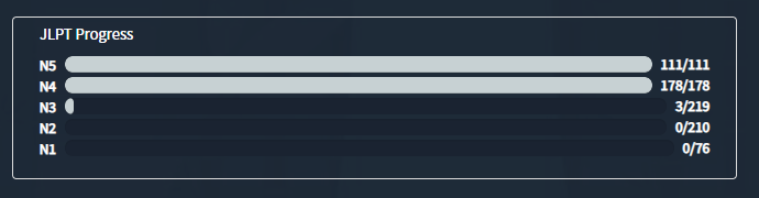
 ).
).