Bug Fixes
- Bug with grammar search and textbooks
Changes:
-
Reading Passages now have discussion topic links to community forum posts. Feel free to ask any questions or just discuss the reading passages with others!
-
New Onboarding - A new onboarding flow has been added for new users.
(If any of you would like to test it and provide feedback, I can toggle it in your account allowing you to go through it. We would love some feedback on how to make it easier for new users to get into Bunpro. Just let me know in the comments or reach out via email!) -
Grammar Points - Added a couple of fields that once we set up will improve the grammar point meaning tab.
-
Textbook Setting - You can now set or change your textbook via settings
Beta Changes:
- Reading Passages are now globally available. We will continue to release more with the N3 batch expected by the end of this month!
July 2nd Update
Bug Fixes
- Bunpro Logo on Mobile didn’t respect start page setting.
- Stats page Breakdown by level counted removed reviews in its total
Changes:
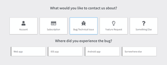
- Better feedback
- Feedback now includes a specific topic/category as well as the extra detail field. This will allow us to more quickly respond to and better manage all the inquires and reports we receive.
- Feedback now includes a specific topic/category as well as the extra detail field. This will allow us to more quickly respond to and better manage all the inquires and reports we receive.
- Options dropdown for search now includes N1
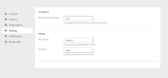
- Left & Right side mobile navigation
- In your settings you can choose between left and right handed. The navigation will slide in and be positioned on the corresponding side.
- In your settings you can choose between left and right handed. The navigation will slide in and be positioned on the corresponding side.
- You can now delete notes
- Deleting a note will remove the note icon from the grammar point tile.
Beta Changes:
- Toggle Furigana Button
- Superscript Bugs in vertical mode
- Would overlap other text
- Was horizontal
Forum Fixes
- Bugs for Lightmode theme
- Weird banner size
- Warning button color
- Dropdown color for do not disturb & logout
- Email notifications are now active again
Grammar Point Consistency Changes
- Replaced all /'s with ・
- Replaced all ~'s with ~
- Kanji added for all grammar. Rare kanji will have a caution, rather than displaying the kanji in the title.
June 24th Update
New Stuff
-
Grammar is public.
- Previously you needed to sign up and be logged in to see any grammar. Now anyone can see the Lite version of each grammar point without an account. This will allow you to share a link to a grammar point and have the open graph protocol preview show.
-
All grammar now have friendly URLs.
- https://bunpro.jp/grammar_points/1 → https://bunpro/grammar_points/だ.
- Old urls with numbers will still work though

- There is a “Share” option that copies the URL. You can find it below the Structure section.
-
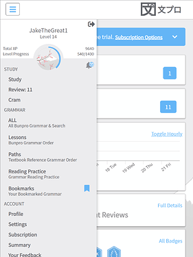
New Mobile Side Drawer
- Navigation on mobile was, to put it gently…awful. The new mobile side drawer should make navigation much easier. Please let us know if you have any feedback.
- Navigation on mobile was, to put it gently…awful. The new mobile side drawer should make navigation much easier. Please let us know if you have any feedback.
-
Versioning & More Transparent Updates
- Version info with a link to the latest updates
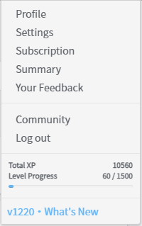
- Additionally, the updates will include more transparency on changes and bug fixes. In the past they were simply notes as “Minor Changes” or “Various Bug Fixes”. This doesn’t give you any insight into the work that goes on behind the scenes. Going forward the changes will be listed out in more detail.
- A public roadmap & release calendar - While not here yet, we do hope to implement both of these in the near future to better organize feedback and give you a sense of the direction of the site.
- Version info with a link to the latest updates
Beta Features
You can see more about these features in depth, give feedback or make suggestions here: Bunpro Beta [July 30th, 2021]
-
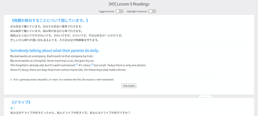
Reading Practice [N5 is live and N4 will be released in the near future]
- Features:
- Toggle vertical text
- Highlight grammar
- Click on grammar to get a quick overview
- Detailed notes on the trickier/nuanced parts.
- Features:
-
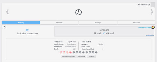
Review Data on Grammar Points
- General info such as: when you first studied it, timing of last review and next review
- Stats such as: Times Reviewed & Accuracy
- Info on ghosts (if applicable) Ghost count & Ghosts vanquished
-
Mass Select Grammar
- Mark Known
- Add To Reviews
- Study
Bug Fixes
- A Bug with notes in reviews
- Bug with how reviews tracked total times correct/incorrect
- Bug with Sale banner appearing when it shouldn’t
Changes
- Audio now loads on demand in example sentences rather than being preloaded.
- Page speed optimizations to reduce render time
- Overall reduction in asset file size (roughly 3x reduction)
- Remember me is checked by default
- Dark Mode is now the default (if you use another theme, this will only affect you when logged out)
- [Dark Mode] - Change hover color in navbar
- Color change for example sentence name highlighting to make it more visible for those with color blindness
- Switch to use Noto Sans JP exclusively with varying font weights.
Classic Theme Sunsetting
- Classic theme still exists but won’t be supported in upcoming UI changes or across new features
- We want to make the modern themes (light or dark) appealing so please provide any feedback on changes that will make the transition easier for you.
The future of Bunpro
You may have noticed the lack of consistent updates and transparency over the past year as well as the slow progress turning out new content. We have worked to eliminate the internal processes and factors preventing innovation and growth and will continue to do so going forward. Our goal is, and always will be, to make your Japanese language learning journey easier and hopefully delight you along the way.
We’re hiring
Just a small plug: maybe you or someone you know would be amazing for one of the open positions we have! Competitive pay, fully remote, flex time and a bunch of other benefits
As always, we value your feedback, suggestions and criticisms and will continue to do our best to iterate upon and improve Bunpro. 


