
Any thoughts on what might make one of the modern themes work for you?
The work you guys put into this site is crazy !
These features are amazing! 
I expect to see the virtual AI “Bunpro Sensei” in a couple years. 
2 Likes
I’ve just learned about its existence. Other themes look so plain and boring comparing to it.
I prefer the darker themes but it feels like some of the colours are inconsistent. Low contrast on some things like dark red on black or light grey or a darker grey.
I think it would be worth finding a limited colour palette for each theme and trying to stay consistent and ensuring they pass certain standards for contrast.
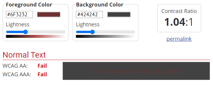
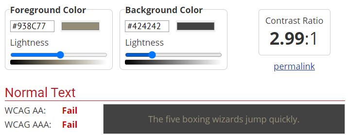
In fairness I have found designing dark themes to be a bit harder but the Material Design documentation by Google give some really good advice.
4 Likes
I think the font could use some tweaks.
On the progress bars, the numbers seem too small now. On my laptop screen, they don’t look as clear compared to before. I know I can change the general font size but, with the next larger size, now things don’t fit on one screen.
Also, with the reviews, now the regular font is so thin that it seems almost faded. You almost can’t even tell that the regular English letters are in two colors. The font of my comment here has easier-to-read font.
Just my impressions. Overall still impressed with the updates. 
3 Likes
I think it goes back to the contrast rules that @Ambo100 was talking about. Classic theme, the thinner font still holds up pretty well and looks good IMO but your screen share for light mode is not as pleasing to my eyes.
2 Likes
New mobile side drawer works great, thanks!
But the link under the Bunpro logo always leads to the dashboard regardless of “Start Page” setting. Looks like a bug for me.
2 Likes
That’s a great starting point thank you! I will look into improving the contrast.
@FredKore like @s1212z mentioned hopefully the contrast changes @Ambo100 suggested will help fix that.
@HotAirGun I believe you are right. I will get that fixed.
3 Likes
black gives a bit better contrast for text though maybe, especially with light gray and light blue. but could be worth a try. still, i like the current dark dashboard.
3 Likes
This is so cool! I also immediately noticed the font change and went to look for an update notice!
(You can tell how up to date I am on my reviews with how long it took me to notice haha…)
3 Likes
I’ve been with you for well over three years now and it’s great to have seen the site go from strength to strength. I’m super proud to have been on the ride with you guys and I’m looking forward to the future of BP! 
9 Likes
July 2nd Update
Bug Fixes
- Bunpro Logo on Mobile didn’t respect start page setting.
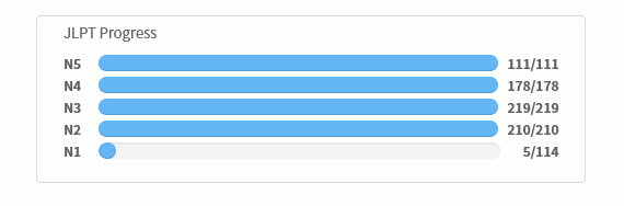
- Stats page Breakdown by level counted removed reviews in its total
Changes:
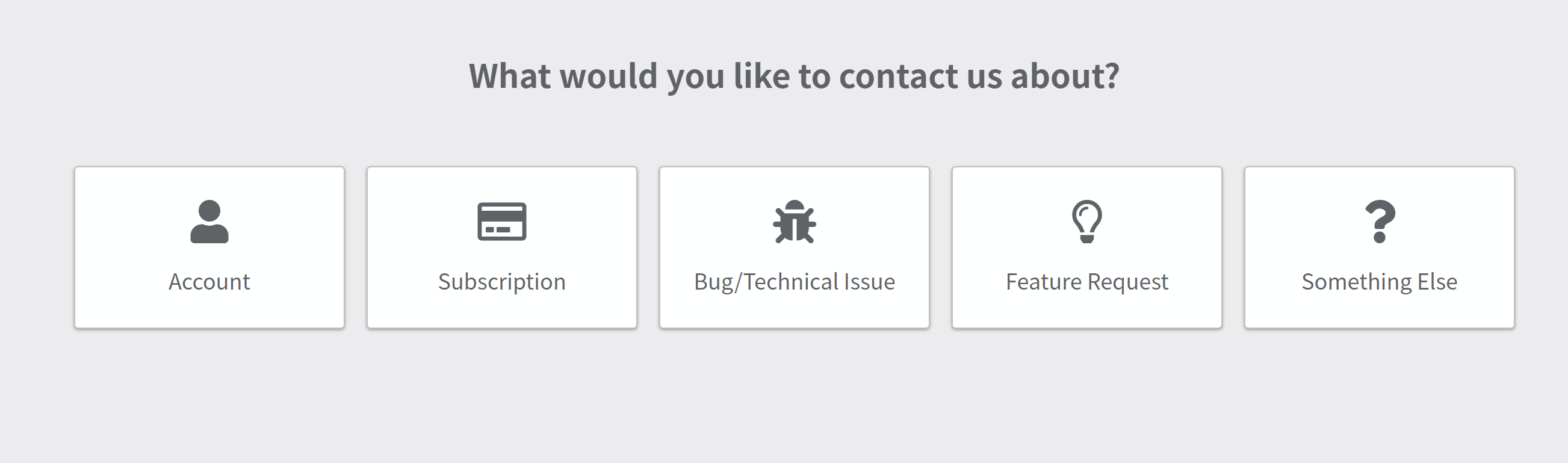
- Better feedback
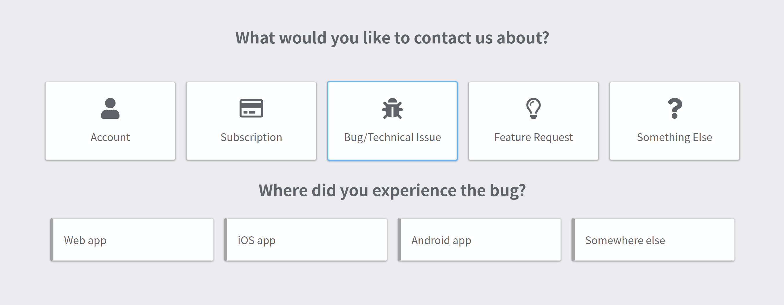
- Feedback now includes a specific topic/category as well as the extra detail field. This will allow us to more quickly respond to and better manage all the inquires and reports we receive.
- Feedback now includes a specific topic/category as well as the extra detail field. This will allow us to more quickly respond to and better manage all the inquires and reports we receive.
- Options dropdown for search now includes N1
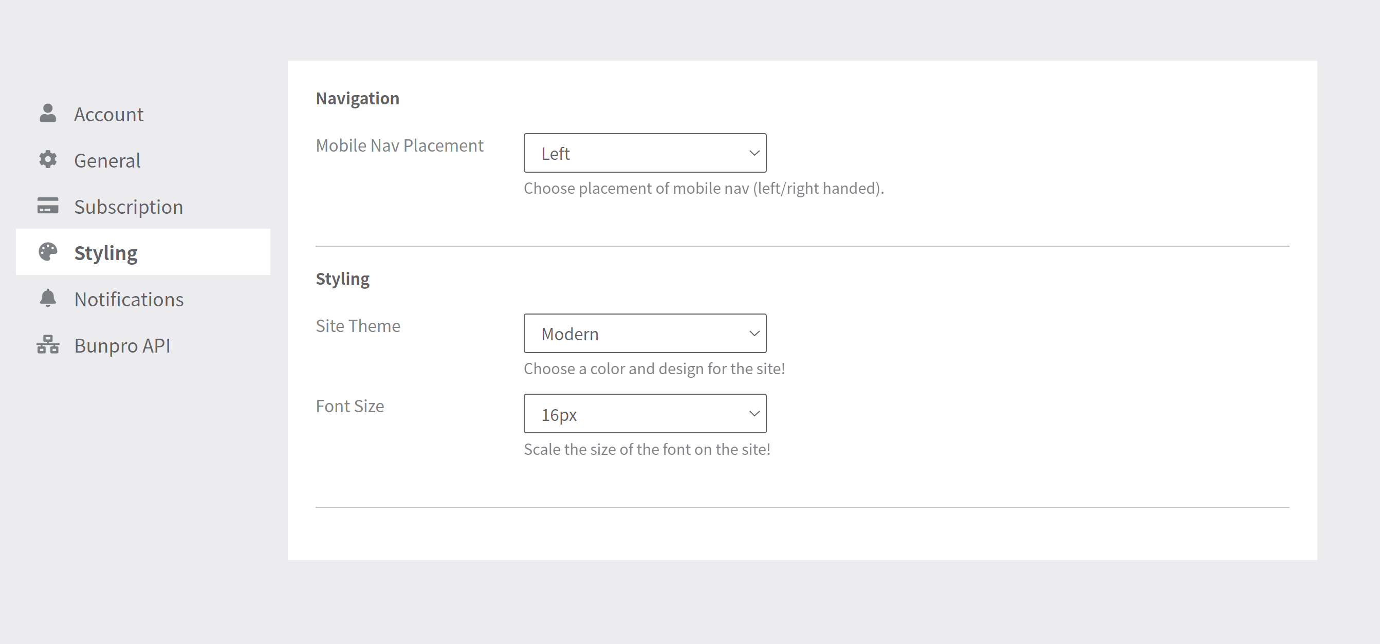
- Left & Right side mobile navigation
- In your settings you can choose between left and right handed. The navigation will slide in and be positioned on the corresponding side.
- In your settings you can choose between left and right handed. The navigation will slide in and be positioned on the corresponding side.
- You can now delete notes
- Deleting a note will remove the note icon from the grammar point tile.
Beta Changes:
- Toggle Furigana Button
- Superscript Bugs in vertical mode
- Would overlap other text
- Was horizontal
Forum Fixes
- Bugs for Lightmode theme
- Weird banner size
- Warning button color
- Dropdown color for do not disturb & logout
- Email notifications are now active again
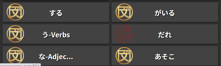
Grammar Point Consistency Changes
- Replaced all /'s with ・
- Replaced all ~'s with ~
- Kanji added for all grammar. Rare kanji will have a caution, rather than displaying the kanji in the title.
10 Likes

4 Likes
Bunpro Logo on Mobile didn’t respect start page setting.
Thanks, it works great!
Is it possible to hide the mobile header in the reviews mode? It takes too much place, I don’t see my XP bar now 
2 Likes
Just wanted thank you guys for implimenting my suggestion about the side the menu pops up on. Probably the first app ever to impliment my suggestion about undoing a change in UI. 本当にありがとうございます
7 Likes
July 13th
Bug Fixes
- Bug with grammar search and textbooks
Changes:
-
Reading Passages now have discussion topic links to community forum posts. Feel free to ask any questions or just discuss the reading passages with others!
-
New Onboarding - A new onboarding flow has been added for new users.
(If any of you would like to test it and provide feedback, I can toggle it in your account allowing you to go through it. We would love some feedback on how to make it easier for new users to get into Bunpro. Just let me know in the comments or reach out via email!) -
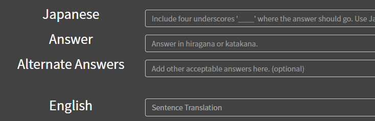
Grammar Points - Added a couple of fields that once we set up will improve the grammar point meaning tab.
-
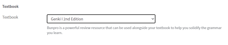
Textbook Setting - You can now set or change your textbook via settings
Beta Changes:
- Reading Passages are now globally available. We will continue to release more with the N3 batch expected by the end of this month!
14 Likes
I’d be down to check out the on boarding page! Excited for the Reading discussion threads, hopefully it encourages others to ask any and all questions that may pop up.
2 Likes
I fell off the wagon, so I just reset all my progress. I’d be happy to test the onboarding if possible! Thanks!
2 Likes
Thanks! I have triggered it for your account. Please let us know any feedback you have!
3 Likes
Everything looked really smooth. I didn’t look as closely as I should have though since I was planning to go back but it put me in reviews before I realized it. haha.
The only thing that I can think of right now is I saw where it recommended not doing too much, which I think is good to have. But did you have a choice on that page to choose how many reviews you want to do per day? It was weird it recommended 1-2 and then instantly started with 3 reviews when you clicked next(but maybe it was there and I overlooked it).
It may be good to have them choose 1-3/4 a day in a box and then a note that they can adjust that in settings later if they want to change it or go higher than 4.
Again, if it’s already there I apologize haha.
If you can reset me one more time I’d appreciate it. I’d like to go through it again in more detail!
3 Likes