
Thank you guys SO much! I can do Bunpro at work again 
5 Likes
Not sure if it came with this particular update but I noticed that there is now a color blindness setting for the review colors. While this isn’t necessary for my particular color blindness. The studied grammar point markers are still an issue.
Now while I am able to see the symbols on the left it takes significant staring to do so. And is practically impossible if outdoors.
Since you guys are already doing a number of graphical changes I would like to request that this particular symbol be modified. I don’t know what would work best for most people: maybe something like changing the color or placing a contrastive glow around the symbol might work?
I tried playing with the filters on my phone real quick and found two combinations that significantly improved my personal ability to see the symbols.
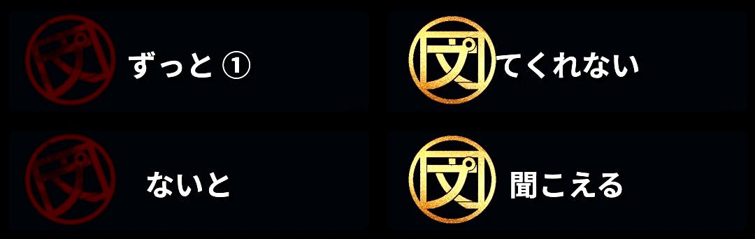
Both seem to achieve better visibility through higher contrast with the background. Based on that I think adding a glow effect like those available in Word would be the best option to improve visibility.
Thank you for all your hard work and effort to continue to improve Bunpro. よろしくお願いします!
2 Likes
Or they could just display the SRS level interval on the top right corner if you have colorblind enabled in settings.
3 Likes
To be fair, this is hard for me (not colorblind) to see too. The values are really close to the background.
4 Likes
Displaying the SRS interval on the point actual sounds like a feature in and of itself.
2 Likes
This isn’t just a colour blindness issue. I don’t think it is particularly accessible for most people and one of the reasons I hesitated changing to the dark theme from the classic one.
4 Likes
I’m glad some other people are having this issue as well. I guess I assumed it was a color blind issue cause I’ve had a similar problem with red chalk on grey blackboards before. Hopefully since more people are having this issue it’ll be addressed sooner.
3 Likes
I have not had new lessons for a few days so have not seen some of the changes. I like the layout but I am not sure whether anyone found the following inconvenient: Normally my English sentences are hidden but sometimes I will view them and then hide them again (so that my eye is not drawn to it anymore). Now after showing the English, I have to scroll up to the top to hide it. It would be really good to have the option of “hide English” on the sentence level, next to the sentence. (Before the changes, if I clicked on the English sentence, it was hidden and I quite liked that option.)
4 Likes
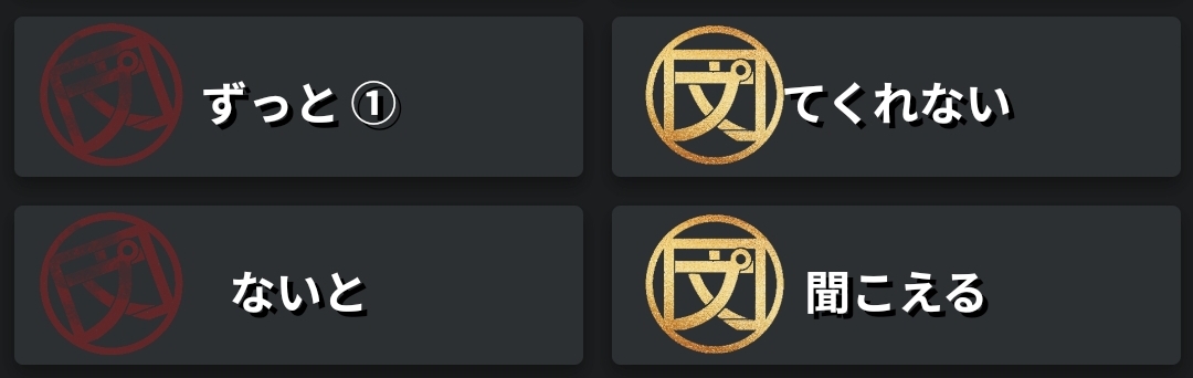
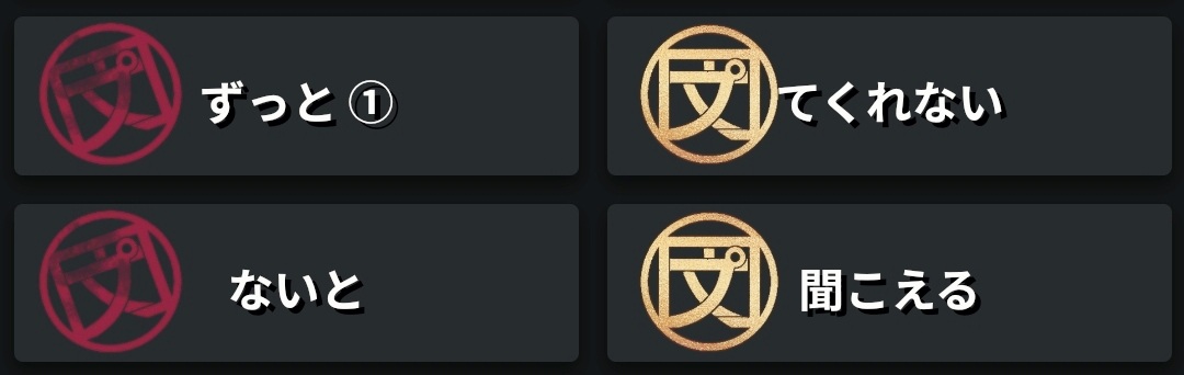
@conan @Ambo100 The hanko on the tiles have been updated to stand out more. Any thoughts?
@JoaoPLF We moved the actions and progress info out of the tab so it is visible across all tabs now.
@HotAirGun Mouse wheel click works again 
@Megumin how does the accuracy show now?
6 Likes
Much better, thank you! 
4 Likes
Looks like it’s working.
It’s hard to validate the numbers because I lack information on that panel, but at least is not going over 100%, so I think it’s fixed.
Thanks
4 Likes
Fortunately with basic HTML knowledge you can still hack it in by using Inspect the element and changing option’s value to Classic
c00lhaxx1ŋ

e.g. if you have Modern theme, change value= attribute of Modern Dark, then change the option in popup to Modern Dark, so browser definitely will send to server “please use value of Modern Dark theme” (which is now Classic) and switch to another tab like “General”. And now you’ll have the lovely background back.
And with the latest updates there is even no white on white text in Classic UI, which makes it even better.
2 Likes
Awesome, thanks for the workaround! It worked for me 
2 Likes
Sorry for the delayed response, I waiting for a chance to use it in the sun.
So they’re definitely easier to see when viewing inside but still almost impossible to see when outside.
I threw this together real quick in word and it drastically improved the visibility outside:
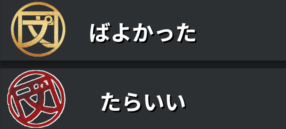
Basically just adding a 3px white glow to the outside of the shape. Thoughts?
1 Like
The image has to be reworked if they going to add the glow, because it looks bad specially on this side:

1 Like
Those artifacts are just due to the “remove background” tool in Word. I didn’t try and make it super accurate. Just enough to demonstrate my idea.
1 Like
Ideally we want to redesign the SRS Progress seal, and I’m already considering what you guys mentioned here for the future update.
For now though, I’d like to hear your thoughts on a fix like this? Temporary of course.
It’s just a white cirlce rather than an outline, and an option without as much white because it might look a bit tacky to have 100% white all around.

3 Likes
I use light mode, but for options you showed, the ‘less white’ one looks best. Something more subtle against the darker background both fits the darker theme and is softer on my eyes.
1 Like