Update - Sept 13th [All Questions have Kanji Answers]

Greetings everyone!

It has been a while since our last official update. However, in general we try to push updates weekly or several times a week depending on what we’re working on. These are usually all small things not large enough to justify an update on their own. Therefore, many of the things mentioned below have been live for up to a couple of weeks while some are newer. The newer ones may draw a bit more attention :wink:.


New Stuff

Kanji Answers
We had some great discussion around this here: Feedback Request: Kanji Answers. Thank you to everyone who took time to answer the poll(s) and provide feedback.

  • The general consensus was that allowing Japanese IME input in the form of kanji would potentially have more pitfalls than benefits.
  • However, the existing hiragana-only input has a major draw back in that it doesn’t allow you to strengthen the mental connection between what you wrote and how grammar is usually displayed with kanji.
  • We have begun the process of providing kanji for all of the sentences
  • Currently kanji is available for sentences in N5-N3 grammar.
  • N2 and N1 are being worked on as we speak.
  • Kanji is available not only on the accepted answer, but also on all alternate grammar that can be cycled for the current grammar point.
  • Kanji have furigana that will be displayed based on your furigana settings

    As always we would love to hear any feedback you have about this!

Answer Error Highlighting
This primarily highlights typos in answers to give you a better idea on where you went wrong.
Here are a couple examples of having too much or too little.


New Header
I am sure many of you noticed but we pushed a new header that @Samu, one of the new team members, built. Part of it was a visual overhaul and the other part was to redesign how notifications work. The notifications now load dynamically on request rather than on each page load. Notification icons were all updated as well.


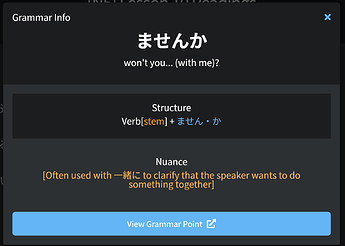
Grammar Popout Overhaul
A visual update to the way the grammar popout displays for reading passages. We have some fun stuff lined up to expand it to other parts of the site. That will come in an update next week! :partying_face:


Bug Fixes

  • Feedback form bug with data not refreshing after submitting
  • Issue with mobile scroll when toggling furigana in reviews
  • Issue with mobile when trying to select grammar points
  • Tooltip on Last Session was wrong
  • Review Activity didn’t respect time zone. (on a side note the stats reviews heatmap still has this bug but will require an overhaul to fix in the future.)
  • Review stats fixes for accuracy and last review session (beta feature)
  • Bug with selecting items in a Path
  • Clicking continue from a Study session gave an error.

Changes

  • Daily/Hourly toggle now respects what is clicked rather than toggling when clicked on any part of the parent element.
  • Changed some numerals in Reading Passage to use Japanese numerals so they aren’t displayed vertically.
  • The orange used in the light mode theme was too tough to read. It is now a darker shade.

As always, thank for all of the feedback and suggestions you give us. Bunpro truly is lucky to have such a great community of users who are vocal about ways we can improve it. We love hearing feedback about the changes we make (for better or worse).

This time, most of the changes were aimed at making your study more stress free, while giving you better information about things that may help you instantly improve your retention in some form. These changes may feel small, but we feel like small changes that don’t affect your routine, but ultimately improve your learning experience are some of the best!

63 Likes

This is great! Happy to see this stuff added ^^

Edit : Wow, just had a series of reviews, it’s amazing how noticeable of a difference seeing these kanji is, it’s a major improvement!

Ah, I saw this yesterday and was wondering if it was new or I had just completely forgotten this was a thing :stuck_out_tongue:

Anyways, lots of great stuff! Really happy with the amount of improvements that have happened recently, lots of thanks to everyone working on BunPro, it really is becoming more valuable of a resource pretty much by the day!

8 Likes

i would suggest adding the option to disable “Answer Error Highlighting” from settings, since i like giving myself unlimited attempts in guessing the grammar, as long as i don’t look it up. showing the correct answer automatically kinda ruins the process!

that’s of course if i’m not the only one who prefer a less strict version of reviews, since i know a lot of people don’t use ghosts and want their srs to be reset if the answer isn’t 100% accurate

14 Likes

The kanji addition was such a pleasant surprise this morning. I really appreciate the hard work being put in here.

5 Likes

thank you for your work, it’s good to know that stuff is happening on the platform

4 Likes

Thanks for your hard work! :pray:

But I’m kinda missing the round progressbar around avatar that was in the old header :cry:
For me it was a quick and convenient way to check the current progress (no clicks required!).

5 Likes

Wonderful! Keep up the good work :slight_smile:

3 Likes

After today’s update, something odd is going on for me running Firefox on Ubuntu.

After a review, when I press ‘a’ to view the alternate grammar, it flashes to a new version of the grammar, and immediately switches back to the original.

I don’t have this problem on Chrome, and it’s also OK on Firefox on iOS.
Only Ubuntu Firefox exhibits the issue for me.

5 Likes

Honestly, same. Being able to tell your current level and progress at a glance was very useful, and I’m honestly not sure if there are any advantages to it not being displayed. It wasn’t visually intrusive and it was perfectly positioned. Currently it’s actually hard to tell that you can even click the avatar to bring up a menu, especially since I have this one: image
It’s very faded in the light theme, nothing really indicates this is clickable, and it leads to a ton of important menu options, so it’s one of the most important elements of the UI!

The previous header not only helped with visibility, it also made it more obvious there’s important info there.

(Also, if it’s relevant in any way, I just spent about 5 minutes clicking around trying to find out how to change my avatar, couldn’t find it, and gave up lol.)

9 Likes

I’m with Xyllicate on this. If I get it wrong I dont want to be told immediately what the answer is, I want to go through the process of wracking my brain for where I went wrong and what the answer could be. This forces you to dig deep and strengthens that mental connection once you get it. I understand it only happens when your ‘close’ (like a particle missing/extra), but I would still rather work that out on my own. Once I get it after getting it wrong, I ‘undo’ it again and type a dummy answer to get it wrong again to adjust the srs and get some ghost reviews for further revision

The team is doing an amazing job here, the platform just keeps getting better and better. I’ve only been here 9 months and I have seen amazing improvements in functionality and services, all your work and responsiveness is much appreciated, and makes our lives as learners much easier.

16 Likes

I think you did a really good thing making the answers convert to kanji when you submit them. I’m kind of what’s known as extremely dumb so if something isn’t obvious I get confused. So when the kanji shows up it makes it really easy for me to see what the kanji is and what the grammar point is. And I know it should be obvious sometimes I just get confused a bit . Doesn’t apply to higher tier reviews though I’m still only in T5

2 Likes

Many thanks for the continuous content updates. For N1+ grammar, will they simply be shown alongside the N_ buttons? Furthermore, do you plan on touching classical Japanese?

5 Likes

I have some issues with the new Kanji display. After I input my answer, it shows the answer as:

Kanji (Furigana) Rest

and then after about half a second it switches to the usual formatting where the Furigana is displayed on top.

This is not really completely game breaking, but the constant switching is really annoying and gets soon pretty tiring on my eyes.

In addition if I try to show different correct solutions it gets stuck (I think usually after the second solution but I’m not sure if that’s always the case)

edit: I don’t know if it’s relevant to the problem, but every time I switch the solutions, the same “flickering” with the Kanji/Furigana happens

I use Firefox 91 on Windows 10

1 Like

Same here, similar setup.
It kind of breaks the feature for me since it slows down the entire review process considerably, since it is almost impossible to read the answer/alternates for about a second each (I am more of a quick reviewer and only quickly read through sentences I get correct)
However, I must admit that this might be partially caused by my restrictive usage of Javascript, and I might simply try using a fully-fledged Chrome for Bunpro reviews, just like in the earlier days of Bunpro :sweat_smile:
However, even through the feature is still lacking a tad bit in usability, I really like how it really bumped my grammar recognition up already!

4 Likes

Huh, I hope you manage to find a fix, it is instantaneously for me… Sorry to hear you’re experiencing such problems!

As I suspected, using Chrome I get instantaneous Kanji+Furigana display. However, even with a bare-bones Firefox there is still a substantial furigana flicker happening.
The answer error highlighting is working amazingly well though, albeit I would prefer it to be a toggle - similar to the hint cascade - as I also like to work things out myself whenever possible. Overall, I certainly appreciate the possibility to have those darn’ forgotten particles highlighted in red though!

Thank you everyone for the feedback! We are happy to see that having the kanji appear after answering is making a difference in your studies.

@anon11044561 @SteveB @mooire Thanks for the feedback on the answer error highlighting I have added a card to our backlog to add some customization into whether the error highlighting happens automatically or not. If it is off, would you want to have a button to still be able to manually trigger it?

@HotAirGun @Lyrith I talked to @Daru about this and he will look to adjust the header to be less cookie cutter and a bit more “Bunpro”.

@Lyrith We use gravatar (or the default) still instead of custom profile pics (although that is something we have thought about adding to allow for greater profile customization and maybe even allowing public profiles. I would be curious on your or other’s opinions on that)

@kensmithzzz @Thousand @mooire It seems that this is happening only of Firefox? We will take a look into why that might be.

@dasmallworlds Once we add non JLPT level specific grammar (hopefully sometime soon) we will have to rework how we display it on the site. That might come alongside a total overhaul of the lessons page.

5 Likes

That would be my guess.

Jup, and preferably a hotkey as well. Right now, my understanding is that this feature is not available for all cards yet? I would in this case love it if this hotkey could trigger a ‘diff’ between the provided and correct (default) answer instead, similar to what Anki does on the answer card with Cloze/Typing fields.

2 Likes

Also not all firefox instances, as I haven’t encountered said problem…

1 Like

I love the Answer Error Highlighting, it worked exactly as you said and helped me realize where I went wrong.

4 Likes