For my own personal needs, the current dashboard is more than sufficient; it already provides more information than I need, but at the same time, I’m not the kind of person to pay much attention to my own numbers. When it comes to activities like exercise or studying, my focus primarily goes toward dragging myself through the activity itself, completely indifferent to my own data readouts 
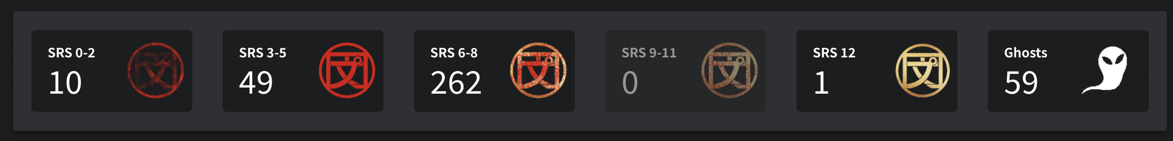
Since I take a pretty minimalist approach to self-stats, the only thing I really need to see is how many SRS Stage 0-2 items I have, how many ghosts I have, and how many reviews are ready to be done at a time, since this has a direct effect on how I pace myself in using the app.
I recently mentioned this in another thread, but something to draw the users’ attention to the Cram feature periodically (I’m thinking long intervals, as in, months apart at a time) that can be seen from the dashboard might be nice. IMO there’d be real benefit to giving oneself a “finals” test occasionally on all the stuff one has learned up to a point, and this is the kind of thing that Cram is perfect for.
I think this is also related to my information-minimalist approach though; to compensate for not caring about tracking stats, I tend to want to make active evaluations on-the-spot, and then look for anything that might need remediation during said evaluation.


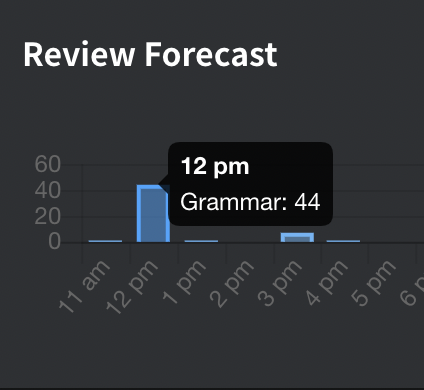
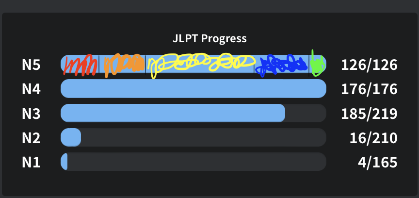
 this:
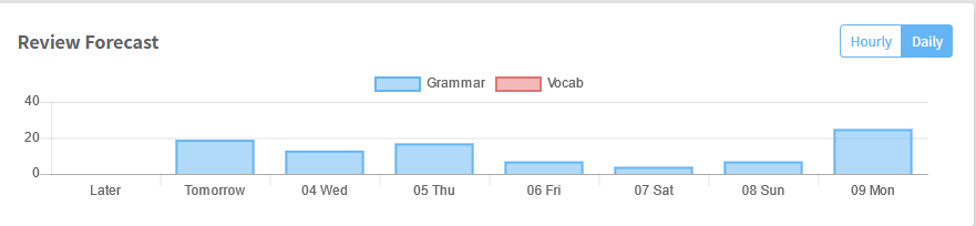
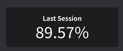
this: