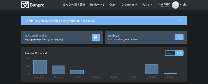
I’m probably blind, but where am I supposed to see this button ? ^^
Oh interesting! Where my screen says Study, your screen says みんなの日本語II.
I guess that automatic feature is only setup for the Bunpro order right now. I’ve never gone through the alternate paths. Sorry about that. 
…So… yeah, I agree that feature should be added. 
No problem  I was expecting the button at the left of review (View grammar from your textbook!) to show me the next XXX grammar points, not launch the list of all the grammar points of the book ordered by chapter, asking me to manually select those I want to add one by one. I want my magic button
I agree with you. I set my path to be Tobira and I was underwhelmed to simply get a link to all the Tobira grammar points in the top navigation bar.
Your post motivated me to try to switch to use the Bunpro order, so I did, but that, too, was not as useful as I thought it should be. From bunpro.jp/learn
- There was no obvious way to add the grammar points to my review list.
- The discussion board links always directed to the discussion board for the first grammar item
I find myself pressing “F” after every review because there’s just so much good info in there that I feel like it’s worth a review even if I’m comfortable with the grammar point. I would like a way for that info to appear by default, if possible.
This is a great site and I appreciate all the work that’s been put into it. Thank you!
Check the extension thread here on Bunpro, I believe there’s one that auto shows the information but it may be only if you get the answer wrong. Still, a useful idea for sure! Also the thread might have other useful things you may want to add like links to jisho, other websites, etc. so it may be worth a look!
idk why i didn’t just link it in the first place, here’s the link
looks like i was right about the auto-show info only being available if you get it wrong!
From /learn, all the items you see will be automatically added to your reviews after the quiz.
I’m not quite sure what you’re trying to do. If it’s adding specific grammar points to your reviews, there’s a button for that at the bottom of each grammar point’s individual site.
e.g. だけあって | Japanese Grammar SRS
Sigh. Thanks for the help! I had no idea there was a whole workflow hiding in there with a quiz and everything. I’m disappointed to be finding such a fundamental features on day 366 of using Bunpro.
I see two UI design issues that mislead me:
- Individual grammar points in /grammar_points have the “Add to reviews” button. Since I saw that affordance first, I expected the controls to be in a similar area in /learn.
- In /grammar_points and in /learn, the “»” arrow in the grammar point header navigates to the next grammar point. Great consistency, except that in /learn, one is expected to use the “navigate to next grammar point” affordance to launch the quiz!
I, for one, would never, ever deliberately hit the “next” button when I am on item 2/2…
Yeah, I can see that that’s not too intuitive, maybe the right arrow on the last item should change to a quiz button. or at least visibly change somehow.
I wish that there was a way to go to the actual page for a grammar point through the “related grammar” section. When I find a related point and want to also add it to my reviews, I have to manually go and search it from the grammar section, even though it’s right there. A “go to this grammar point’s page” button would be nice.
Click on a grammar point with your mouse wheel, it will open the point in a new tab.
Or just click twice - first click will unfold detailed info, but the second one will open the actual page.
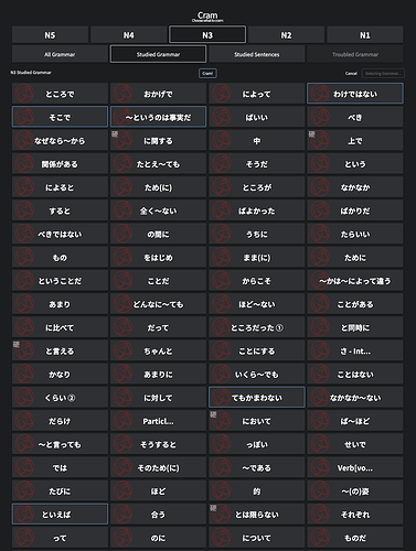
I’m not sure if others have a similar issue to this, but would it be possible to sort the grammar points on the Cram page by the order they appear in Bunpro (or to add a sort option with different sorts)? Like this:
- N3 - Section 1 - 1/12
- N3 - Section 1 - 2/12
- N3 - Section 1 - 3/12
- etc
After learning grammar points I typically go to Cram the most recent ones I learned but it takes a while to pick through all of the grammar points to find the ones I just learned, but it seems like they should be at the bottom.
I posted this comment in the bugs thread the other day, but I think that it’s more appropriate in this thread. Linking it here for reference.
So the way the UI looks right now in Review mode, the giant _____ blank space is always my first intuition to use for entering my answers, and to this day I still move to enter text into it about 80% of the time before realizing/remembering I have to move down to the much smaller and subtle “Your Answer” textbox. Any improvements to make the actual answer box more prominent would be great because right now it’s just not making enough of an impact to my muscle memory to move my mouse to it.
When you first open up reviews does it automatically have the answer box clicked and ready to type? Not on my computer so I can’t check, but usually I can just automatically type without clicking and it’ll auto put it in the box. I may be remembering wrong however! Good idea though, with the recent UI color changes perhaps there’s an easy way to implement this if others have felt the same way too
Yes, the answer box is ready to type without clicking.
You could make it so that clicking on the “___” just focuses the answer text box (again) though, maybe with a toast that you don’t need to click there.
True, it automatically focuses on the textbooks, but your eyes are always naturally going to be drawn towards the most focal point on the screen which is the larger, colourful context sentence. IDK just my opinion, maybe a userscript could be made to make the answer box more prominent.
Nah it’s perfectly valid, and something I never even thought of since now it’s just second-nature to read and type at the same time after about a year of using Bunpro. Might be worth posting your idea in the script/extension thread to see if anyone has the free time to do it!
I also use Wanikani, which is also SRS but they use a lot more colour, dividers, and text to guide your eyes towards where you’re supposed to look.
I’ll probably adjust to Bunpro eventually but the amount of misclicking I’ve done is definitely slowing me down lol.
Would be nice to have a way to define what ‘troubled grammar’ for the cram session (or otherwise) means. Currently it’s giving me no matches, but there sure are some points I got wrong more than once. Maybe a slider for percentage/times of wrong answers? (‘Japanese Kanji Study’ app has a slider like that to filter reviews, example here View grammar by SRS/success rate - #3 by BORN2PEEPEE)
Generally being able to see grammar points sorted by SRS level or success rate somehow would be neat.


