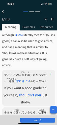
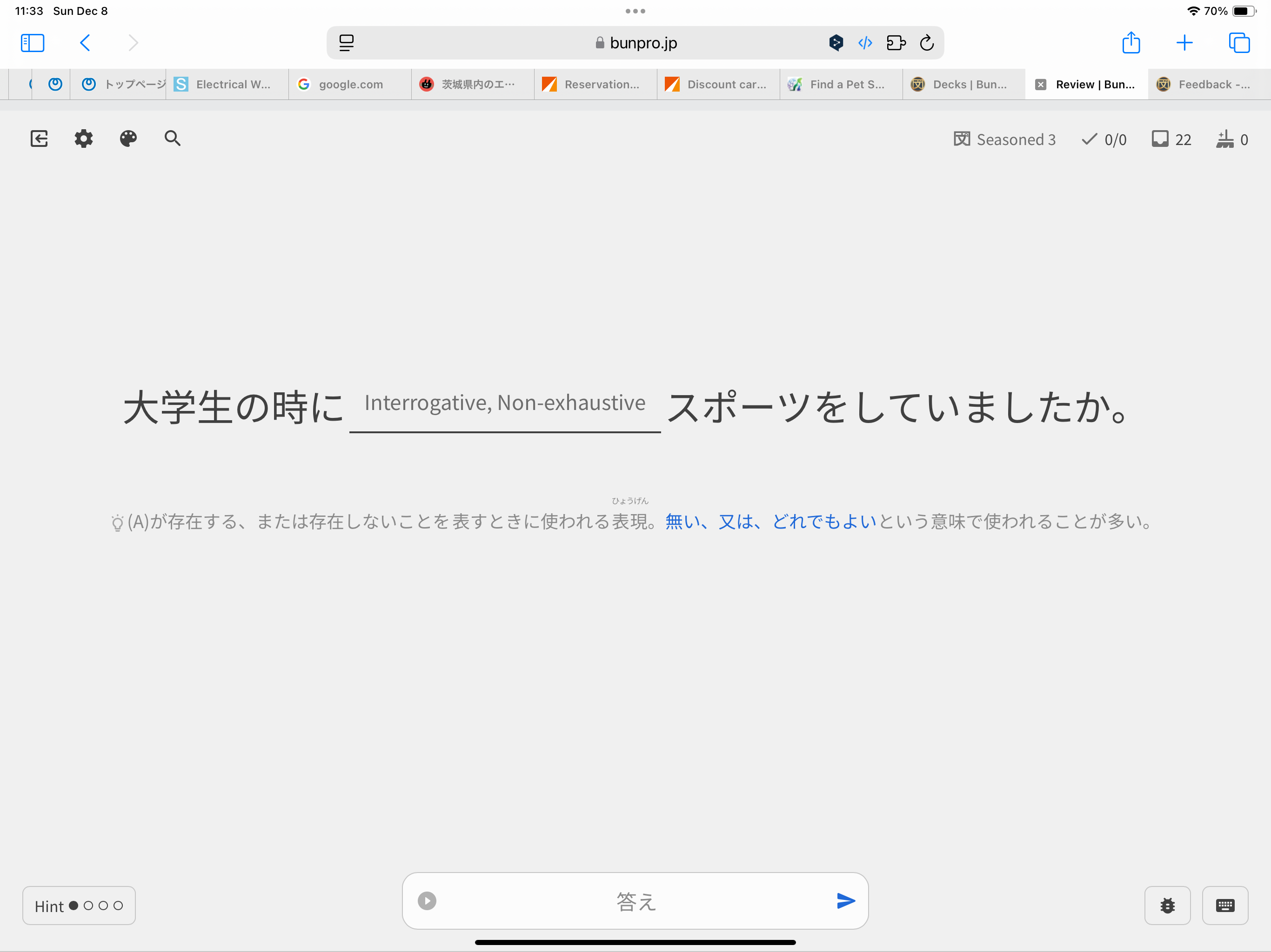
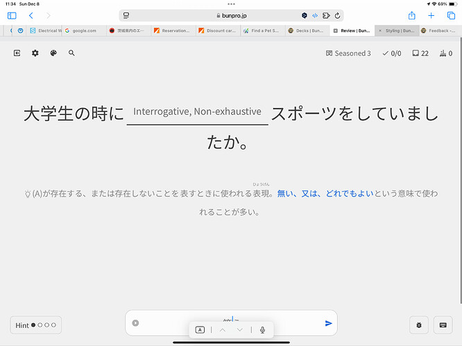
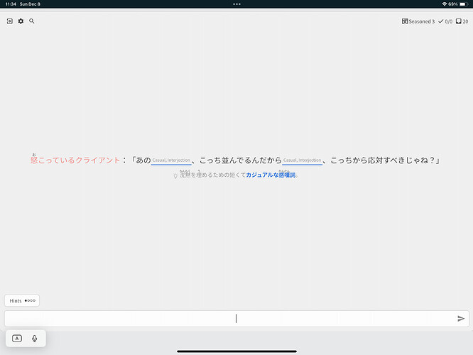
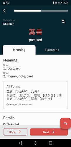
Is the “next” button at the bottom a new addition? I’ve been using the app for a while but had a break from doing Bunpro lessons for a while. I don’t remember it being there before - does anyone else find it quite distracting when reading or is it just me? Also, I don’t see any benefit of having all the content on one ‘page’ which can be scrolled through - is it possible to revert to the old layout with separate tabs which must be switched between?
Also, this seems like a bug: if I’m partway through reading a section such as the example sentences, then switch to a different app and immediately switch back to Bunpro, I get taken back to the top of the section.
@allanw
You can still switch between Meaning, Examples, and Resources tabs which will scroll to the them automatically.
The adventage of the current design is that you can swipe left and right to move between learned grammar vocabs.
Also, you can tap and long tap the indicator at the top to move between them.

For vocab related to verbs, the current app allows the dictionary form or the form conjugated for the specific sentence being shown. A feature to disable allowing the dictionary form would be appreciated because I am really trying to learn the conjugations and those questions give me more practice. It would be most beneficial for words which contain 2 final う kana in a row, like 作る so I don’t equate つくる to つく.
This is a great idea. I feel like fill-in type reviews suit me better at the start to hammer in the conjugation and then later on switching to reading mode helps build comprehension of the grammar point.
Switching decks’ review modes is a way to achieve this effect but as you said it also changes new reviews which can easily result in ‘false’ progress for conjugation-heavy grammar points.
Personally, I have a feeling I’d keep Beginner and Adept stages as fill-in reviews and then from Seasoned onwards I’d switch to reading reviews. Ideally the threshold for switching would be customizable, possibly even down to the SRS stages themselves. (Could pull off some neat setups, like having fill-in for SRS 5, reading for SRS 6, fill-in for SRS 7, reading for SRS 8 and so on, for example.)
That was grammar_points search. Sorry I should’ve clarified.
Is it ok to submit requests for search visibility as feedback on the grammar item?
E.g. to make まい grammar page come up when searching for すまい.
Or is it not a focus for now?
Also, I just though of another “proactive feature request” 
Currently there are 2 alternative ways to search, grammar_points or search. And my developer sense hints that there might be conversations in the team to unify them to just 1 way to search.
I’d like to request to not unify them and keep an option to search only for grammar as a separate feature. The obvious reason is performance impact of only searching through 1k grammar, not 100k words (e.g. timeouts for particles Feedback - Bug Reports - #5413 by casual). Another reason is to search specifically for long-form grammar pages.
Is there a specific reason why gestures need a double tap to flip cards? I feel like a single tap anywhere not on the words or buttons should flip cards. Minor nickpick, mostly curious if it’s just more difficult to implement
Can you make the vocab in example sentences change colors according to the level of mastery? it is something that Migaku is doing and it makes it really easy to know with one glance how much of the sentence I should be able to understand.
Hi there,
I wanted to know if there is a way scaling for UI scaling on the apps could be dependent on the device used. I use Bunpro for Android on my phone and then Bunpro for iPadOS on my iPad. One issue I find annoying is that at the medium scaling, the text on an iPad for the questions is quite small. So anytime I move to my iPad I have to change the scaling to large. Then, if I go back to my Android phone or my PC to study, everything is gigantic. So then I have to change it back to medium sized text.
I would be nice if scaling could be improved to give a better experience. Also as a note, if I open BunPro in Safari on iPadOS, the medium scaling is perfect for me. I usually use large on iPadOS native app, which is a slight bit smaller than the web version. But the medium is just uncomfortably small for me to read as I usually sit a bit back from my iPad.
Here are some screenshots to show what I mean.
Medium Safari on iPad
Large Safari on iPad
Medium Native App on iPad
Large Native App on iPad
Hey! I put this in a private message, but I am also adding it here, just in case. Yesterday I switched my settings to the “reading” answer option in order to get through a massive pileup of reviews. Today, I reversed the changes, making sure to reset all decks and the primary review options under the settings tab. However, when I am actually in the learning mode, it will not give me the “fill in” option, no matter what I do. I have tried everything. I went back and changed the settings again, logged out and logged back in, and restarted; nothing works. Not sure what I am missing, but it seems to be a glitch.
Can we please have more larger options for font size?
I use a 10.5 inch iPad, and even with the largest font setting, I struggle to read the furigana.
Can you make it so that when reading through a section (example sentences, for example) on a grammar point, switching away from the app and back on iOS doesn’t automatically scroll back to the top of the section?
I frequently switch apps and it’s quite distracting when I lose my place
Recently I came back to Bunpro and was super confused how to find breakdown by SRS. In stats page it was actually called “Breakdown by Streak” and recently changed to “Breakdown by SRS”. I had no idea “streak” meant SRS here, so I kept looking for stats in other places.
Now that it was changed, can we also change “Streak Average Over Time” to “Average SRS Over Time”, so it matches the other one and is more clear? Thank you! 
A way to skip items from a deck would be useful.
I’m learning the N5 grammar deck. I’m also learning the Yotsuba deck.
I’m getting on well with the Yotsuba vocab, but I’m having trouble with the N4 grammar points that it is introducing.
I’d like to be able to skip the Yotsuba grammar items as they come up, and return to them later.
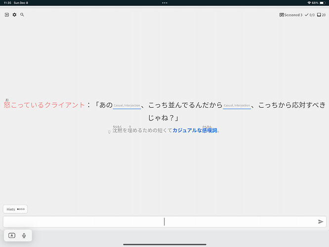
Little late to this reply, but on my mobile app, if I input an incorrect answer, I am able to find my mistake(Often a mistype) and correct it. Which I absolutely love, especially for the longer conjugations. Could his actually be implemented for the web side too?
Unless this is a bug in which case, please do not fix it lol
Perhaps add a section where it explains mathematical symbols like x, +, - etc and a brief explanation of how the JP maths system works.
Also an explanation of just symbols in generals
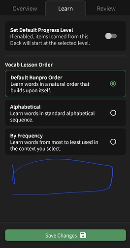
Option to learn deck items in custom order/deck order. Currently there’s no option for this, leading items in learn queue to be introduced out of order. Not immediately helpful if following a deck for anime episodes or novel chapters
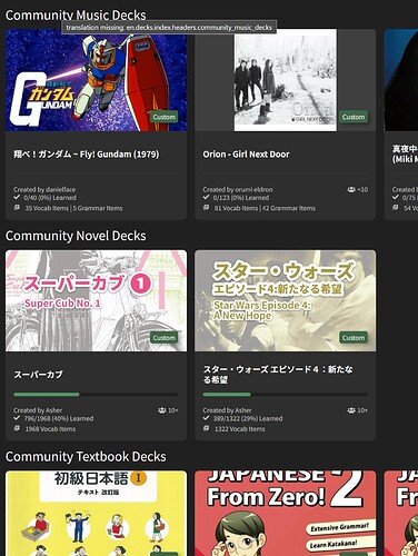
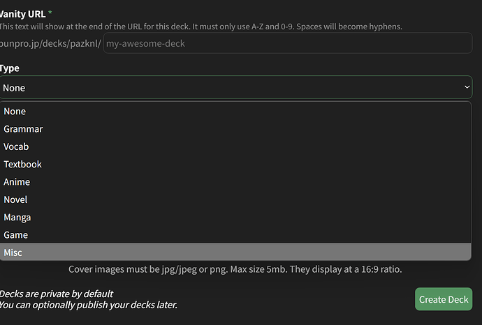
Would you consider adding music or song as a “type” for vocab decks?
Reason - I’m trying to learn the vocab for the lyrics of a song.
Would be nice to have it as a type.

