Feedback - Suggested Improvements/Feature Request

Need to split up grammar points even more.

Example:

Separate formal and polite into separate review items. Separate different forms of grammar points into different review items if the form is different (typically following na adjectives).

When I learn one grammar point, it’s extremely difficult to recall all 4 forms at the same time. But once I master one form, it becomes much easier to learn the next form, the form after that, and the final form. This is the equivalent to starting to ride a bicycle on gear 6 instead just starting on gear 1 and accelerating your way to gear 6.

2 Likes

I’m sure these have been mentioned for vocab, but: 1) Anki Mode and 2) Keeping Vocab reviews separate from Grammar

Bunpro has been insanely good so far, as far as grammar goes though. I’d love to dig into vocab but I can’t until reviews are separate from grammar. My vocab pace is lightning fast, and my grammar pace is intentionally slow-until-i-understand-it lol

I think I’ll keep a folder of bunpro setting screenshots for faq ʕ⁠ ⁠º⁠ ⁠ᴥ⁠ ⁠º⁠ʔ

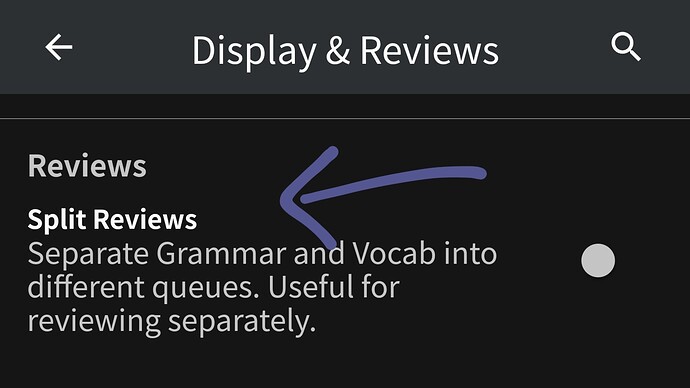
Like gome said, settings. You’ll then get a drop down menu to choose which reviews

here’s some screenshot to help for mobile


Side note, can you specify what you mean by Anki mode

2 Likes

On the settings page you can scroll down to the section labeled general there is a drop down box that says split reviews. If you select yes then you’ll have a little drop down arrow next to your review button that allows you to select either only vocab or only grammar.

2 Likes

thank you!!! :pray: :pray: :pray: :pray:

Maybe a mode that’s like… I see the word, and then see the meaning and a couple of buttons that are like, Good or Again. Just something kind of streamlined that I can flip through a ton of vocab. But maybe bunpro already has that too :thinking: If so, I apologize!!

1 Like

On the same settings page from earlier you are able to select the default grammar and vocab review settings. Those settings should be at the top of the page. For the field labeled answer type you can choose the option called reveal & grade

2 Likes

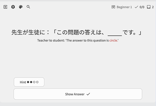
To summarize, would revealing the reading of the target vocab within Fill-in-the-blank-style Vocab questions?

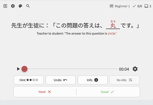
The same way it’s done for Translate questions? Like:

on reveal becomes:

^If so, I can probably do that pretty easily!
Just let me know

1 Like

That’s perfect! I like having it in a sentence though, is it possible to do exactly as you just showed, but still in the context of a sentence?

1 Like

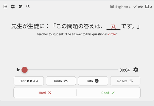
Ah K. Like this then:


I was about to implement it, but thought that some users would actually probably want to test themselves on the kanji reading too, and that would need to be done first.

What might be a good middle ground is adding a hotkey to show all Furigana.

This has been asked for/discussed before, and would potentially help reduce the extra steps you need to take.
E.g something like:

While not holding Shift + F:

While holding Shift + F:

2 Likes

Why not just take the current implementation and reveal all furigana when the answer is clicked? Just disable revealing furigana for the target word before the answer is clicked.

1 Like

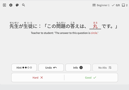
Because I am thinking that maybe at this step:

People are also wanting to test themselves on the reading of the target word – can I understand the sentence and read the kanji 丸?→ then decide Hard or Good.

They also might just want their current furigana settings to also affect this location.

But yeah, Reading + Fill-in-the-blank mode is super new, and this is the first time I’ve seen this requested. I don’t wanna break other people’s study system with a change like this, hence suggesting the optional hotkey (which is a non-breaking change).

If you or anyone else has more opinions on this, would love to hear them!

2 Likes

I agree with the optional hot key. I personally solve the question before and then read the full sentence. If they came on for every single kanji automatically, I might delude myself into thinking that I can read the kanji when In actuality I’m not able to.

At the very least if it were to be automatic, maybe it could be an optional setting that you can turn on and off.

1 Like

Perhaps I’m misunderstanding. My request was just for reading, not fill in the blank. Both could be interesting though.

1 Like

Ahhh you’re totally right! I was misunderstanding the mode :woozy_face:
If it’s Reading mode then the second step is kinda pointless!
I can’t think of any reason not to show the furigana after Show Answer-ing :thinking:

@drunkgome
As for the hotkey, still think a site-wide Show All Furigana hotkey would be useful/desireable!
Will keep it in the back of my mind.

4 Likes

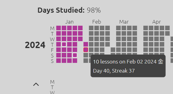
I love the Wanikani heatmap where I can see how many lessons I did on a certain day. It also reminds me to actually do lessons every day so I don’t lose my streak.

image

We already have graphs on our dashboard for how many reviews we have done every day. Would it be possible to add a graph for how many items we have learned every day too?

2 Likes

It’s currently available on your profile page under the Stats page

4 Likes

Now we just need to have it start on the current month. Currently it starts on the October I joined and I have to scroll through 3years of sporadic boxes to get to current data. Same for reviews. When I click the boxes it doesn’t tell me any more info or number of items, maybe my Internet is just slow today, but if it doesnt already do that it would be nice

On this note, I think it would be neat to have the option to toggle display this data on the dashboard. Seeing a heat map of added/reviews would be really helpful to determine if you need to slow down your pace or pick it up. (Yes forecast does help a lot here, but the heat map can tell you about past stats vs future)

3 Likes

You’re on mobile right? I checked it on IOS Safari and it doesn’t show anything when clicking on a box. On pc it displays the info when you hover over it.

2 Likes

Thought that also might be the case lmao yeah mobile web

2 Likes