Recently, Bunpro updated the way info pages are displayed when inside of reviews
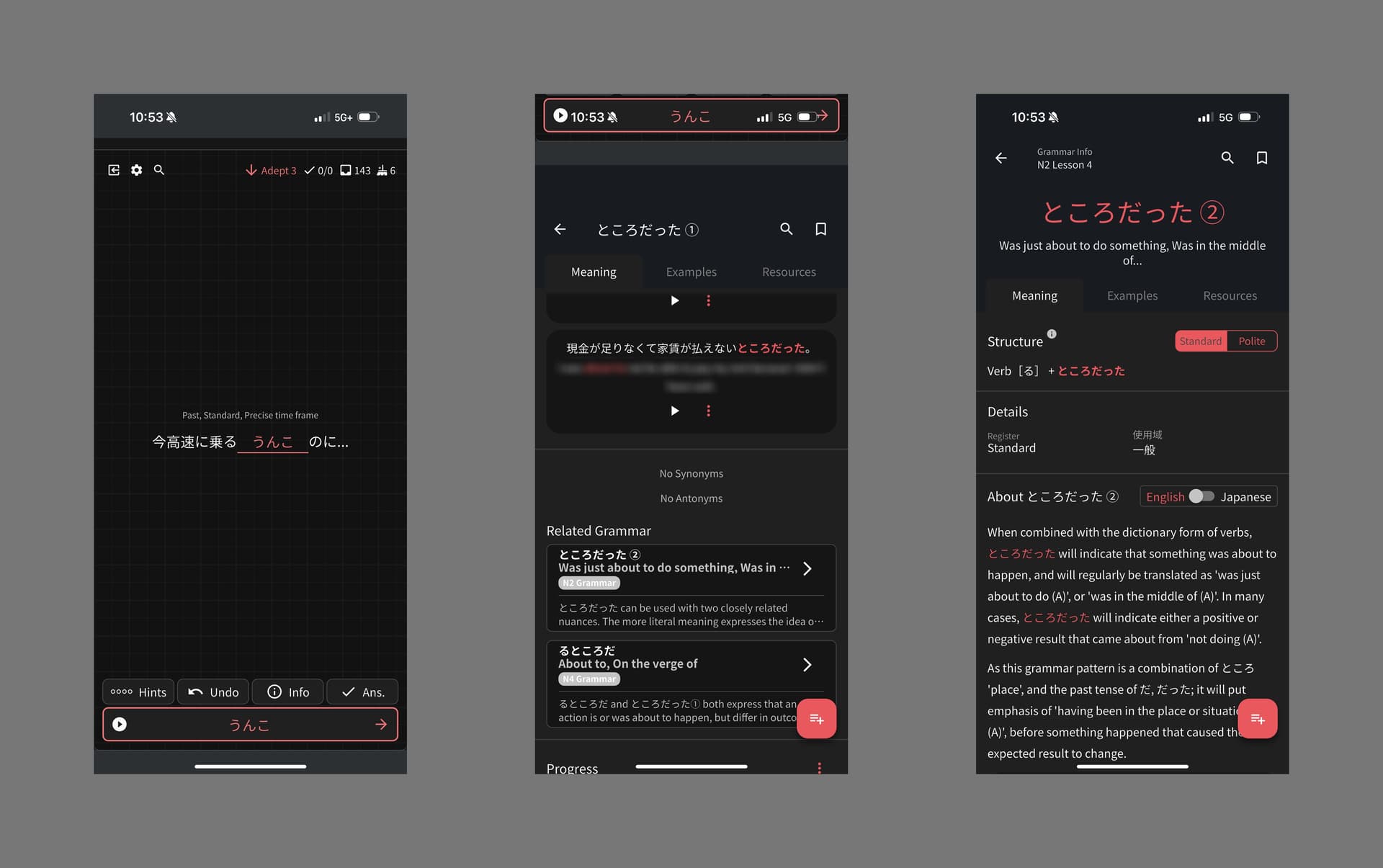
Current version (Review → Info → Related Grammar Point)
- Even when scrolling down, most of your screen space is filled with obsolete padding
This makes the page feel claustrophobic, and harms the users ability to quickly contrast between different items written on the page
- Arrow takes you back to home instead of returning to reviews
Perhaps this was implemented as the arrow points left? However, as arrows in Bunpro always take you back one page, this feels unnatural. Scrolling down to return to reviews also feels finicky at the moment.
- Having the banner shifted downwards feels… Very weird… (Title, search, arrow, etc.)
- The answer at the top collides weirdly with Apple’s UI elements (especially for users with a center dock)
I understand that this change may have been implemented with the intention of improving flow of information and UX (making it more obvious that the user is still in reviews, instead of the gist that perhaps they’ve exited out of reviews) – however I think it could’ve been approached differently
Here’s a rough example of an alternative, assuming you wish to:
- Make it clear the user is still in reviews
- Want the arrow to be lore accurate
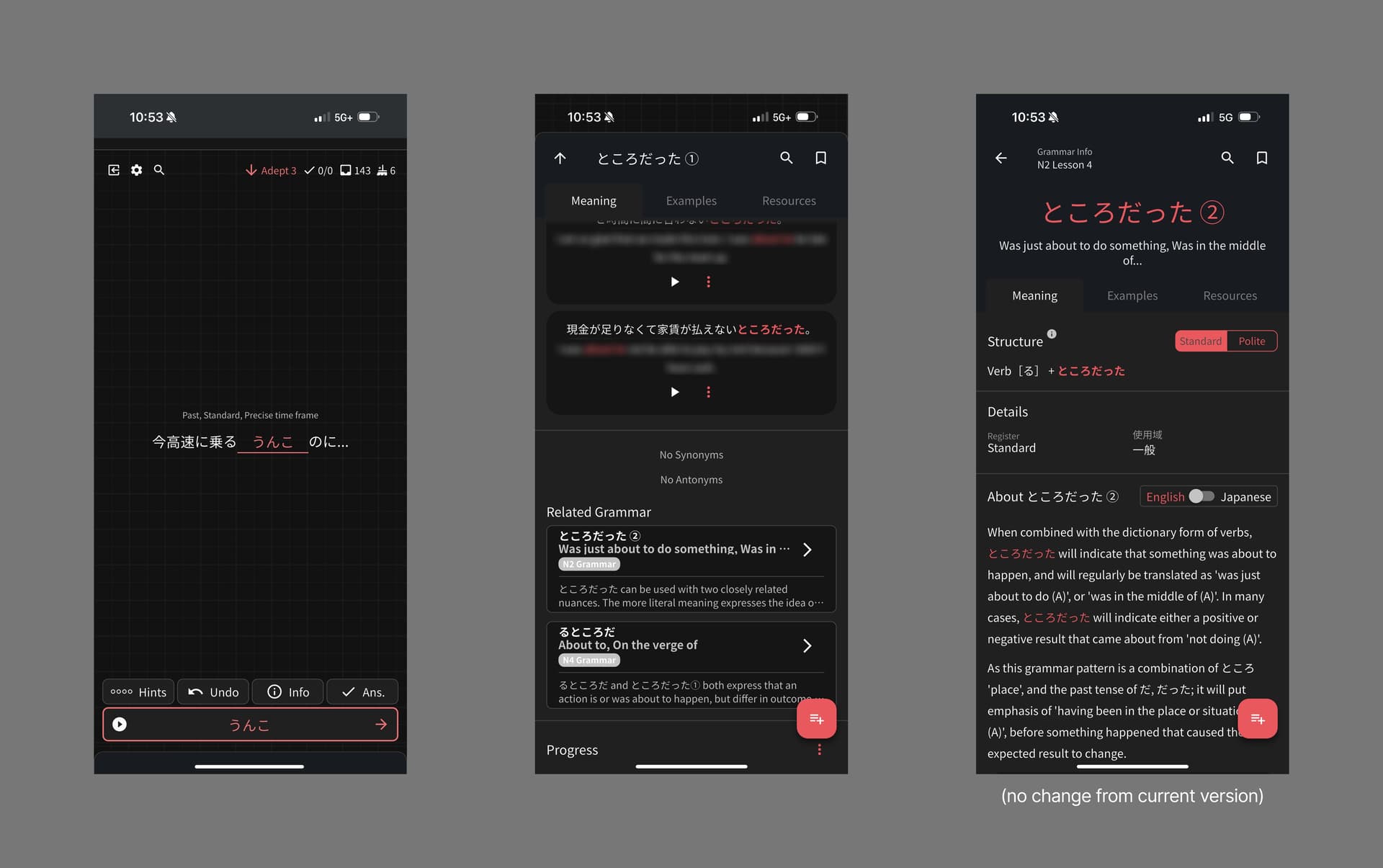
Rough Proposal (Review → Info → Related Grammar Point)
Clicking on Related Grammar would function as it currently does. However, the root page would be differentiated by:
- The top part is tab-shaped, with the user’s set review background as the background and other UI elements hidden
This is done with the intention of not having the app’s UI collide with system UI
- The arrow is lore accurate and brings you back to the reviews, quickly hiding the info section with a downward motion (I honestly don’t find much of an issue with the left pointing one, however I do find it quite frustrating that it takes you back to the homepage instead of back to reviews)
in retrospect, however, i definitely feel the arrow should be pointing downwards instead of up, as it’s a tab and not a full-page ui
bunpro i love u but this update has me feeling a bit antsy