Feedback - Suggested Improvements/Feature Request

Check the extension thread here on Bunpro, I believe there’s one that auto shows the information but it may be only if you get the answer wrong. Still, a useful idea for sure! Also the thread might have other useful things you may want to add like links to jisho, other websites, etc. so it may be worth a look!

idk why i didn’t just link it in the first place, here’s the link

looks like i was right about the auto-show info only being available if you get it wrong!

2 Likes

From /learn, all the items you see will be automatically added to your reviews after the quiz.
I’m not quite sure what you’re trying to do. If it’s adding specific grammar points to your reviews, there’s a button for that at the bottom of each grammar point’s individual site.


e.g. だけあって | Japanese Grammar SRS

1 Like

Sigh. Thanks for the help! I had no idea there was a whole workflow hiding in there with a quiz and everything. I’m disappointed to be finding such a fundamental features on day 366 of using Bunpro.

I see two UI design issues that mislead me:

  1. Individual grammar points in /grammar_points have the “Add to reviews” button. Since I saw that affordance first, I expected the controls to be in a similar area in /learn.
  2. In /grammar_points and in /learn, the “»” arrow in the grammar point header navigates to the next grammar point. Great consistency, except that in /learn, one is expected to use the “navigate to next grammar point” affordance to launch the quiz!
    I, for one, would never, ever deliberately hit the “next” button when I am on item 2/2…
3 Likes

Yeah, I can see that that’s not too intuitive, maybe the right arrow on the last item should change to a quiz button. or at least visibly change somehow.

3 Likes

I wish that there was a way to go to the actual page for a grammar point through the “related grammar” section. When I find a related point and want to also add it to my reviews, I have to manually go and search it from the grammar section, even though it’s right there. A “go to this grammar point’s page” button would be nice.

1 Like

Click on a grammar point with your mouse wheel, it will open the point in a new tab.
Or just click twice - first click will unfold detailed info, but the second one will open the actual page.

4 Likes

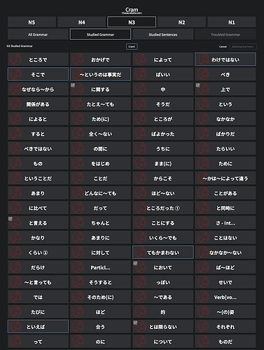
I’m not sure if others have a similar issue to this, but would it be possible to sort the grammar points on the Cram page by the order they appear in Bunpro (or to add a sort option with different sorts)? Like this:

  • N3 - Section 1 - 1/12
  • N3 - Section 1 - 2/12
  • N3 - Section 1 - 3/12
  • etc

After learning grammar points I typically go to Cram the most recent ones I learned but it takes a while to pick through all of the grammar points to find the ones I just learned, but it seems like they should be at the bottom.

3 Likes

I posted this comment in the bugs thread the other day, but I think that it’s more appropriate in this thread. Linking it here for reference.

1 Like

So the way the UI looks right now in Review mode, the giant _____ blank space is always my first intuition to use for entering my answers, and to this day I still move to enter text into it about 80% of the time before realizing/remembering I have to move down to the much smaller and subtle “Your Answer” textbox. Any improvements to make the actual answer box more prominent would be great because right now it’s just not making enough of an impact to my muscle memory to move my mouse to it.

1 Like

When you first open up reviews does it automatically have the answer box clicked and ready to type? Not on my computer so I can’t check, but usually I can just automatically type without clicking and it’ll auto put it in the box. I may be remembering wrong however! Good idea though, with the recent UI color changes perhaps there’s an easy way to implement this if others have felt the same way too

1 Like

Yes, the answer box is ready to type without clicking.
You could make it so that clicking on the “___” just focuses the answer text box (again) though, maybe with a toast that you don’t need to click there.

True, it automatically focuses on the textbooks, but your eyes are always naturally going to be drawn towards the most focal point on the screen which is the larger, colourful context sentence. IDK just my opinion, maybe a userscript could be made to make the answer box more prominent.

1 Like

Nah it’s perfectly valid, and something I never even thought of since now it’s just second-nature to read and type at the same time after about a year of using Bunpro. Might be worth posting your idea in the script/extension thread to see if anyone has the free time to do it!

I also use Wanikani, which is also SRS but they use a lot more colour, dividers, and text to guide your eyes towards where you’re supposed to look.

I’ll probably adjust to Bunpro eventually but the amount of misclicking I’ve done is definitely slowing me down lol.

Would be nice to have a way to define what ‘troubled grammar’ for the cram session (or otherwise) means. Currently it’s giving me no matches, but there sure are some points I got wrong more than once. Maybe a slider for percentage/times of wrong answers? (‘Japanese Kanji Study’ app has a slider like that to filter reviews, example here View grammar by SRS/success rate - #3 by BORN2PEEPEE)
Generally being able to see grammar points sorted by SRS level or success rate somehow would be neat.

2 Likes

I don’t know if this was suggested before, but it would be nice, if you conjugated a godan RU verb as ichidan or vice versa you would only get a hint and not an error.

2 Likes

When selecting grammar in the search function it give you options such as ‘add to review’ or ‘study’ would be good to include ‘cram’ likewise when clicking on ‘cram’ from the side menu would be good to be able to search grammar rather than scrolling through 100s of grammar points to find the ones you want.

1 Like

Would be nice to have a tag for the tone or context (polite, casual, rude, towards customers, friends…) of the overall sentence, not just the prompted grammar point.
Sometimes it translates into the English sentence as well, but probably more often than not it does not.
Eg. if I’m not mistaken 今暇だから、晩ご飯を作ってあげるよ。could have a “casual” and/or “close, friendly relationship” tag.
Example sentences are great, but without context there is the danger of memorising something that’s grammatically correct but you should absolutely not use towards your boss lol. Not just in terms of grammar, also vocab. So having at least the info which context/tone the sentence in might help a bit.

1 Like

I mean, you should be able to tell from the constructions used in the sentence, and the tone.
If it’s using dictionary/plain form (る/だ) etc., it’s probably casual (like your example). If in doubt, never use these forms with someone higher up (unless they’re part of some grammar followed by a polite form).
If it’s using です/ます form (or higher), it’s probably polite.
And for even more polite/humble tone you’d use various forms of Keigo.
(If you’re still near N4, you’ll learn these forms later, and can use です/ます for now)

(the other concern is that retroactively tagging all sentences like this would be a huge amount of work, and it also depends on context anyways. If your boss is about to slip on a banana, it’s probably ok to quickly call out a warning in a simpler form, like あぶない! (and then perhaps correct yourself with あぶないですが。。。, but i’m not an expert)

Yeah, ideally you should be able to tell which is which from having learned all the grammar of course. But yanno, we’re all still in the process of learning :wink: And seeing there’s the option to have the meaning of the sentence translated I feel like it’d be useful to also have the tone “translated” as well, since that is also part of the meaning (sort of).

来い, 来て and いらっしゃってください can technically all be translated the same, but then you’d lose some meaning. Sure, you can tack on some “oi!” or “would you kindly” etc to differentiate, but English doesn’t have that many ‘naturally’ different politeness levels. Having some tags would both be simpler to implement and to understand, than trying to convey the tone with Shakespearean wouldst though whatnot.

です/ます vs. だ/る are some simple basic points to look out for sure, but I presume there’s still more nuances than that? Like idk, colleagues all using です/ます, but there’s still a difference whether you’re talking to a younger/newer employee or someone more experienced? (Maybe? I don’t know but I’d presume so?) Or some expressions being more used in written language rather than conversation.

Sure, it’d certainly be a bunch of work to add all those tags. Would imo add a lot of value too though.

There the common warning to not learn Japanese through anime cause you might pick up inappropriate language. Same could happen with out of context example sentences. Heck especially with those, since I have an expectation that a textbook/learning site will teach me ‘proper’ language, unlike a some fictional fantasy story.

Added benefit: Once you have all the sentences tagged you could also filter for politness level. Feel like you struggle understanding formal stuff? Search for formal example sentences and work through a couple of those. (If there’s a search function for example sentences, no clue. If not, that’s another feature request haha.)
I don’t think such a database of example sentences with clear tone tags exists yet, so that’d be a unique selling point :slight_smile:

1 Like