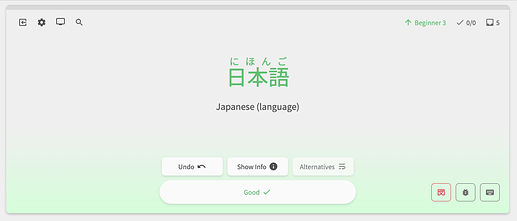
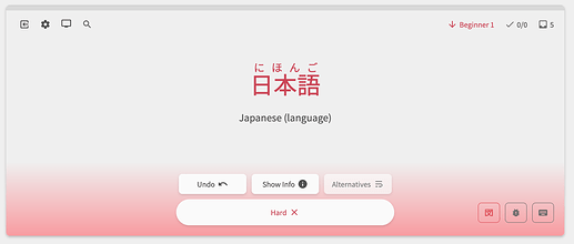
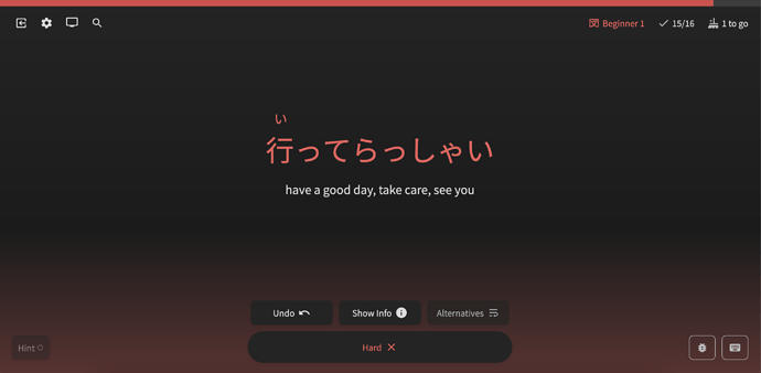
This should now be fixed!
Sorry for the inconvenience.
Hi there,
This is a Firefox-only rendering issue.
Had a bit of a deep dive into this, and there is no solution we can give apart from potentially replacing the gradient with a background image of the same gradient.
As you can maybe tell, this issue is on our radar, but because of its nature, it’s low on the priority list of stuff to fix. If anyone has any ideas/insider knowledge that could lead to a fix, I can take another look into it.
I changed my ‘main deck’ from Bunpro N3 Grammar to Genki 1 3rd Edition complete… but the ‘Learn’ button at the top is still pulling from the Bunpro N3 Grammar deck…

When I use the regular deck button on the dashboard it works fine though, but that isn’t using beta 
This is working now thanks!
I had a similar problem, except it was only the very last review of my session that was marked incorrect. I’m also pretty sure there was a different review that I genuinely did get wrong, but which was marked correct… You win some you lose some?
Hey! Thanks for the feedback.
The bug ThisIsntTheWay is referring to was a bug that was present when we first released the Beta a month back. This was patched.
I believe the bug you’re referring to is different, and is only related to the Summary page!
I’m still trying to figure out what conditions cause the Summary page to bug out like that (very hard to replicate – lemme know if you got any insight too), but rest assured your SRS progress from the Review session should be correctly maintained 
Sorry for the inconvenience!
I did try out screenshoting the gradient in my Chrome and setting that background to that and it seemed to work, however I’m not sure if would look good at different screen sizes and pixel ratios. Additionally, there was some banding visible if it was resized to fit the height of the window. I’d probably set it the solid gray background for Firefox only and remove the gray step in the correct and fail gradients.
It’s incredible that this bug has been on their tracker for over a decade and no one has fixed it.
Yeah I was pretty disappointed when I found out about it…
I’ll see what I can do through some media queries!
Thanks again for all the input.
The latest fixes for Reviews 2.0 are here! Mainly these are fixes/updates for Vocab
Features
-
Added a post-attempt phase to Flashcards
- Added the post-attempt phase (when the BG changes color and you can see the change in SRS)
- We felt having this would better fit in with the phases of the other question-types
- Next question can be reached by clicking the Hard/Good button again, or pressing the Enter key
- Thanks to @gapl for the suggestion
-
Added Undo to Flashcards
- This allows you to skip back to the pre-reveal state
- Hotkey is the usual
Backspace/Delete
- Hotkey is the usual
- This allows you to skip back to the pre-reveal state
-
Add more visual clues when focusing the text input-field when answering Manual questions
- Darkened shadow when focusing, arrow turns to the accent color
- This should help keyboard users visually know when they are able to input text


-
Added the hotkey “Mark as Good/Hard” (for Flashcards) to the Hotkey Guide
- Also changed the styling of the Hotkey Guide while we were at it
Fixes
- Use default browser scroll behaviour if prefers reduced motion
- Added JLPT/Part-of-speech info to the Vocab header
- Fixed Reviews not returning the correct data if you specify a Deck (from the
/deck/page) - Fixed the strange flash of the previous Grammar Points when Continuing after a Quiz in
/learn/- This was part of an overall refactor of the Learn system
- Changed the Flashcard “Good” button icon (was a cross) to a Check

Up Next
- Revamp the Alternate-Answer system for Vocab
Thanks as always to ya’ll who keep giving feedback with the new system.
I see everything in this thread and try to stay on top of it all, so any feedback you have will (at the very least) be considered, if not fixed/implemented.
Until next time!
Oops! That’s what I get for not checking the post timestamp haha.
I unfortunately don’t have any further insight on the Summary page issue, but I took a screen recording of my most recent review session, which also experienced the same bug. (Can’t attach video, so here’s a link if you want one: https://drive.google.com/file/d/1i7z5X7BhkFAuXuA1GRPt1Qpug5JqI5e2/view?usp=share_link). Not sure if it’ll be helpful or not, but figured it’d be worth a try.
Reviewing the video, there was actually a brief glitch where I gained 600 XP for the session, as opposed to the 1620 XP Bunpro eventually settled on. The たり… たりする grammar point was also missing the second たり in the summary sentence.
Best of luck troubleshooting 
Hi there!
I went through the video, and yeah there were multiple items that were just clearly bugged.
I can also replicate it on my end. My guess is that it’s caused when you don’t wrap up items.
I’ll pass this to the backend dev and we’ll get it fixed.
The たり… たりする grammar point was also missing the second たり in the summary sentence.
On it 🫡
Thanks so much for the detailed vid!
I’ll tag you when it’s fixed.
Hey! Nice find.
Do you remember where you saw this? Like what Grammar Point it was?
I’ve tried to reproduce the bug but I can’t 
Not off the top of my head, but I will look around. Probably the first couple sections of N2 stuff.
I’m not quite sure how, but after completing a (rather short in this instance) review, the “Learn” tab is lit up with a staggering 217 new grammar points that it wants me to perform. Don’t get me wrong, I like learning Japanese, but not this much. This is fixed when going to the main menu.
Just encountered that same glitch. Happened after I finished my reviews. It was just the number of total N2 Grammar rather than my batch number.
Hi!
We’re aware of this bug, and will push some fixes out soon!
Sorry for the inconvenience. Those big numbers aren’t exactly motivating huh…
 I’m back again! lol. When I mark a word as ‘good’, I can just click the ‘good’ again and it continues, but when I mark a word as ‘hard’, clicking on the ‘hard’ again doesn’t continue… I have to press the ‘enter’ key to proceed. I’m using Firefox
Third round of Vocab fixes babyyyyy
Fixes
- Replace all instances of Cloze placeholder inside of Summary sentences
- Fixed bugged display of some questions that had multiple instances of the answer inside the question (think とか、たり etc.)
- @amph1ptere
- Fixed how info displays when Auto-Expand is On for Flashcards
- Added check for explicit wrong answers before checking correctness
- There are instances where our typo detection will think an answer is correct, even when it definitely should be incorrect
- E.g. Typing “reserved seat” instead of the actual answer “unreserved seat” will lead to the system thinking you’re correct, but just made a typo
- Now we’ve added the ability to specifiy explicitly incorrect answers so this doesn’t happen
- If you see any more instances of this, please let us know in the Feedback and we’ll add in the explicitly incorrect answers
- Thanks to @Rukifellth for pointing this out
- There are instances where our typo detection will think an answer is correct, even when it definitely should be incorrect
- Fixed issue where words with Katakana input with the long vowel sound 「ー」were not able to be input in Katakana
- Learn batch size displaying incorrectly
- Fixed issue where going to Reviews with a Deck from the Decks screen returns items that haven’t been learnt yet
- Adding Custom Study Questions will now instantly update the review count in the navbar
- Fix issue where clicking Hard twice doesn’t go to the next question for Flashcard questions
- Various minor design tweaks and internal refactors
Up Next
- Revamp the Alternate Answer system for Vocab
- Add “Add to Reviews” / Review updating functionality to the Furigana tooltip
- Add Bug Report feature for Custom Study Questions
- This should help me debug issues with these questions @Ponpoko
- Dashboard 2.0
Thanks as always for helping us test our app.
If you have any feedback, or think I’ve forgotten something, please let me know here.
Just bumping this cause i’m still having this issue 
YES!!!


